When Barneys New York emerged from bankruptcy in 1999, the luxury fashion retailer began searching for new, undeveloped areas to grow its business.
While the flagship stores were too cost-prohibitive to saturate the market, Barneys identified its COOP (as in cooperative) concept – a department for the younger, more accessible Barneys brand with a flair for trendy, hip fashion founded in the early 1990s – as an area of untapped potential.
“We look at COOP as the entry into Barneys,” says David New, executive vp, Barneys New York. “We felt it was a vehicle we could take on the road that would have wide appeal.”
Thus began a two-year re-evaluation period for Barneys, in which it began strengthening the COOP focus and identity. During that time, it turned the concept into two New York stores, the original Barneys space in Chelsea and a new store in SoHo. But New says the pieces didn't all fall into place until the opening of COOP in Miami's South Beach in September.
“South Beach is really the first true COOP,” he says.
Barneys' in-house design team partnered with RGLA/ Robert G. Lyon & Associates Inc. (Schiller Park, Ill.) on the 9000-square-foot store, which is located in a two-story, white, art deco building on Collins Avenue in the heart of South Beach. (A Tommy Hilfiger store formerly occupied the space.)
Advertisement
“People will come from all over to visit the store, so we definitely wanted elements of memorability and surprise,” says Kent Wells, RGLA's director, retail planning and design.
Relying on new and creative ways to use utilitarian objects, the store embodies a mix of materials, fixturing systems and artisan objects to create an eclectic store environment, with an emphasis on wacky and fun.
New explains that the COOP brand is structured around three merchandise segments: denim; designer labels, such as Diane von Furstenberg and Marc by Marc Jacobs; and more bohemian, up-and-coming designers, such as Alabama and Alice & Olivia.
To create that one-of-a-kind environment, the retailer strives not to use anything off the shelf, rather relying on its fixture manufacturer to create one-off, arts-and-crafts pieces for the store.
“We wanted a fixturing concept that was unique and different, and something we could use going forward,” says Randy Sattler, vp, visual marketing and retail solutions, at RGLA, “but, no two stores will be the same.”
In South Beach, designers added an element of “eco-tech,” using a number of recycled materials and reused items, including recycled crates as jewelry display tables and refrigerator doors circa 1950 for the women's denim display.
Advertisement
“The whole combination of eco-tech and recycled materials, along with found and art objects, gives the store personality and pop,” says Sattler.
While the COOP store design strives to buck conventionality, so does its layout. For example, the men's department, including clothing and shoes, is on the second floor.
“We felt there was going to be a strong men's fashion customer in South Beach,” New says. “So we weren't afraid of putting that department upstairs. We were certain that men were going to find the merchandise.”
Helping lead the way is a winding staircase just to the right of the entrance inside the 2-story atrium. Skylights and a striking mannequins presentation at the top of the stairs also draw attention upward.
For South Beach, designers created every fixture in the store to be unique to the merchandise that is presented with it. For example, New says that the hanging rack system used in women's was inspired by an English towel-warming rack. For a fresh, innovative twist on the slatwall presentation in women's shoes and accessories, designers used a metal grate system interspersed with wood shelves that can be changed out to accommodate various products.
“It ties back to the eclectic mix,” says Sattler. “It's stainless steel along with plywood along with blackened steel along with recycled products – planned chaos.”
Advertisement
For denim, which comprises a large part of the COOP brand, designers kept the presentations simple and allowed the volume of merchandise to speak to COOP's authority on the product.
“It's geared toward the fact that there's been an explosion in denim labels in the past two years,” says Wells.
A green metal shelving system creates a striking wall presence in men's, while women's has a simple wood shelving system. Standing in front of each denim wall display is another taste of “found-object-turned-utilitarian.” For men's, architectural flat filing cabinets become a display table; in women's, the antique refrigerator doors provide the colorful and unique base for a checkout counter/ display table/storage unit.
With so much visual activity inside the store, designers kept signage minimal and low-tech. In the women's area, lightboxes typically used by advertising firms to view film and prints are suspended from the ceiling. Messages for the lightboxes indicating particular products and brands come from a variety of sources, from computer-generated to hand-stenciled. In denim, clipboards are attached to shelves and display each style and SKU number, written in chalk.
The final layer of visual interest inside the store is found in the mix of new and thrift store artisan objects dispersed throughout. A vintage driftwood table with a glass top displays women's accessories, while different styles and sizes of block lettering spell out the words “cool” and “courageous” inside departments. Barneys' visual team even fashioned a horse out of denim material for a window display.
Custom wall murals by New York artist Carter Kustera also splash up the neutral palette. The wallcovering features colorful silhouettes of male and female heads with attention-grabbing phrases, such as “Kristin is dealing with the fact that her brother is now her sister,” scrawled underneath.
Perhaps the strongest visual statement of COOP, however, comes from the blue mannequins from Goldsmith (Long Island City, N.Y.). While Barneys had used the blue color in some of its previous branding efforts, the move to a blue mannequin statement was more accident than intentional.
“We just happened to paint our mannequins blue for the SoHo store, it's as simple as that,” says New.
It proved to be a worthy happenstance. “We found that at the SoHo opening what people remembered about the store was the blue mannequins,” he adds. “As silly as it was, it stuck out in people's minds. So at this point, we're going to stay with it.”
South Beach's COOP will be the prototype design as Barneys continues to roll out new stores in high-fashion markets, including Chicago's Lincoln Park in fall 2004. “At the end of the day, I hope that everyone thinks it's really well-thought-out in terms of that mix and balance,” says New. “We worked hard to achieve that.” (integral)
Barneys calls its new store in South Beach “the first true COOP,” one in which all the pieces fell together. Artisan objects create an eclectic environment. The store's apothecary features a curved-wall fixture system and a concrete floor that's been ground down to a raw finish and sealed with a clear coat.XVM+SD DECEMBER 2003
Client: Barneys New York, New York – Howard Socol, ceo, president; David New, executive vp; Russ Delisi, vp, construction and facilities; Simon Doonan, creative director; Claudia Domingues, director, store design
Design: RGLA/Robert G. Lyon & Associates Inc., Schiller Park, Ill. – Robert Lyon, principal; Joseph Geoghegan Jr., president; Randy Sattler, vp, visual marketing and retail solutions; Kent Wells, director, retail planning and design; Ed Hanlon, Meg Boyle, senior designers/client services
General Contractor: R.C.S. (Retail Contracting Services), Sunrise, Fla.
Outside Design Consultant: Commune, Los Angeles
Architect: RGLA Inc. (Robert G. Lyon & Associates Inc.), Schiller Park, Ill.
Suppliers: Amuneal Mfg. Corp., Philadelphia (fixturing); Ruggles Sign Co., Versailles, Ky. (signage); Carter Kustera, New York (custom artwork/ wallcoverings); Goldsmith LLC, Long Island City, N.Y. (mannequins)
Photography: Mark LaRosa, Brooklyn, N.Y.
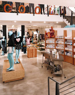
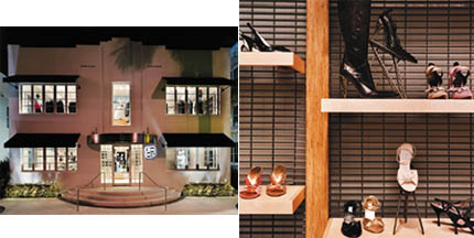

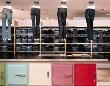


 Photo Gallery3 days ago
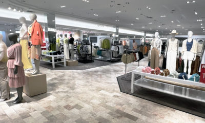
 Headlines1 week ago
 Sector Spotlight2 weeks ago
 Headlines1 week ago
 Headlines4 days ago
 Headlines2 weeks ago
 Designer Dozen1 week ago
 Headlines2 days ago