The effective combination of words and a visual medium can be a powerful tool in retail design. This is called typography, an important aspect of retail design that you will have to use in some way. Either on your store front in order to let passers-by know who you are, on your product packaging to let customers know what your product is or elsewhere in the store to either display your brand or to assist the customer journey. When designing your retail store be unique and creative, yet always in line with your defined brand image and visual identity concept. This ensures gaining recognition from consumers with a strong and branded interior identity, also called store identity.
Use of an Appropriate Typeface
Using generic, commonly used fonts can suppress individualism and result in branding that allows consumers to confuse competitors with each other and make standing out from the crowd effectively impossible. Here are some simple yet successful examples of typography used on store fronts that are in line with the brand identity and draw the consumers' attention inside the store and towards the product.
Typography in Graphic and Visual Identity Design
Advertisement
Typography is used primarily as a tool of communication; therefore you should use it to talk to your customers and make your point in a style that is in line with your brand image. It is also used for the purpose of organisation. For instance, to signal locations to customers and ease their efforts in finding what they are looking for. Here are some creative typography design examples used in packaging and graphic design that create eye catching, visually appealing products.
The Importance of Simplicity
Despite what we said earlier about generic types of fonts; 15 of the top 20 retailers on the Fortune 500 list in the U.S. use the font Helvetica. This would suggest that there must be some value in keeping things simple and familiar for customers and consumers choose retailers and products based on neutrality and familiarity. Then again it could be argued that this only works for the large, well established brands who have already gained brand recognition in other ways over an extended period of time. Below are campaigns from Home Depot, Kohl's, JC Penny and Gap that all use Helvetica.
Hand Drawn Typography
Advertisement
Hand drawn typography has seen a recent resurgence in retail. It is something that undeniably shows authenticity and allows retailers to connect with customers on an organic level – even if the result is sometimes a little rustic. Here are some light hearted examples.
Multilingual Typography
In an increasingly globalized world, the challenge of understanding foreign values and communication systems in order to make a multilingual setting for customers is one that has never been more relevant for designers and retailers than it is now. Type Hybrid, a book from Viction:ary proposes visual communication solutions in order to draw an international crowd whilst simultaneously remaining sensitive to various local cultures.
There are countless methods to apply typography to retail store design. The main message to take away is to develop a clearly defined brand with both store and graphic design elements that are unique and enhance the brand.
Advertisement
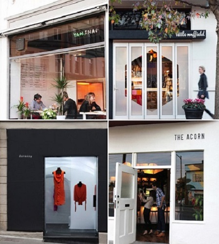
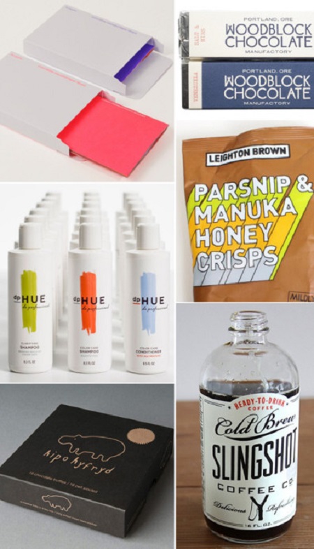
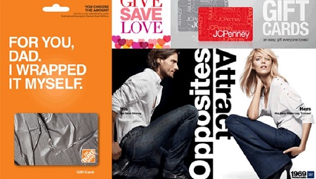
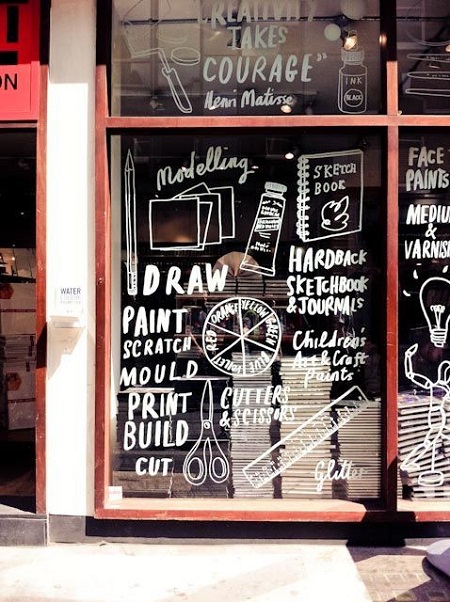
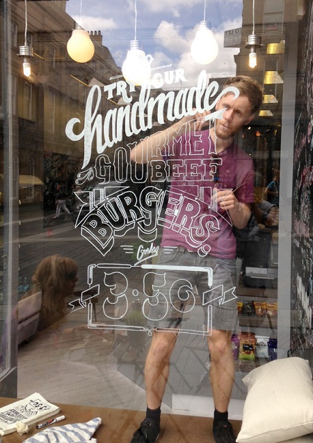
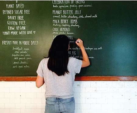

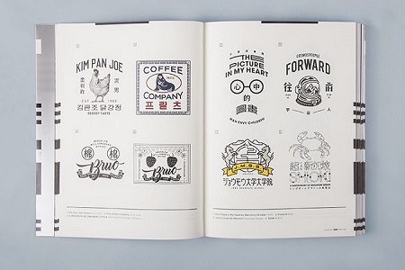


 Photo Gallery2 days ago
 Headlines1 week ago
 Headlines2 weeks ago
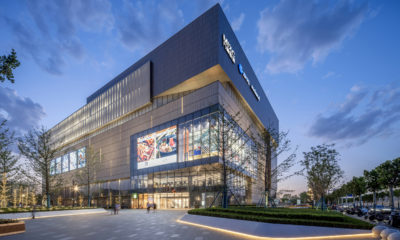
 Sector Spotlight2 weeks ago
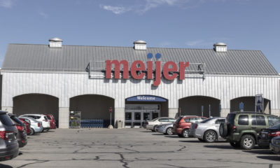
 Headlines1 week ago
 Headlines3 days ago
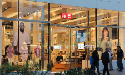
 Headlines1 week ago
 Designer Dozen7 days ago