The foodie revolution of the past decade has transformed our taste buds from accepting to discerning, making the search for unfamiliar, exciting flavors and presentations a contemporary pastime.
Even the humble doughnut has evolved: First into a cronut (a croissant-doughnut hybrid), and recently – because the cronut is so 2013 – into an extravagant champagne icing-glazed, gold flake-dusted doughnut concoction.
Similarly, chocolate has also become a foodie favorite. With complex flavor profiles like dark chocolate with notes of rhubarb, or milk chocolate infused with agave, quinoa and sesame, it’s not likely you’ll find these varieties in your grandma’s candy dish.
And just as confections have undergone a metamorphosis to suit modern tastes, so too have the spaces housing these Willy Wonka-enviable edibles.
Seeking inspiration for Antwerp, Belgium-based chocolate company BbyB’s first Tokyo flagship, design firm Nendo (Tokyo) looked to the products’ compartmentalized packaging. Since the product itself is modular – each rectangular chocolate is the same size and slides out of the packaging in a drawer-like fashion – the designers opted to replicate this trait in a functional way.
“The design creates a seamless transition between the shop space, the packaging and the act of eating the chocolates, offering an organic, compelling experience,” says Oki Sato, chief designer, founder, Nendo.
Advertisement
Displayed in rows of clear acrylic drawers, the boxes appear to be floating in mid-air at the store’s center. While from afar the packaging is nondescript, each colorful box contains a distinct flavor, which shoppers can browse drawer by drawer. The stacked appearance gives the illusion that the boxes multiply indefinitely into the white backdrop.
The store’s all-black café, juxtaposed at the back of the store, is clearly defined, creating a moody ambience where customers can pair their purchase with a complementary beverage.
Given the nature of the merchandise, designing a chocolate shop around its labeling is not uncommon. But for Jcoco (Bellevue, Wash.) – the trendy offshoot of Seattle Chocolates – a dedicated brick-and-mortar outpost wasn’t the anticipated end result.
In its inception, the brand tapped design firm MG2 (Seattle) to create its name, concept and packaging. Evoking a high-fashion feel, the sans-photo, minimalist packaging was a match for its target audience, but positioning the brand as a household name with chain grocers was a challenge.
“For grocery store customers, it was a bit of a mystery: You have these really unusual flavors with a really evocative package, but not overly descriptive,” says Peter Stocker, senior associate, MG2. “So it was a difficult thing for someone who wasn’t familiar with the brand or that particular product profile to get their head around.”
To introduce the couture chocolate line to the masses, it was essential that the brand’s image was demystified in a space of its own. To do this, MG2 created a pop-up shop for Jcoco, which would operate for seven months in three design phases, each inspired by one of its signature flavors.
Advertisement
The shell of the store was intended to remain constant with a neutral color palette, the brand’s logo, wall imagery and neon signage intact throughout the pop-up’s run. The shop’s façade, accenting color scheme, sampling area and floral centerpiece transformed with each phase to spotlight a particular flavor.
Cocoa + Co. of Chicago looked to the cocoa bean itself for inspiration. The shop offers a variety of in-house creations, as well as chocolate brands from around the world, tasking design firm Ideation Studio (Chicago) with uniting its range of labels in the store’s design. A large illustrated focal wall behind the candy bar fixtures depicts a cocoa tree, symbolizing the common thread between the regional artisanal treats, while epitomizing the store’s moniker.
“It was really about bringing the sophistication of the chocolate to life in a physical environment,” says Jennifer Nemec, principal, Ideation Studio. “It’s a premium product, so the [goal of the] environment was to capture that premium feeling, as well as bring in the cocoa bean for the graphic package and textures.”
When selecting materials for the project, the client wanted to incorporate a wood called Macassar, which inspired the package design for the in-house pastries and candies. To make this striated wood a primary store element, designers included the material in the transactional area. Further complementing the brand image, brushed silver derived from the company’s logo was added to the store’s wall art. The café and pastry shop’s subdued tones and natural materials craft a relaxing space to sit and savor the shop’s sweets and hot beverages.
In designing a cohesive aesthetic for a candy shop, the same is always true when designing around food – it has to be clean and appetizing. In doing so, Sato discourages aiming solely for a minimal environ, which can at times come across as emotionless.
“It needs a pinch of humor or friendliness,” says Sato. “One of the pitfalls of minimalistic, simple designs is that they can sometimes give off a rigid and cold impression. By sprinkling in emotions like joy and surprise, as if they were seasonings, you can create an intimate sense of connection between people and space.”
Advertisement
And, after all, what’s the point of candy if not joy and surprise?

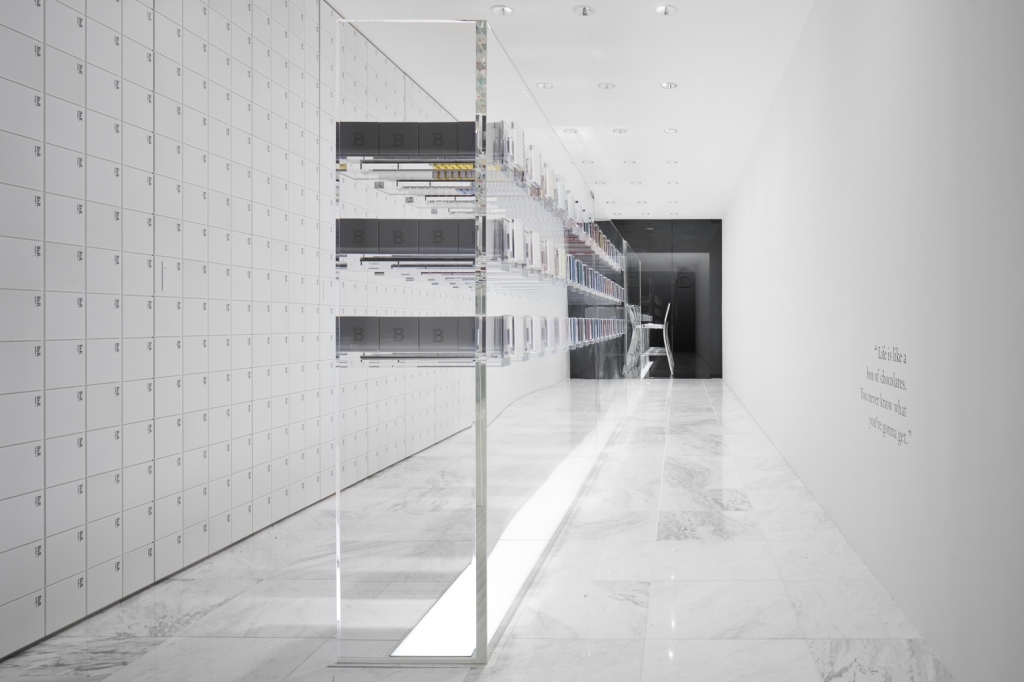
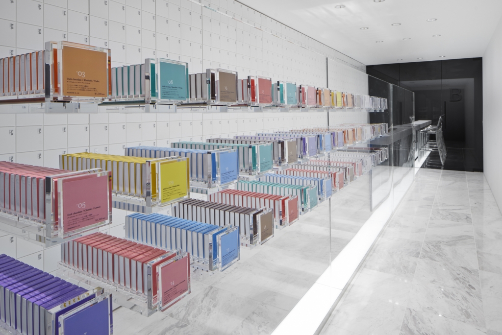

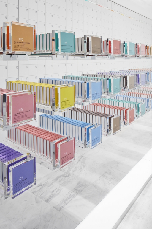
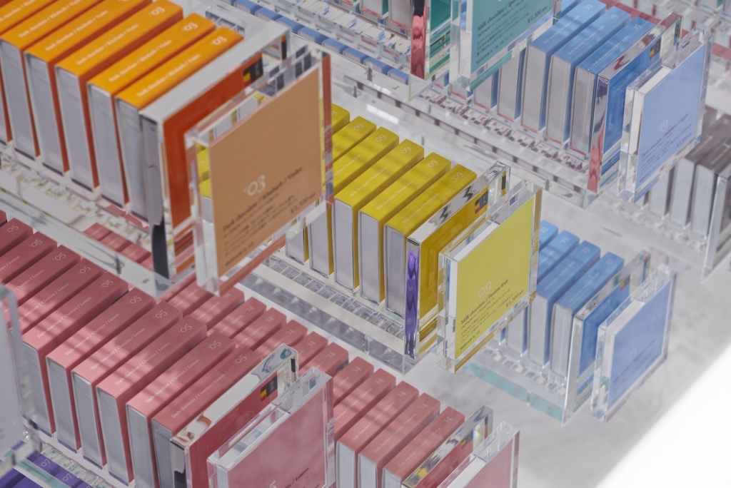

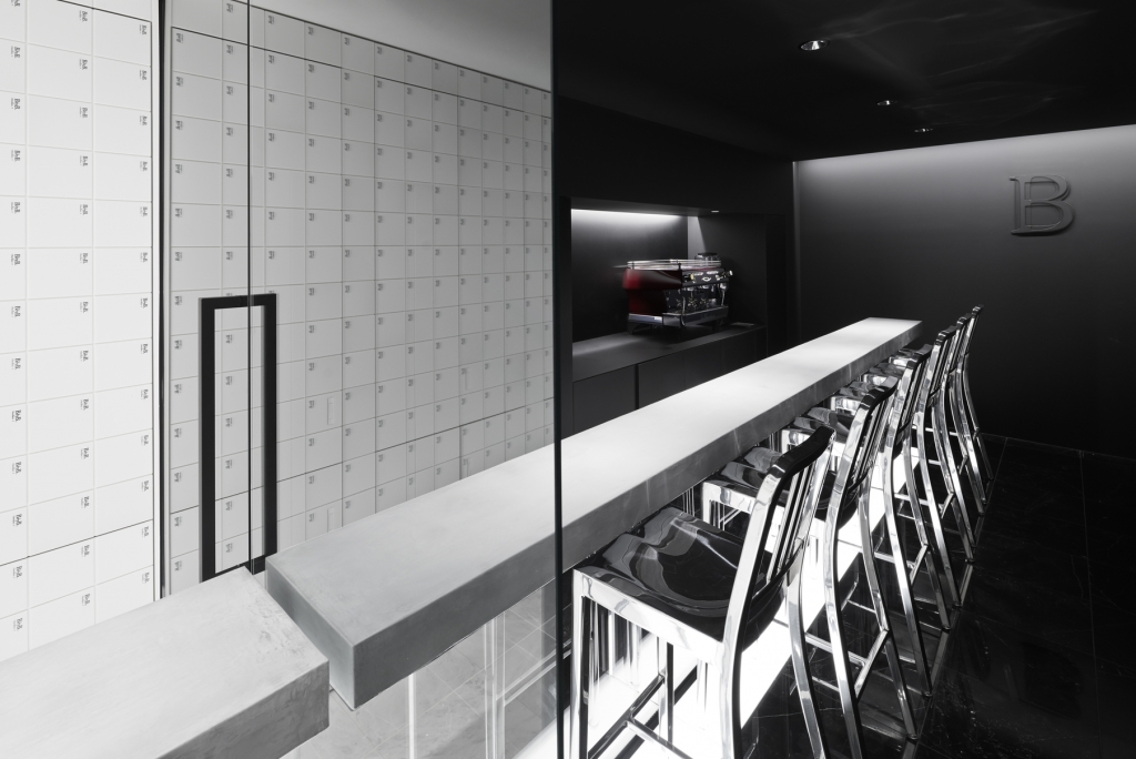


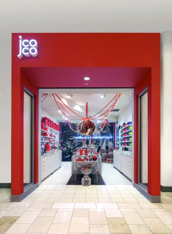


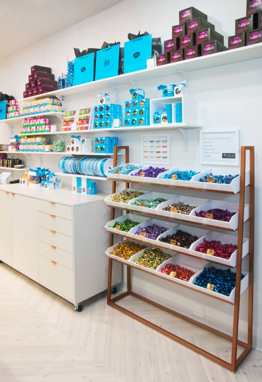
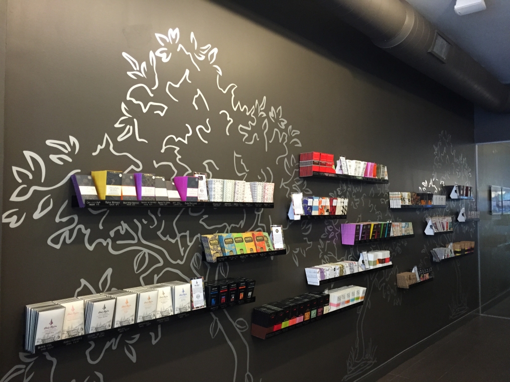
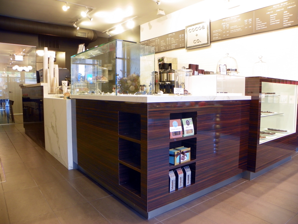

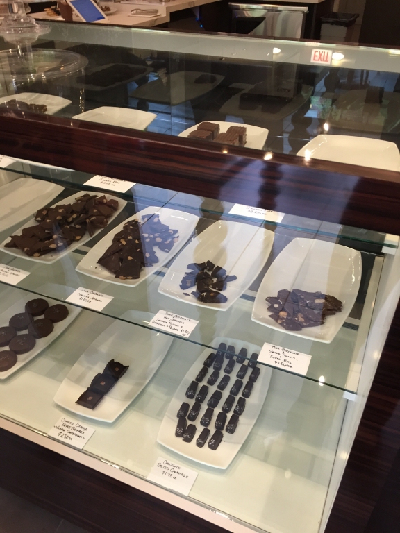


 Photo Gallery6 days ago
 Headlines2 weeks ago
 Headlines6 days ago
 Headlines1 week ago
 Headlines2 weeks ago
 Headlines7 days ago
 Designer Dozen2 weeks ago
 Special Reports2 weeks ago