Throughout the process of designing a retail environment, the customer and their emotional response is at the center of the experience. A great store develops a personal connection between the brand, the customer and the place. Many different elements play a role in the creation of that desired emotional response: the materials, the customer’s circulation “journey” of the space and the sensorial experience (sound, smell, touch), to name a few. The lighting of the space is also a crucial element. The ambience created by a dimly lit space is very different than that of a brightly lit space.
Beyond the lighting level, the correlated color temperature (CCT) of the light plays a major role in shopper’s perceptions. In part one of this blog series, we discussed the importance of lighting within a retail store and how it can play a role in shaping a customer’s psychological response to the physical space. An atmosphere with an overall warm color temperature may make the space feel cozier and create an association with home, whereas cooler color temperatures could make a space feel cleaner or more modern.
For example, a coffee shop might want to use 3000 kelvin (K) lighting to create an atmosphere that makes the customer want to snuggle into the space and read a book for a few hours. This lighting would complement the overall aesthetic of warm materials such as dark brown and caramel colored leathers with an abundance of reclaimed wood fixtures, countertops and furnishings. A Los Angeles bakery that wants to feel urban and modern, utilizing clean white tiles and paint in contrast to the warmth of smooth planks of teak wood, would use 4000K lighting to create that perception. However, in most environments, designers tend to specify 3500K across the board. Why is that?
From the materials that define the space to the products themselves, light, and its CCT and color rendering index (CRI), can alter customers’ perceptions and emotional experiences. Before we can really study people’s emotional response to CCT and CRI within a store’s design, we need to understand the attributes of these light sources in order to specify the appropriate lighting to achieve the intended customer experience.
Every light source (lamp in commercial applications/bulb for residential) has associated metrics that specify details of brightness, efficiency, CCT and CRI number. CCT is the metric that defines the color of white light emitted and is derived from what color an ideal black-body radiator would emit when heated to particular temperatures. As this is based on heat levels, kelvin temperatures of 2700K are yellowish white, orange or red in nature (and called “warm” colors), while something at 5000K or more would appear bluish white (considered “cool” colors). While CCT indicated the whiteness of light, it does not define how materials under the light will appear. When talking about light’s impact on materials, each material’s LRV (Light reflectance value) also needs to be taken into consideration, but that’s a blog for another time.
Based on need for nature theory and biophilia research, we know that people feel best when connected to nature. 5000K light is closest to daylight at noon under an overcast sky. So again, this raises the question: Why is 3500K the most commonly specified? Is 3500K really preferred by customers, or would they prefer something that more resembles daylight?
CRI, first developed in the 1960s, indicates the accuracy of a light source’s color rendering. At the time of development, incandescent bulbs were the most widely used and were ranked the highest, therefore, any other source is ranked as lower quality. The CRI score is a comparison of average color rendering quality scores between an incandescent light and a new source. A light that renders blue well but red poorly could have the same CRI as one that renders blue poorly and red well. With advancing technology, high-quality LEDs, which could render colors more naturally, would not receive a higher ranking, because it is not the same as an incandescent. CRI only describes quality and accuracy of emitted light.
While CCT and CRI impact the appearance of colors and materials, neither can measure a customer’s perception of these changes.
Currently, how do you approach the selection of lighting for your projects? What color temperature of light do you most commonly specify, is it 3500K? Do you currently have a method for studying customer's perceptions of lighting?
Rebekah Matheny is the assistant professor of interior design for The Ohio State University (Columbus, Ohio). She holds a Master of Architecture degree from the University of Oregon, where she also received a Technical Teaching Certificate in the area of Sustainable Design Strategies for Interior Architecture with a concentration in interior finish materials and lighting design. Additionally, she has undergraduate degrees in interior design and architecture from the University of Cincinnati. Building from her professional experience as a retail designer, Matheny brings a unique balance of the functional and emotional attributes of interior finish materials, allowing her to have a holistic and forward-thinking, strategic approach to her teaching and research. Matheny’s research investigates the sensory perception of interior finish materials and their application in retail design to create an emotional connections between the customer and the brand.
Emily Bell is a current Master of Fine Arts design candidate in the Department of Design at The Ohio State University, where she also serves as a graduate teaching assistant. She is also completing a graduate interdisciplinary specialization in aging. Emily graduated summa cum laude from High Point University in 2013 with a Bachelor of Science in interior design with a business administration minor. She has worked in high-end residential design and in custom kitchen design. Emily's master’s research is focused on the influence of light's color temperature on older adults' perceptions of residential healthcare patient rooms and how it influences their sense of well-being.

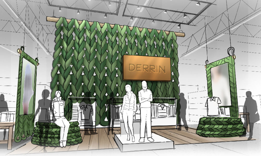


 Photo Gallery3 days ago
 Headlines1 week ago
 Sector Spotlight2 weeks ago
 Headlines1 week ago
 Headlines4 days ago
 Headlines2 weeks ago
 Designer Dozen1 week ago
 Headlines2 days ago