When in New York, in December, take advantage of 50-degree temperatures. That’s the gist of what we learned this year at the Retail Design Collective. We also reminded ourselves that black clothing is a good thing to wear when everyone else is more fashionable than you.
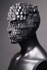
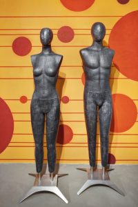
On the mannequin front, everywhere we went we saw the usual abstracts and egg heads (those abstracts with eyelashes are fun, aren’t they?), with new options as the metallic influence moves from the runway to mainstream.
We also caught a glimpse of something a bit edgier than textured trends – you might call it a combination texture, and it’s one step past mixed media. In fact, these forms and figures use combinations of paint, vinyl, burlap and even silver leaf to create these new looks.
Like the athletic mannequins we saw in spades last year (these continue to be adopted by retailers), some of these styles are on the bleeding edge. You probably won’t see them in stores every day, even if we wouldn’t mind a few fur-covered forms laden with jewelry or scarves.
But expect some of these touches to trickle down to retailers like Bloomingdale’s, where smaller-format stores, including a new launch in Glendale, Calif., are incorporating matte metallics, including pearlized silver and gold, into contemporary sportswear departments for men and women.
Originally planned as a local touch, Jack Hruska, executive vp of creative services, says he was pleased enough with the outcome to consider a wider rollout in the future. And he’s taking a never-say-never approach to bolder metallics, too: “Of course, we’ve used shiny silver and a lot of people have used chrome, but we’ve never used gold – well, at least not in my 21 years here – until now. We used a little bit of gold finish throughout the whole store.” For a sun-loving market not afraid of “a bit of flash,” gold finishes make sense.
But some of the more off-kilter textures and eye-catching finishes that beg for accessories aren’t a fit for Bloomingdales, Hruska explains: “Our job is to sell products. I don’t really use mannequins and forms as a prop.”
What he does demand, however, is a level of fashion intelligence that passes from stylists to merchandisers to sales associates. With a wealth of photos, runway videos and commentary constantly updated online, stylists stay atop trends, adding a contemporary twist for in-store presentations, sharing the essence of the trend and the retailer’s voice all at once.
“We put a lot of bodies in our stores that need to be dressed fashionably. Whether it’s a form or a mannequin, it all needs to be done with Bloomingdale’s edge of fashion, which is a slightly contemporary twist,” Hruska says.
Macy’s takes a bit of a different approach than Bloomingdale’s might, but it’s not a stretch to imagine its team has a finely tuned antennae for the latest looks.
“We’re mixing metals and metal finishes, particularly here for the Herald Square remodel,” says James Bellante, senior vp, visual merchandising presentation. “And we don’t use just one metal finish throughout the building; we’re combining them, so a base might have a chrome cap and a bronze foot, or a different finish for the cap, block and base.”
But Bellante and Hruska might agree on the best use of some of these unusual textures; in a word: props. Combined with dressed mannequins, Macy’s is grouping forms and using finishes to complement color and material palettes by department. And, Bellante says, “If we have a few forms in a set-up, one of those will simply accommodate accessories – handbags, jewelry, belts – and not a full garment, so the presentation can be a bit more visual.”
In the men’s area that opened last fall at Macy’s Herald Square, that translated to mixed-metal for mannequin stands and caps, with the forms themselves covered in a heavier, textured linen that matches the department’s trim.
With fashion influencing visual merchandising in a less-than-subtle way, it’s fun to see it washing over into mannequin design as well. And if you remember the influx of leather sleeves in 2011 and 2012, and the subtle swing into metallics and, more recently (and less subtly), pleated metallics, modern-art-inspired mix-and-match prints and even the madness that is multi-colored furs for spring (or so Vogue promises), you can see how a form covered in silver-metallic-finish burlap is a hat tip to the shopper’s inner stylista.
What does all this mean for smaller retailers or people struggling to translate a high-end fashion week to a display that sells? “You have to be able to look further – look on the street and see what people are really wearing,” Hruska advises. “The extremes are rare, so try to understand what’s reality, what’s rare, and develop that eye. Look in magazines, online, on the street and in stores – good stores.”
Read These
The point of mannequins isn’t just to show off the goods – it’s to prompt multiple buys, something that’s easy to do when a fashion-forward visual team has one eye on upcoming trends. Point your consumer toward a combination she couldn’t imagine (but can intuitively sense is “in”) and you’re on your way.
Manolo’s Shoe Blog:
Hip and hilarious, its author reportedly earns six figures.
shoeblogs.com
Vogue Paris: The gold standard of more fashionable than thou.
en.vogue.fr
The Sartorialist: A mix of street styles and runway updates.
thesartorialist.com
The Bengal Stripe: Super chic; nothing you’ve seen around town lately.
thebengalstripe.com
Style.com: Encyclopedic coverage of fashion shows – and everything else.
style.com


 Photo Gallery3 days ago
 Headlines1 week ago

 Headlines2 weeks ago
 Sector Spotlight2 weeks ago
 Headlines1 week ago
 Headlines4 days ago
 Headlines2 weeks ago

 Designer Dozen1 week ago

