Blogs & Perspectives
Starbucks’ Cup of Controversy
Will devotees still drink from a cup without the familiar name?
Advertisement
7 design trends to drive customer behavior in 2024
In-store marketing and design trends to watch in 2024 (+how to execute them!). Learn More.


Headlines16 hours ago
Nordstrom to Evaluate Founding Family’s Plan to Go Private

Headlines16 hours ago
“Balmain Beach Club” Washes Ashore at Neiman Marcus

Designer Dozen1 day ago
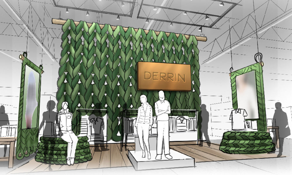
2024 Designer Dozen: Lisa Rachielles


Bulletins
Get the most important news and business ideas from VMSD magazine's news bulletins.
-
 Photo Gallery3 days ago
The 2024 Shop! Design Awards Winners
-
 Headlines2 weeks ago
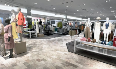
New-Look JC Penney Debuts in New Jersey
-
 Sector Spotlight2 weeks ago
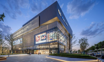
It’s a Mall World After all
-
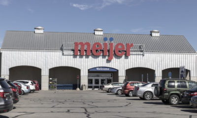
 Headlines1 week ago
Meijer Adding Three Supercenters
-

 Headlines5 days ago
Long Island Shopping Center Sold for $8M
-
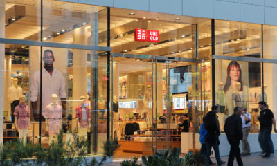
 Headlines2 weeks ago
Uniqlo Expanding Into Texas and in California
-

 Designer Dozen1 week ago
2024 Designer Dozen: Evan Harkrider
-
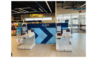
 Headlines3 days ago
ALDI Launches Checkout-Free Grocery