Specialty Apparel
Around the World
A quick look at some innovative international store designs

Photography: Xie Dan, China
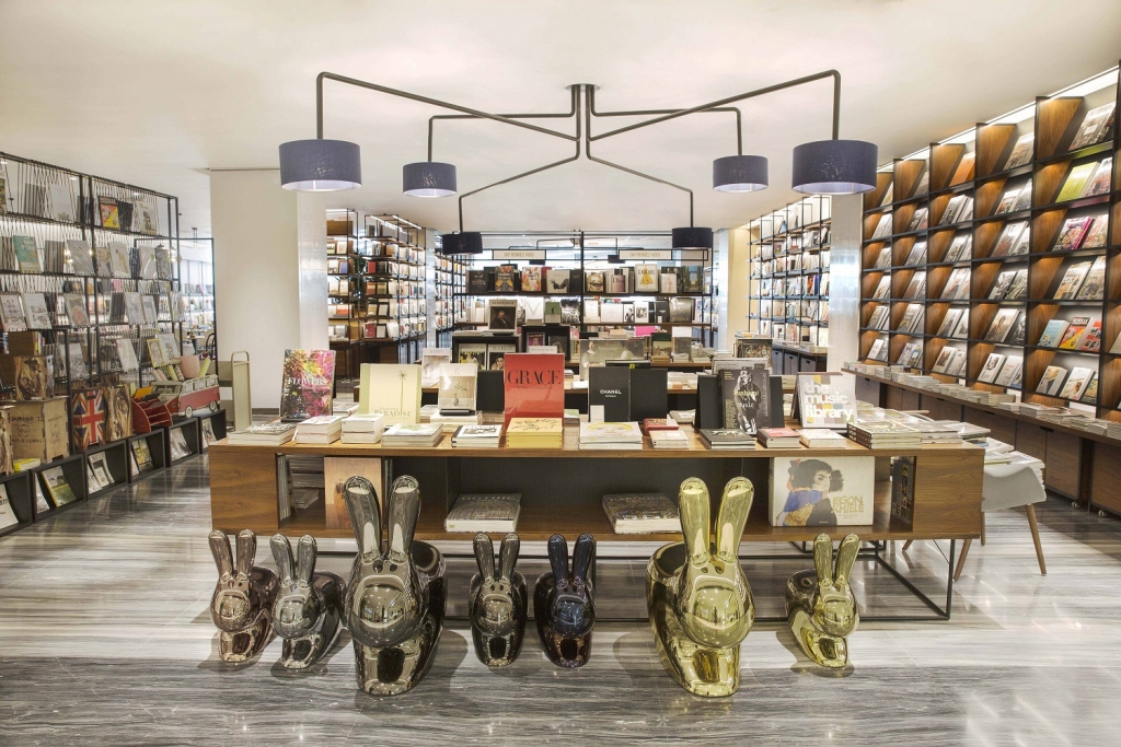
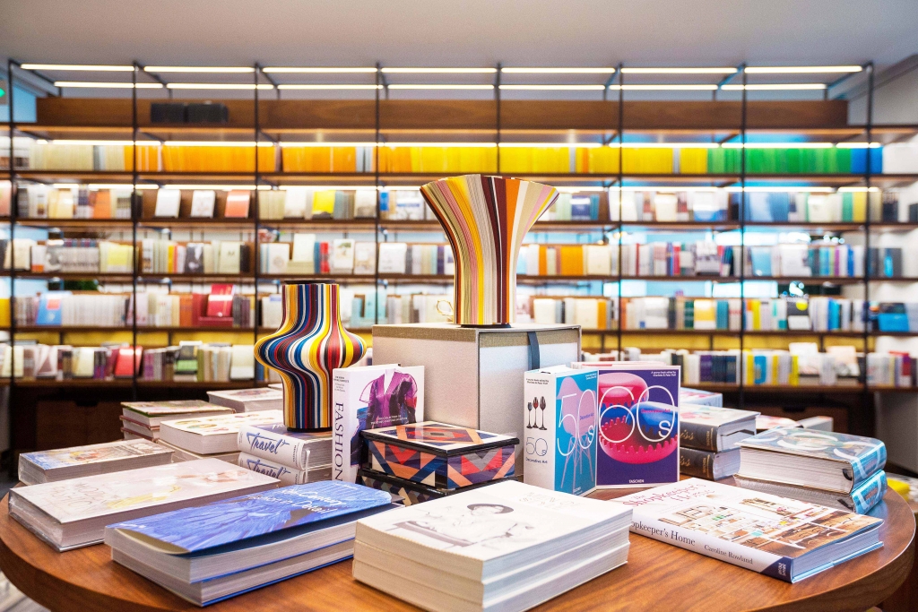
Rendez-vous, Beijing
As part of evolving the department store Shin Kong Place into the rebranded SKP Beijing, Sybarite (London) was tasked with designing Rendez-vous, a luxury concept store with a curated bookstore, an artisanal cheese room, a TWG tea room and a restaurant, Without Borders. “All seven floors of the SKP store have been reimagined to incorporate a tailored and timeless architectural language to create an iconic house of fashion,” says Torquil McIntosh, Co-Founder of Sybarite.
The materials chosen were intentionally simple, with combinations of walnut, black lacquered steel, a marble floor and brushed brass accents creating an atmosphere of eternality and intimacy. Yet the newly branded SKP Beijing’s identity is found throughout. “[The design included] the SKP logo and packaging, in addition to a new corporate identity known as the SKP curve,” says McIntosh. The curve comprises “two parallel lines linked by two tangential curves – [it’s] used throughout the store to provide a holistic language and house style to realign the store into one form that enhances the customer experience, without overpowering the brands.”

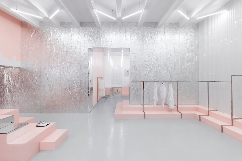
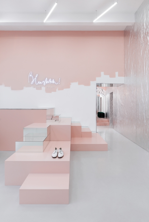
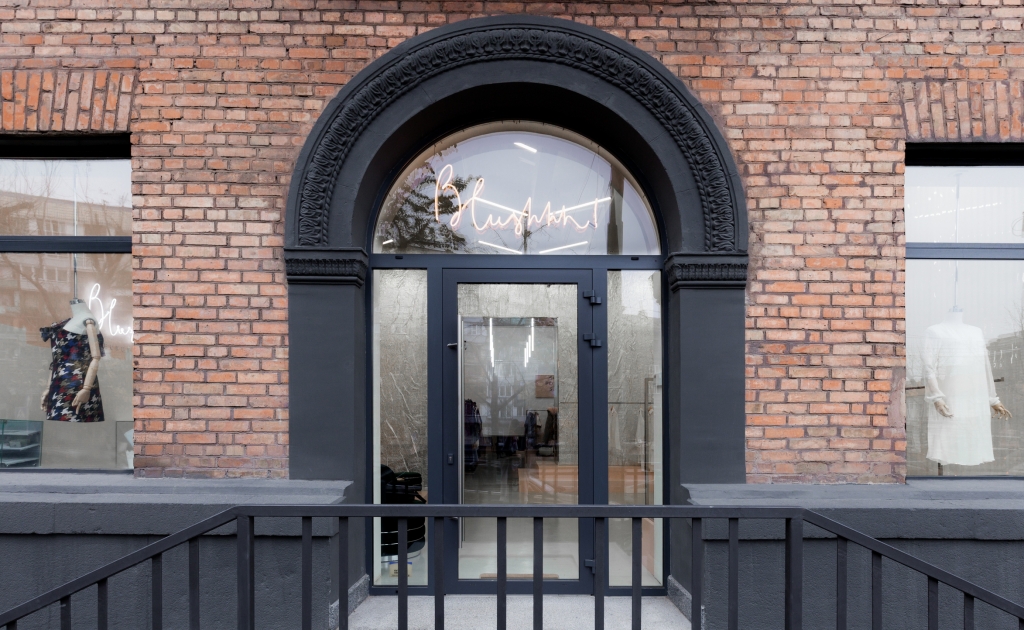
Photography: Lesha Yanchenkov, Kiev, Ukraine
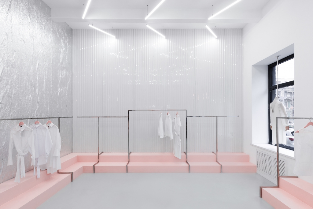
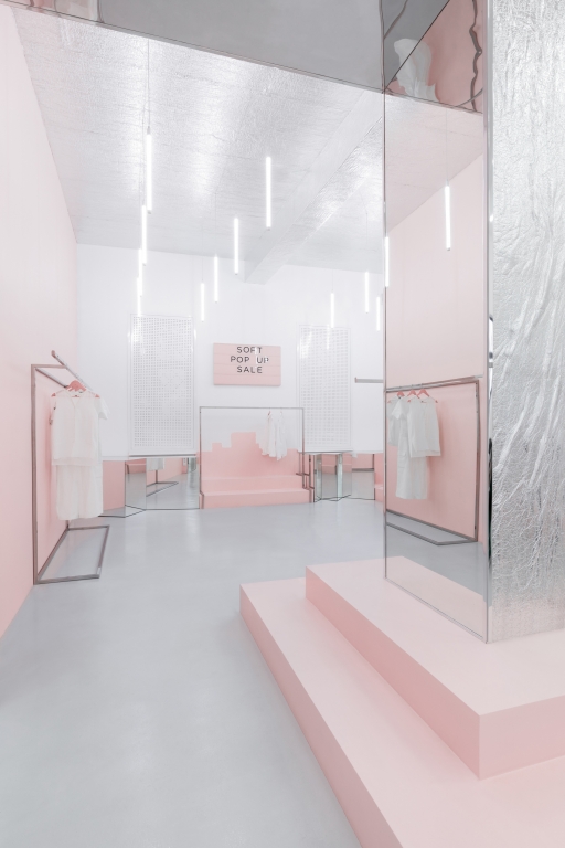
Blushhh! Secret Shop, Kiev, Ukraine
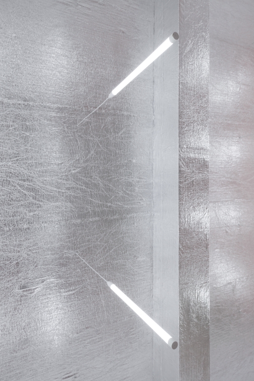
Housed in a red brick building in Kiev, Ukraine, Blushhh! is the epitome of pretty in pink. AKZ Architectura (Kiev, Ukraine) straddles the line between millennial aesthetics and less-is-more design principles to create a one-of-a-kind retail experience that screams #nofilter.
Blushhh! resides on two levels, with apparel located on the top floor, while accessories and footwear are shown on the lower level. Throughout the store is its namesake color used in playful ways (fixtures for merchandise, carpet leading into the dressing rooms), but the true stroke of genius was the use of reflective surfaces. In the relatively small space (just over 1000 square feet), mirrored walkways and a large, silver accent wall reminiscent of aluminum foil, create the illusion of a much larger store. But the interior is not pretty for pretty’s sake; retail is at its core. “To land the main focus on retail, we designed a perimeter-wide path starting with the entrance on its right-hand side and aided by rails and steps with the assortment on them,” says AKZ Architectura in a statement.
It’s a design concept that keeps in mind the all-important tool of social media, without compromising the store’s merchandise, as well as leaning into the creative opportunities a shop named Blushhh! has to offer.

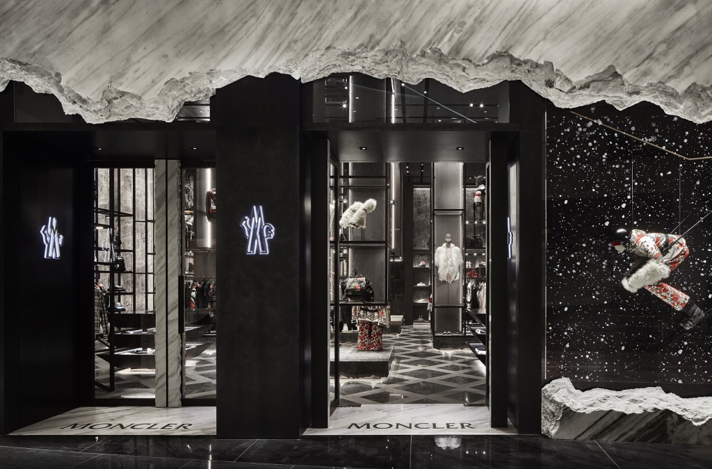
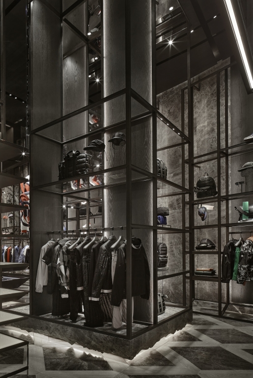
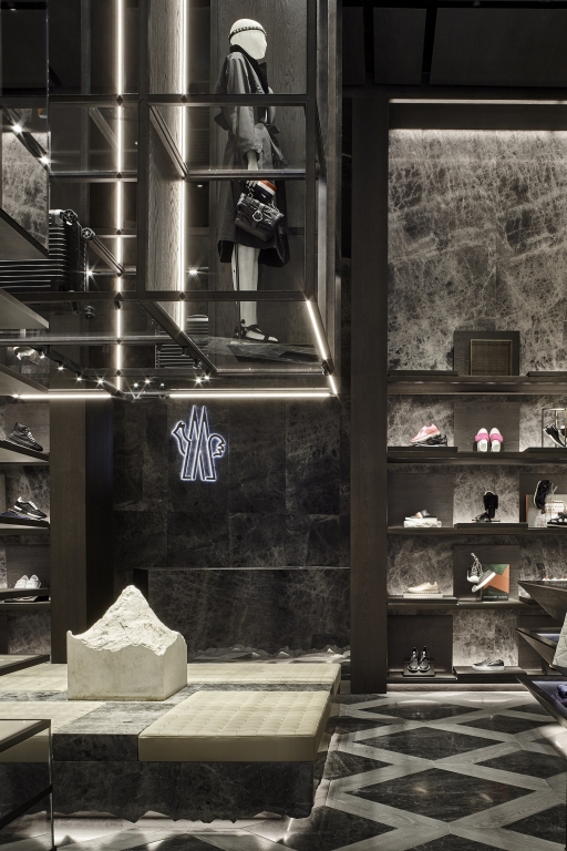
Photography: Alessandra Chemollo, Venice, Italy
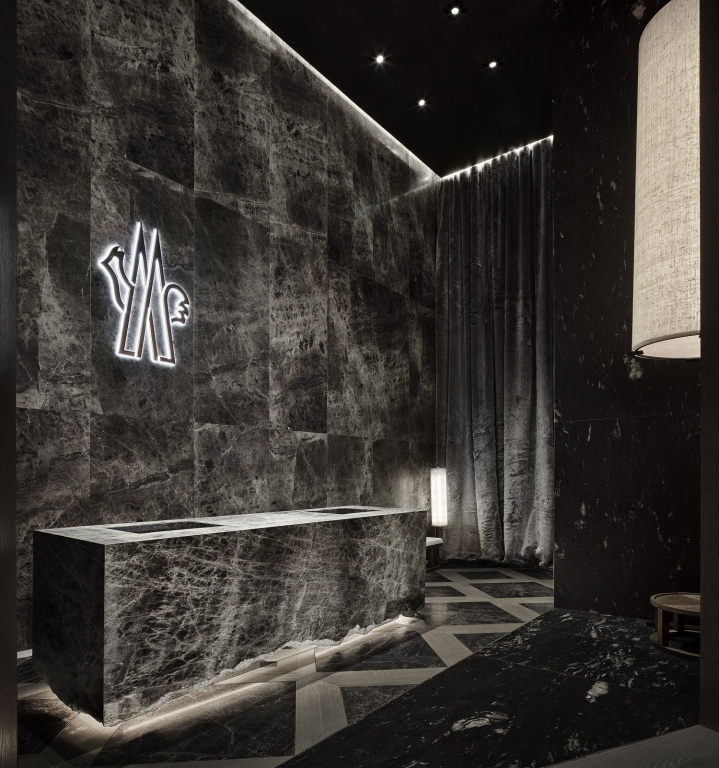
Moncler, Dubai, U.A.E.
When faced with designing a Moncler (Milan) store in The Dubai Mall (Dubai, U.A.E.), Curiosity Inc. (Tokyo) decided to play on the stark contrast between the store’s inventory and Dubai’s desert climate. The store’s façade suggests a broken block of ice, with mannequins dressed in the brand’s winter gear, and positioned as if gliding down a mountain. The interior, while remaining true to the overall design, opens up to a larger expanse. “The interior contrasts with the façade,” says Gwenael Nicolas, President of Curiosity Inc. “The very vertical ceiling feels like walking into a forest, a forest where displays and products float at different heights.”
That floating motif continues throughout the fixtures, with lighting hidden within vertical lines on the towers and underneath tables holding merchandise. The design delivers customers to the middle of two extremes, creating “an iceberg in the desert,” Nicolas says. “A store is meant to last longer than a collection and must become a canvas for various collections and experimentation in the products, though still meaningful and expressive.”

Photography: Courtesy of BSH Hausgerate GmbH, Vienna
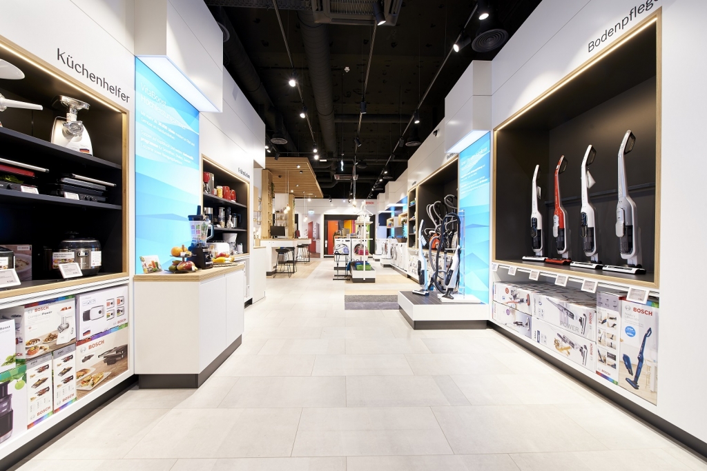
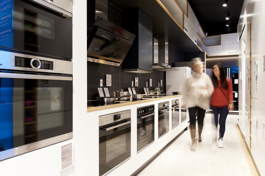
Bosch, Vienna
AdvertisementWhen Bosch (Stuttgart, Germany) set out planning its first direct-to-consumer retail store, the household appliance brand knew its design would have to reflect the mission to make life easier for its users.
Designers selected oak wood and coal gray tile to create a simple, approachable space along Vienna’s Mariahilfer Strasse high street. Maintaining the corporate design in the new space, as well as incorporating elements of digital retail, rounded out the design goals.
“We wanted to create a store … where customers can experience the brand with all senses,” says Christine Bauer, Marketing, Special Brands, BSH Hausgeräte (Munich). “Our customers highly appreciate … the tailor-made one-on-one consultations and the possibility to try out our complete product assortment, ranging from blenders to washing machines.”
The store itself is like a playground of all things Bosch, with engaging product displays that encourage shoppers to try before they buy, interactive touchpoints and wayfinding graphics to help guide customers through the product-heavy space.
A full kitchen, outfitted with Bosch appliances, is at the center of the space, inviting discussion and product trial, and a wall of video screens near the cashwrap shares product information and tips as shoppers complete their purchases.


7 design trends to drive customer behavior in 2024
In-store marketing and design trends to watch in 2024 (+how to execute them!). Learn More.


2024 Designer Dozen: Lisa Rachielles

Little Caesars to Add 30-plus Restaurants

Deadline Extended: Retail Renovation Competition


Bulletins
Get the most important news and business ideas from VMSD magazine's news bulletins.
-
 Photo Gallery2 days ago
The 2024 Shop! Design Awards Winners
-
 Headlines1 week ago
New-Look JC Penney Debuts in New Jersey
-

 Headlines2 weeks ago
Lego Stores in U.S., Canada to Be “Sensory Inclusive”
-
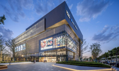
 Sector Spotlight2 weeks ago
It’s a Mall World After all
-
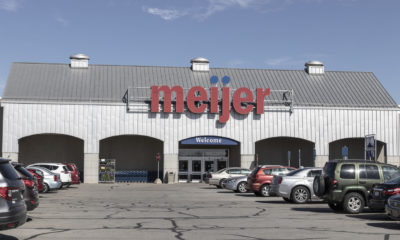
 Headlines1 week ago
Meijer Adding Three Supercenters
-

 Headlines4 days ago
Long Island Shopping Center Sold for $8M
-
 Headlines2 weeks ago
Uniqlo Expanding Into Texas and in California
-

 Designer Dozen1 week ago
2024 Designer Dozen: Evan Harkrider