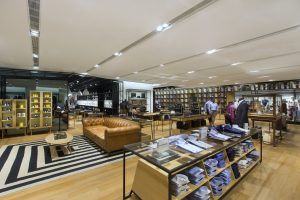
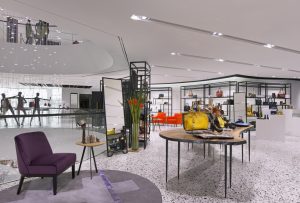
For all the discussion surrounding the death of department stores, new projects have flooded our inboxes over the past year or so. It’s partly due (we hope) to a surge of resources flowing back into design, refreshing stores that languished during the recession.
Lord & Taylor is rolling out new stores, curtailing its closings and acting like it expects future prosperity. Macy’s is reworking its Herald Square flagship, floor-by-floor. Shinsegae rolled out a new menswear section in Seoul last year.
Today’s department stores are also a little nervous about the future. Millennials want same-day delivery and raw selvedge denim, while the average department store shopper is aging.
In turn, department store designers are using more enlivened whites to brighten spaces, funky bursts of color for a sense of fun and even zones geared toward younger shoppers (think Macy’s 2012 strategy to target millennial subgroups).
For Singaporeans, lifestyle shopping centers are already the norm, while department stores are competing less with boutiques or fashion houses and more with multi-level malls that are designed – like Vegas – to provide so many attractions that you forget to leave.
When Robinsons (Singapore) decided to squeeze in a department store on Orchard Road – already home to more than half a dozen competitors – they, of course, wanted a store that would appeal to devoted, loyalty-card-carrying customers, but also the next generation (and the city-state’s 15.5 million tourists per year).
Advertisement
But, oh, the challenges along the way. Midway through the project, the retailer’s managing director was replaced and the project was restarted just as designers were about to package their concept and send it out for pricing.
And while designphase dba (Singapore) is well-accustomed to accommodating cultural expectations, like incorporating tons of light to balance the country’s sun-drenched climate and integrating f&b that can compete with lifestyle malls, its team still had to contend with a five-story, glass-topped atrium that triggered designers to ramp up the store’s ambient lighting to about 2000 lux, compared to 1500 in a typical department store.
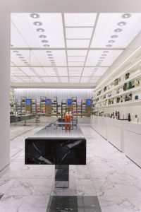
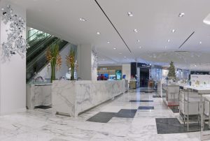
Then, there were the twin elevator bays that run vertically through the space to a corporate tower above. To make something unique in those spaces, designers created special “labs” around them: one for men’s personal care items on the fourth floor, as well as a futuristic, ground-floor hair lab with a backlit glass ceiling and a 12-meter-long black marble slab table on a mirrored base.
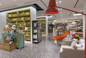
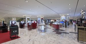
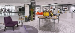
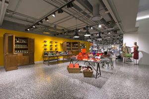
The result is a store with traditional division of its six floors, and hints of the classic woven into a fresh-faced design. That means an 186,000-square-foot space with elements like displays based on the shape of an armoire, but stripped to its most minimal (yet still recognizable) outline.
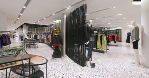
Robinsons Orchard also incorporated research on gender-based shopping preferences in its design. A third-floor womenswear area cross-merchandises shoes, handbags and more, with niches arranged by style rather than product type. For men, design director Joris Angevaare says, “It’s a bit more traditional. We looked at the way people shop. Generally speaking, men like to know exactly where to go, while women like to not exactly know what’s next.”
The best advice Angevaare could give for working in the tiny nation boils down to two words: Be there (as his firm has for 35 years). Angevaare is a native of The Netherlands, but has a practiced eye for Singaporean culture.
Advertisement
“In Asia, the personal space is less than Europe or the U.S. What we have to realize when we design for this is that if it’s too spacious, it feels empty quite quickly to the Asian observer,” Angevaare says. Floor finishes stretch from common areas to branded spaces so that the area “feels wide although it’s narrow.”
Orchard Road is such a destination that the retailer dropped its customary, “Robinsons at” nomenclature in favor of the simpler “Robinsons Orchard.” In turn, designphase creatives eschewed a familiar department store hue.
“We wanted strong contrast within the store,” Angevaare says, explaining his palette. “We didn’t want to use beige. No one’s offended by beige, but no one is engaged by beige.”
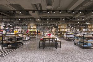
But this is not a store that’s going to be redone in 3-5 years, so Angevaare’s look has to last. To wit, he used a notably neutral yet beige-less, high-contrast palette with white walls and a black framework.
And all the furniture in the space is custom – one advantage of working in Asia, Angevaare notes. For all the challenges designers in the U.S. bemoan in working abroad, the designphase team hardly had to blink before cabinets, fixtures and furniture were custom made. “The response time is different from what I’m used to in Europe,” Angevaare says. “Mainland China is right next door, and that’s where lots of factories are. Customization is the norm here: You get a mock-up, you come back the next day and there’s something to look at.”
These days, Orchard Road shoppers have something new to look at, too.
Advertisement

 Headlines1 week ago
 John Ryan2 weeks ago

 Headlines7 days ago
 Headlines2 weeks ago

 Headlines1 week ago
 Retail Buzz3 days ago
 Headlines1 week ago
 Headlines1 week ago
