
2022 Retail Renovation of the Year: “Wushang Superlife Supermarket, Wuhan, China”
Renovation: Supermarket | Submitted by: Shenzhen Onewe Commercial Space Design & Planning Co., Shenzhen, China
📷 : Haibo Wang, Wuhan City, Hubei Province, China
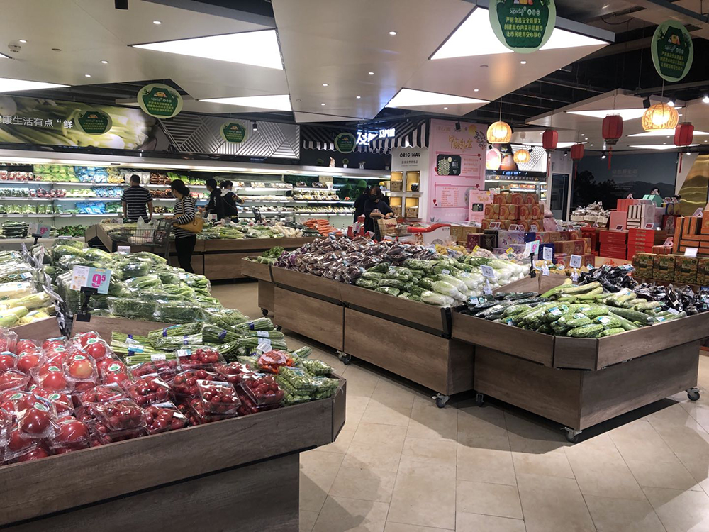
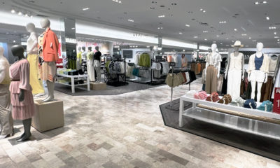
FOR THE PAST COUPLE of decades, the interior of the Wushang Superlife Supermarket consisted of row-upon-row of parallel shopping shelves. That layout was an efficient money-maker, pulling in the U.S. equivalent of roughly $89 million per year.
Why mess with that success? Two interconnected reasons: operator Wuhan Wushang Supermarket Management Co. Ltd. felt the store had fallen behind the times, especially in terms of appealing to millennial shoppers. And by strengthening its appeal to that demographic, the operator believed it could up its yearly haul to about $118 million.
After
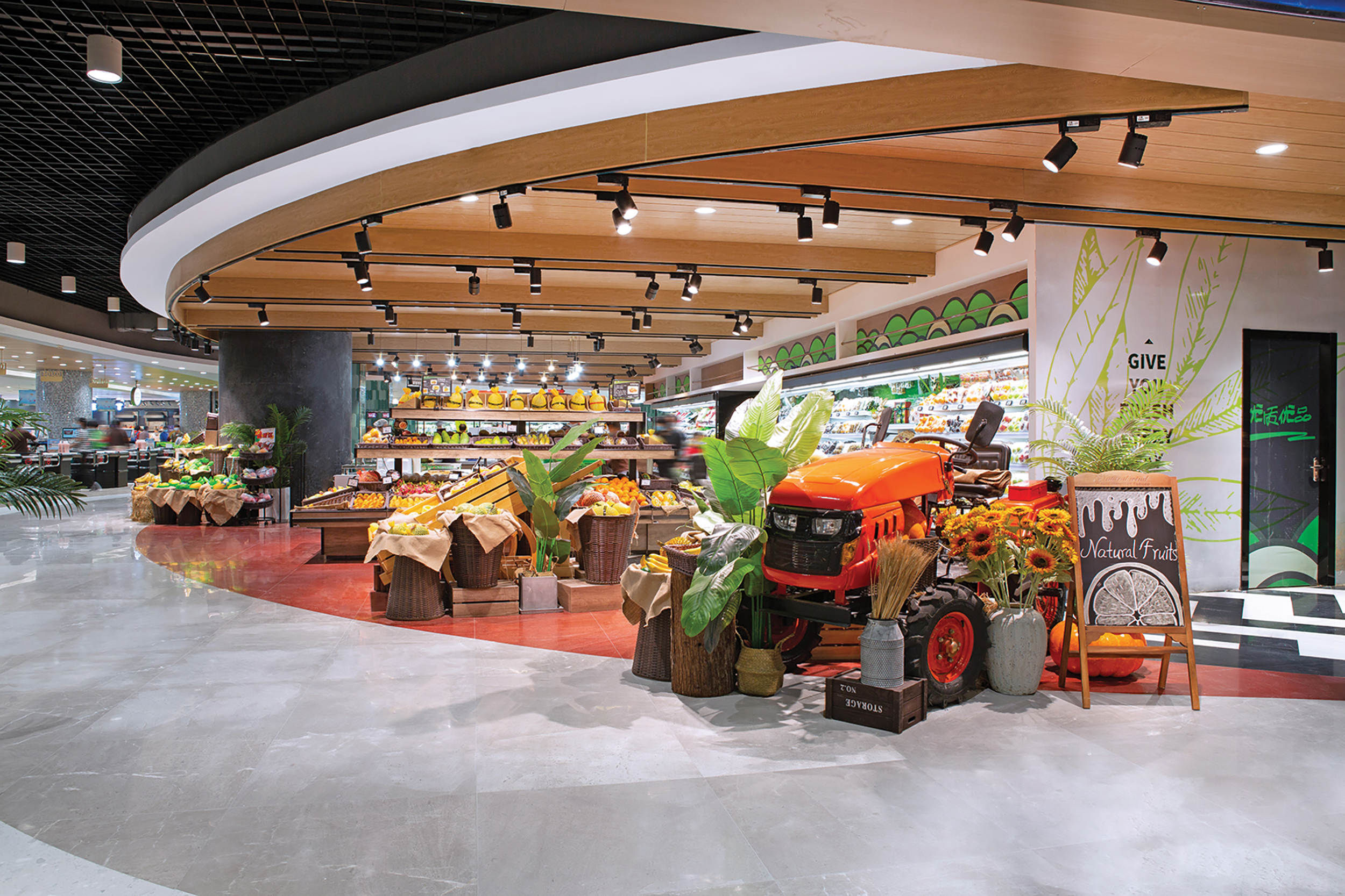
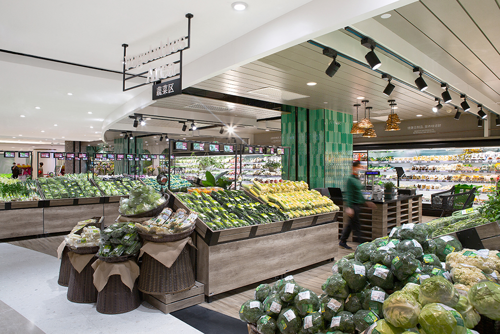
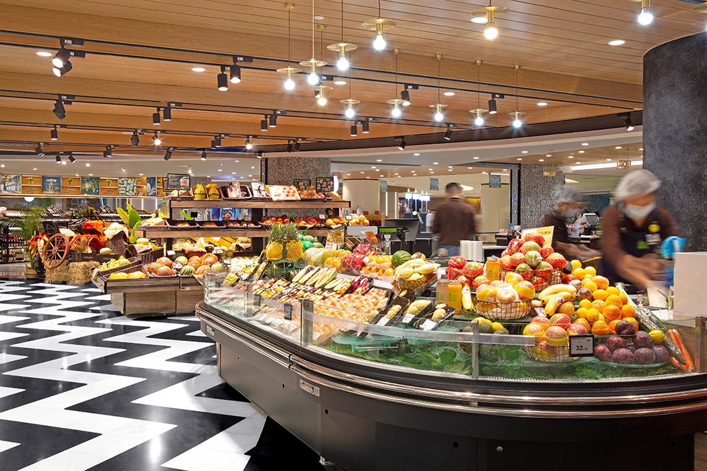
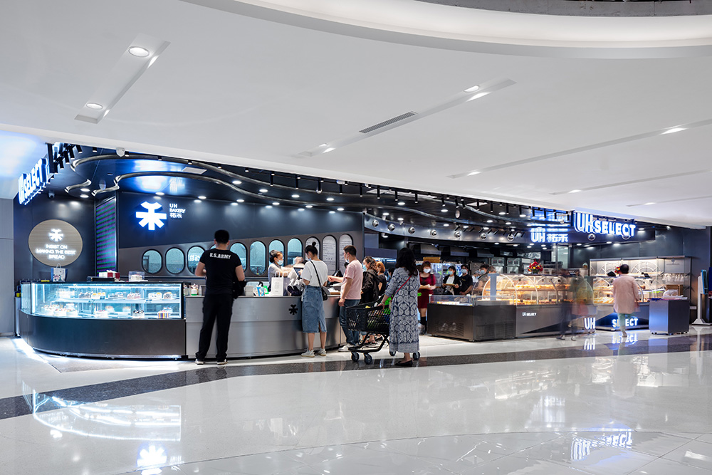
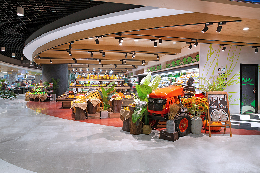
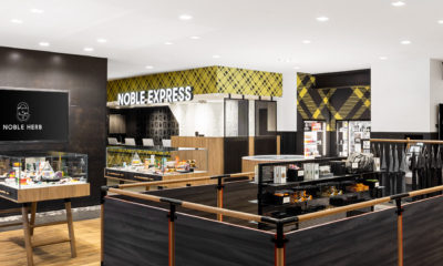
To make that happen, the design team at Shenzhen Onewe Commercial Space Design & Planning Co. (Shenzhen) strove to change what was “a singular retail experience into a multifaceted experience hall” that would especially appeal to younger shoppers, says Chief Designer Zhenan Qin.
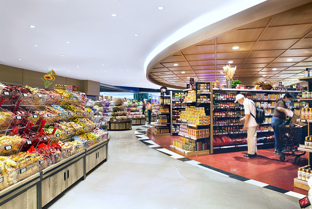
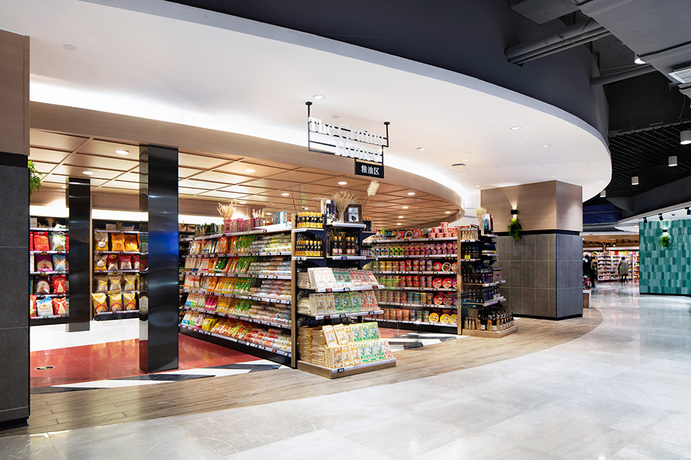
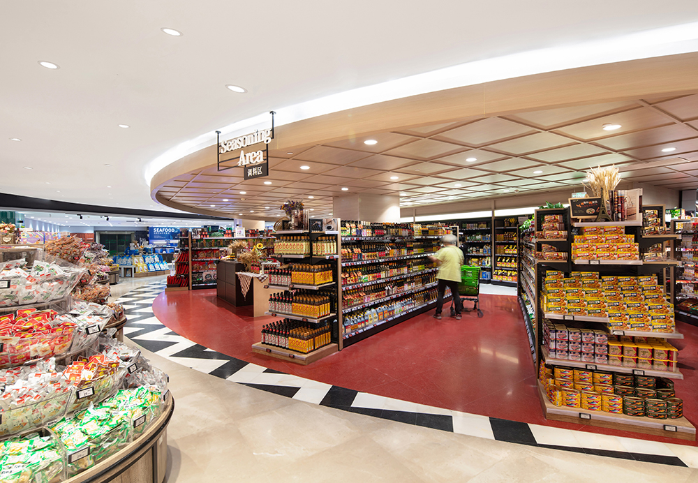
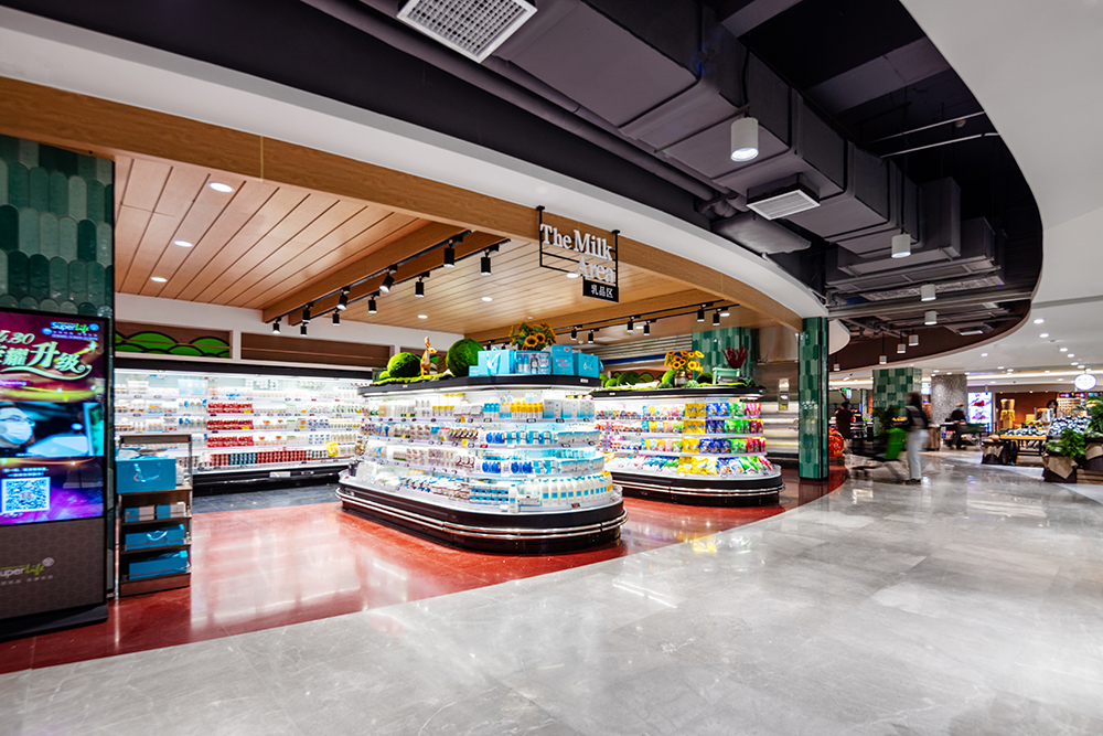
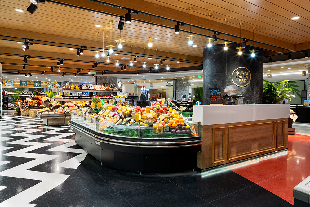
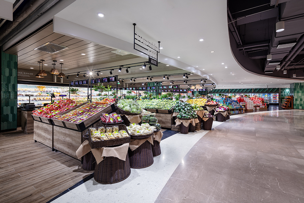
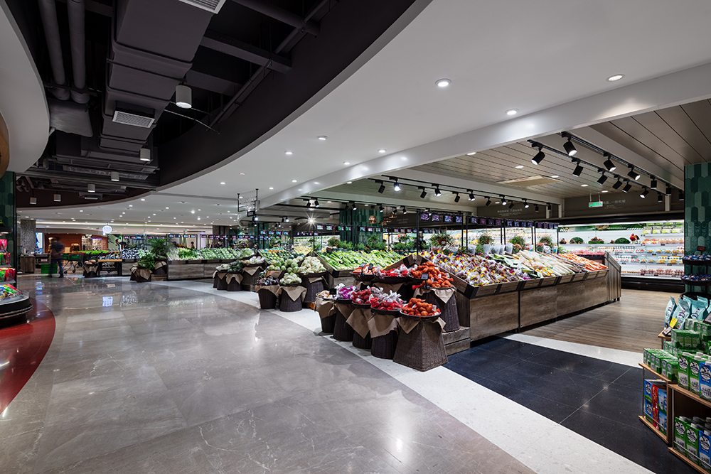
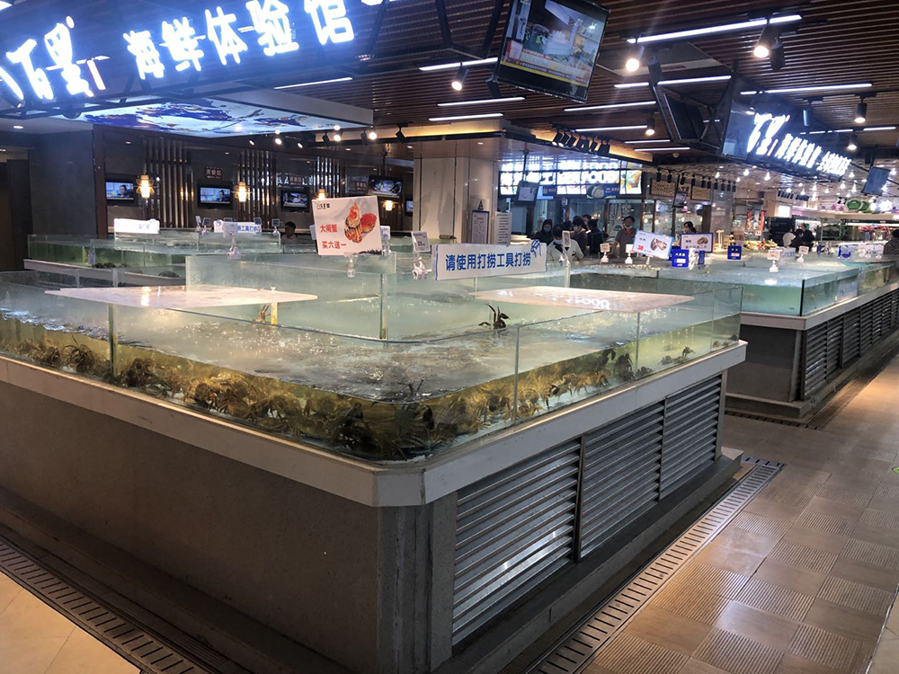
So, it was out with the monotonous grid system and in with two interconnected egg-shaped main pathways with off-shooting aisles.
“In contrast to the previous straight lines that shoppers moved through, shoppers now traverse the space in a circular fashion and feel a bit like they’re playing hide-and-seek,” says Qin. “They encounter surprise offerings as they go, which makes shopping more fun.”
Advertisement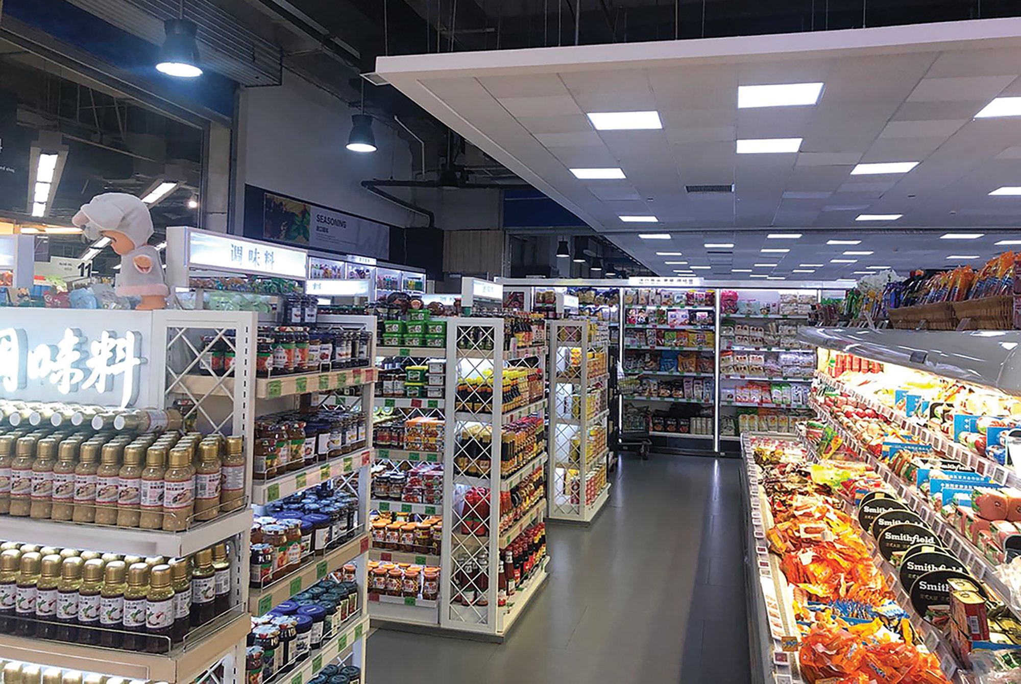
Before
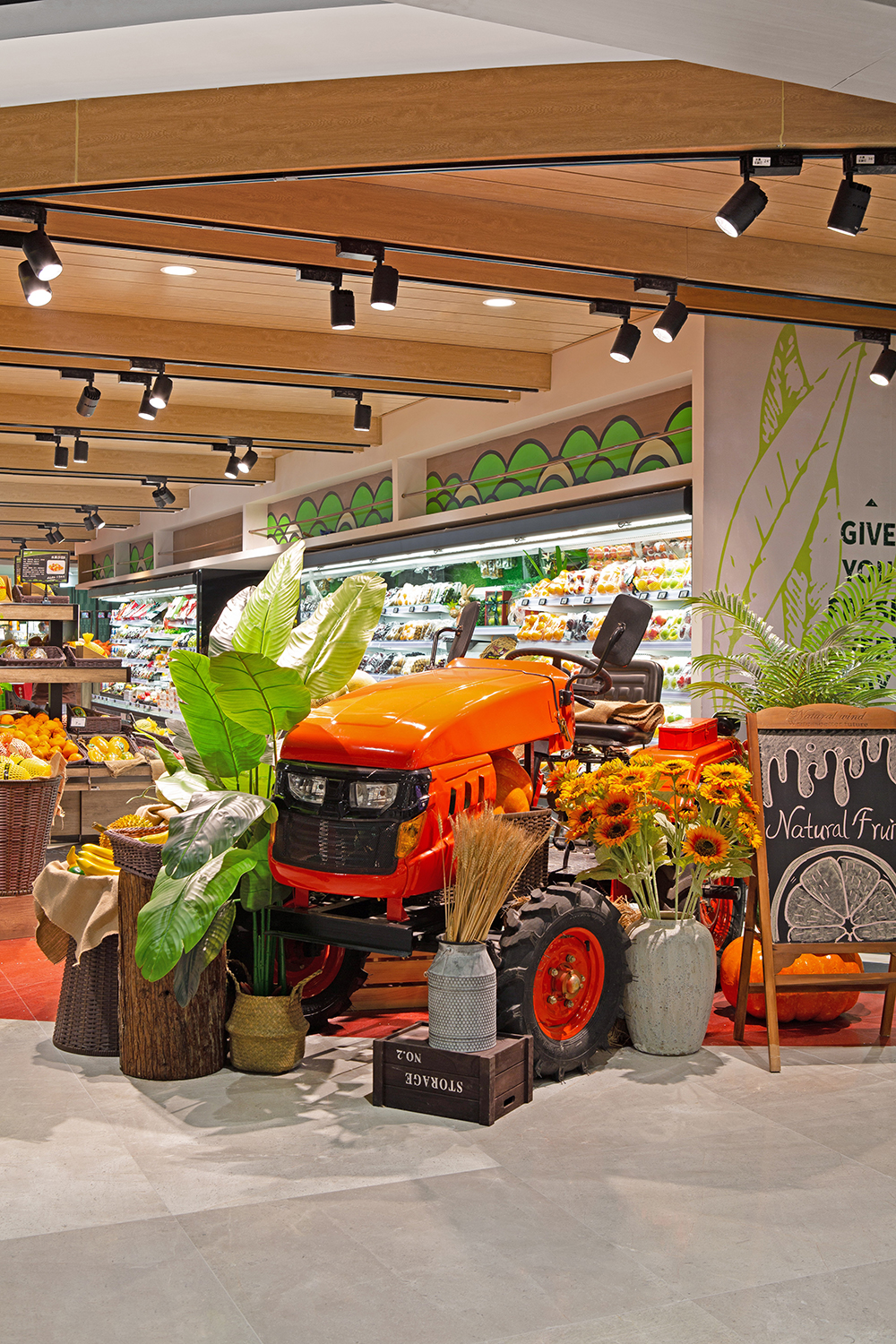
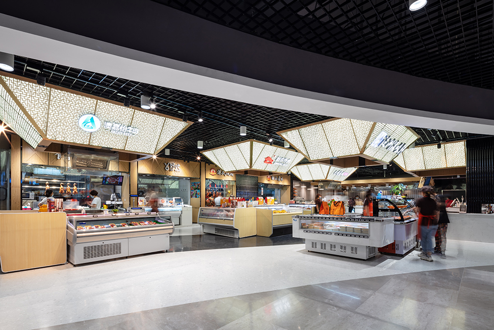
Helping shoppers navigate the space is a dropped ceiling that mirrors the paths of the egg-shaped main aisle. In addition, the designers added special-shaped overhead elements at key focal points. Those elements replaced a mishmash of dropped ceilings that formerly dominated the space.
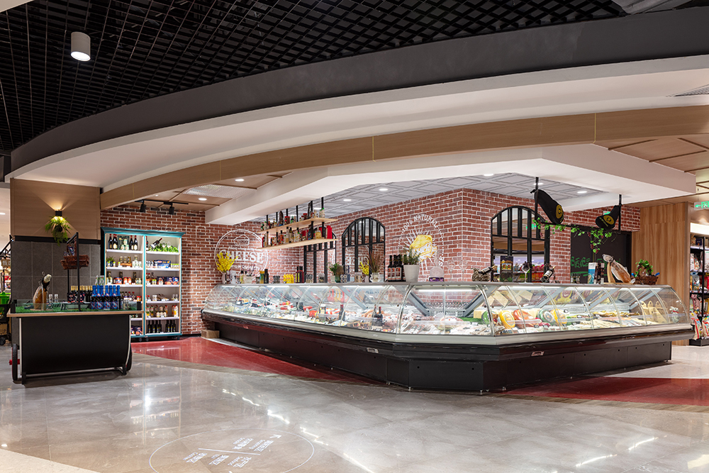
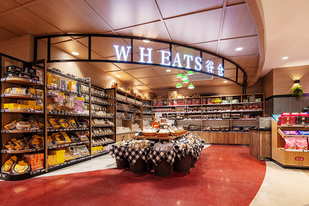
“For example, a house-shaped ceiling in the deli area highlights the local traditional food culture, while the ceiling of the wheat area adopts the traditional Chinese granary shape,” Qin says.
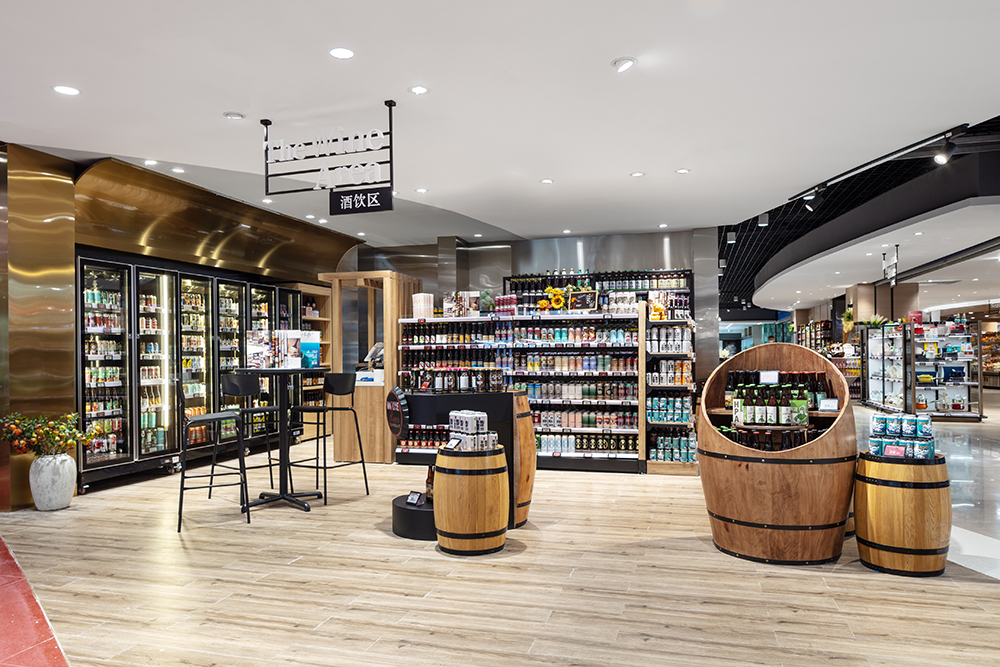
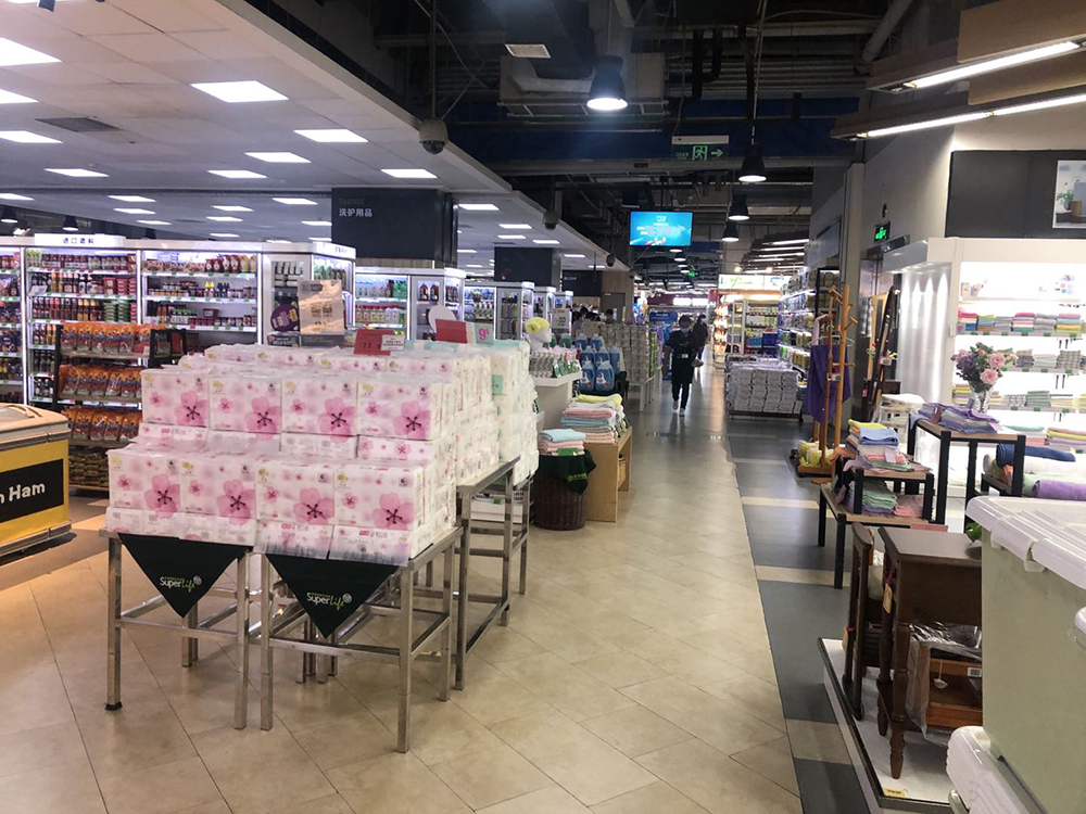
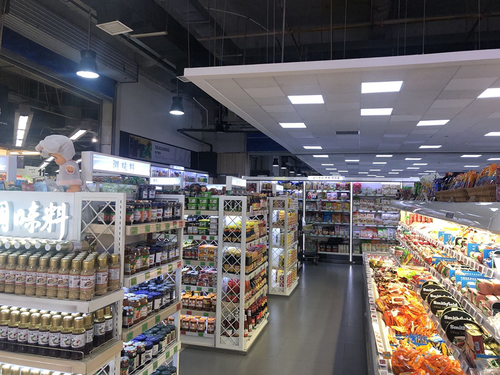
At eye level, the designers used a contemporary material palette that included ceramic tile, natural stone, wood and aluminum veneer, glass and stainless steel.
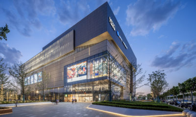
Due to its large floor space (roughly 108,000 square feet) the store layout includes a firewall that previously divided it into two major sectors. As that wall had to stay for code reasons, the designers sought to create “a pavilion-within-a-pavilion that essentially hides the high wall,” says Qin.
The overall result, says Qin, is a space that exudes “vivid vitality” that attracts shoppers of all ages, including those coveted millennials.
AdvertisementPHOTO GALLERY (33 IMAGES)


7 design trends to drive customer behavior in 2024
In-store marketing and design trends to watch in 2024 (+how to execute them!). Learn More.


Nordstrom to Evaluate Founding Family’s Plan to Go Private

“Balmain Beach Club” Washes Ashore at Neiman Marcus

2024 Designer Dozen: Lisa Rachielles


Bulletins
Get the most important news and business ideas from VMSD magazine's news bulletins.
-

 Photo Gallery3 days ago
The 2024 Shop! Design Awards Winners
-
 Headlines2 weeks ago
New-Look JC Penney Debuts in New Jersey
-
 Sector Spotlight2 weeks ago
It’s a Mall World After all
-
 Headlines1 week ago
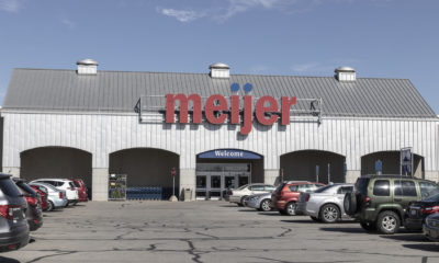
Meijer Adding Three Supercenters
-

 Headlines5 days ago
Long Island Shopping Center Sold for $8M
-
 Headlines2 weeks ago
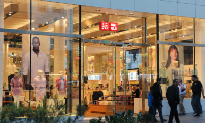
Uniqlo Expanding Into Texas and in California
-

 Designer Dozen1 week ago
2024 Designer Dozen: Evan Harkrider
-
 Headlines3 days ago
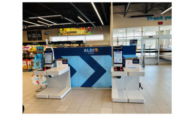
ALDI Launches Checkout-Free Grocery