In Character
Warm woods, found objects and bold artwork create an approachable yet refined experience for Southern clothing brand Billy Reid’s first Minneapolis store.
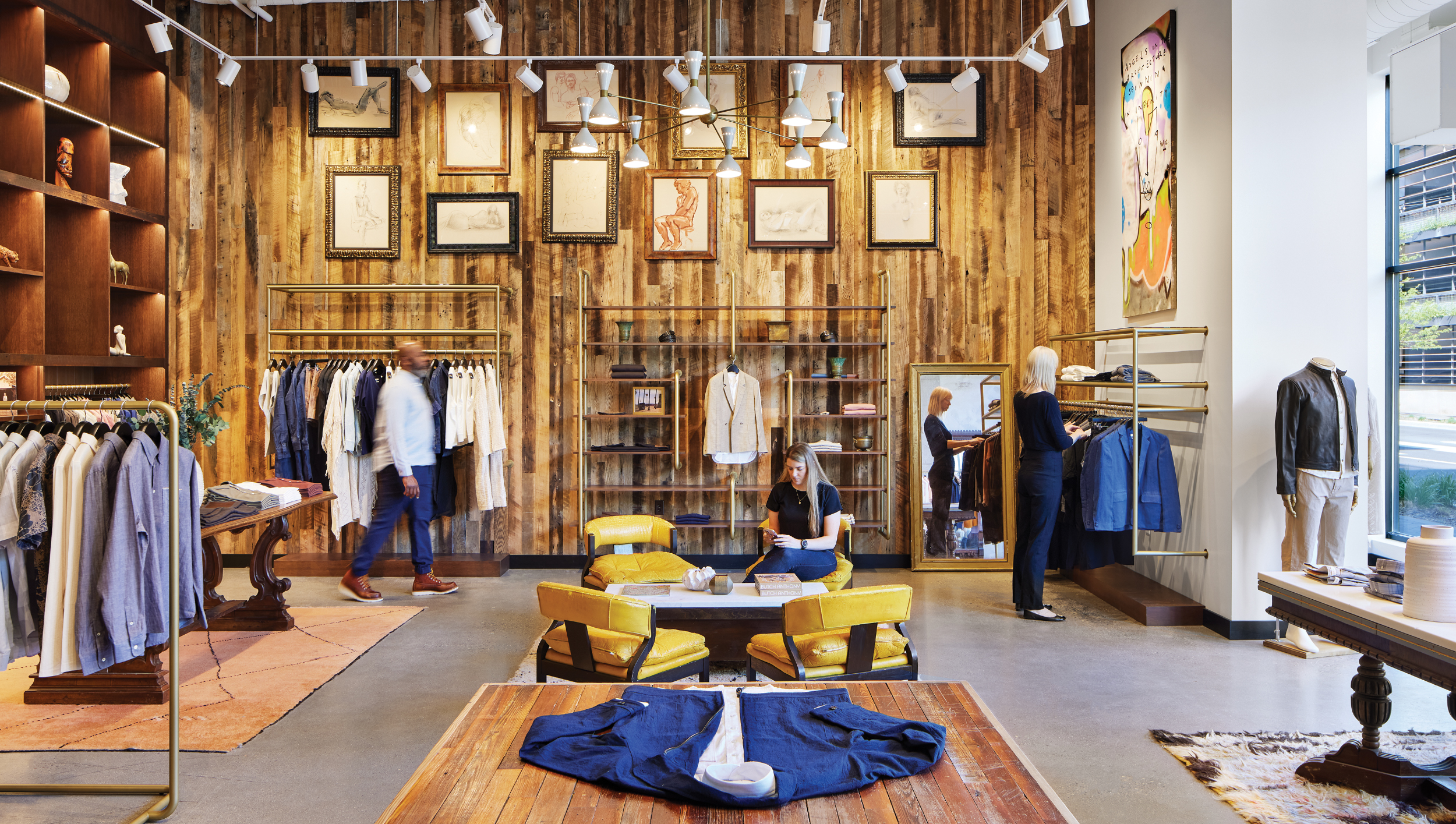
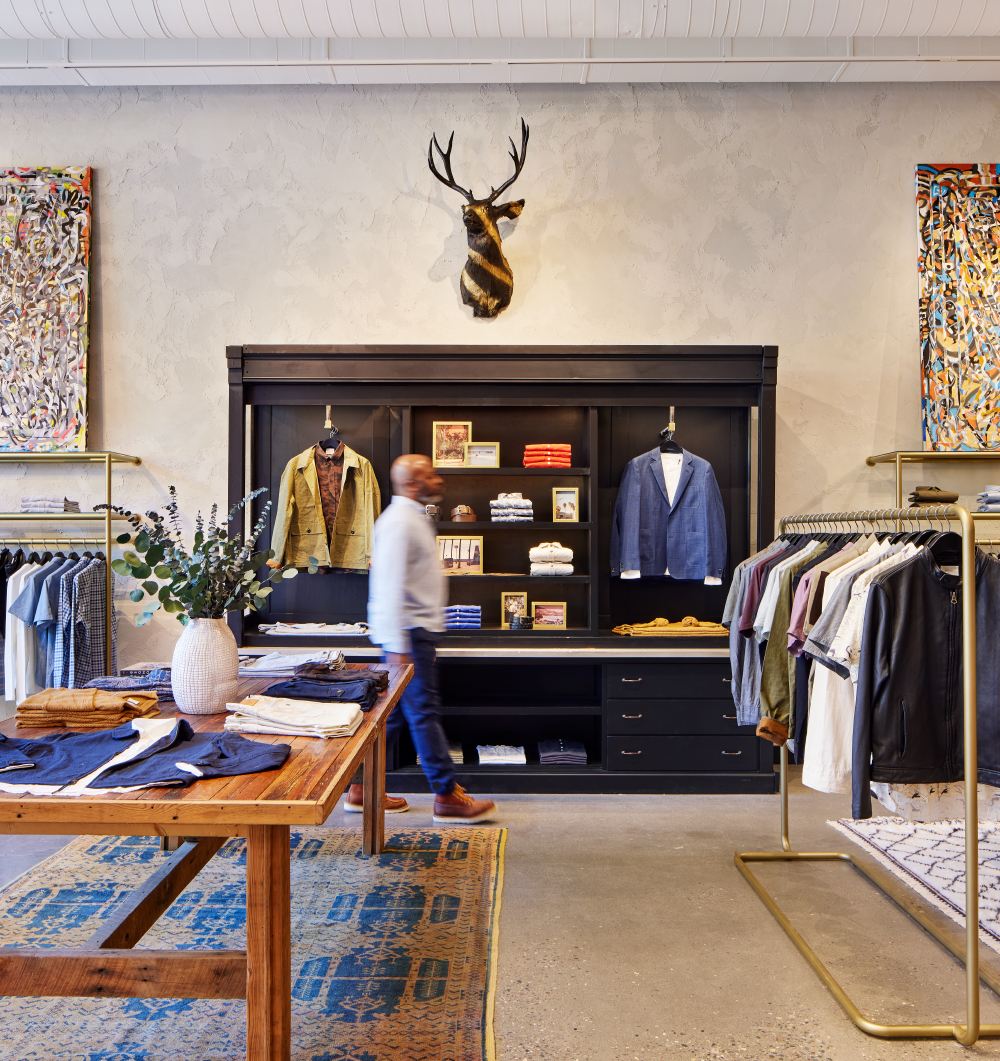
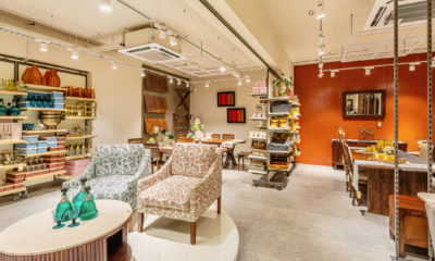
MOST OF THE TIME, high ceilings are a good thing … but when you’re trying to create a comfortable, intimate shopping experience within a modern, new-build shell, 14-foot-high ceilings can have drawbacks. “The challenge was to embrace the freshness of the box, but warm it up and make it feel approachable,” Betsy Vohs, founder and CEO of Minneapolis-based architecture firm, Studio BV, says of the new Billy Reid (Florence, Ala.) shop her firm designed.
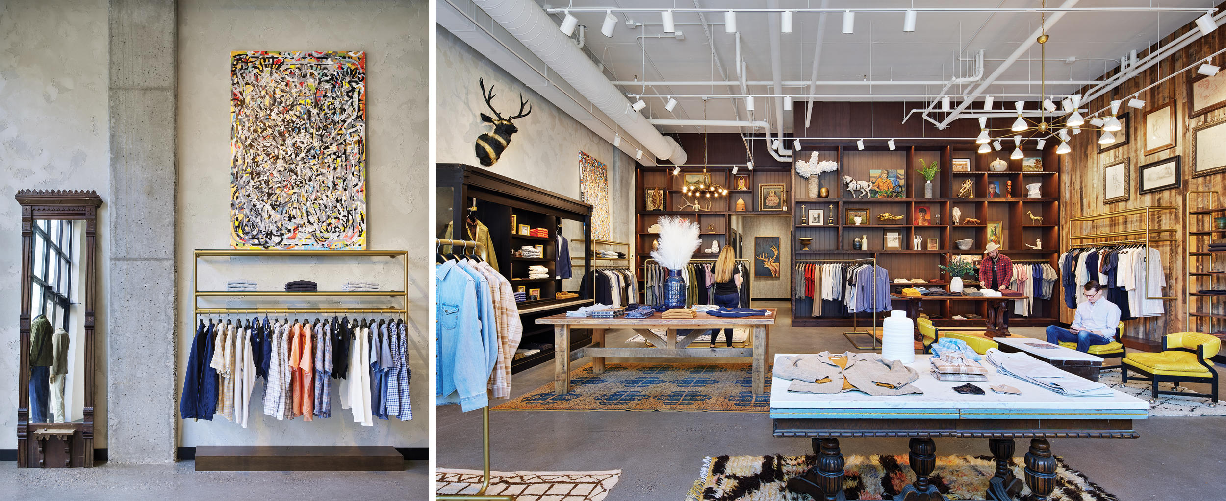
The 1800-square-foot store, located within the luxury mixed-use Nolan Mains development in Edina, Minn., reflects the ethos of the classic American clothing brand – and the man behind it – with a sophisticated, yet not-too-pretentious space that encourages shoppers to stay awhile and explore.
“The verticality was good and bad,” Vohs says, noting the high ceilings provided an optimal gallery space to display colorful artwork, but detracted from the store’s overall comfort.
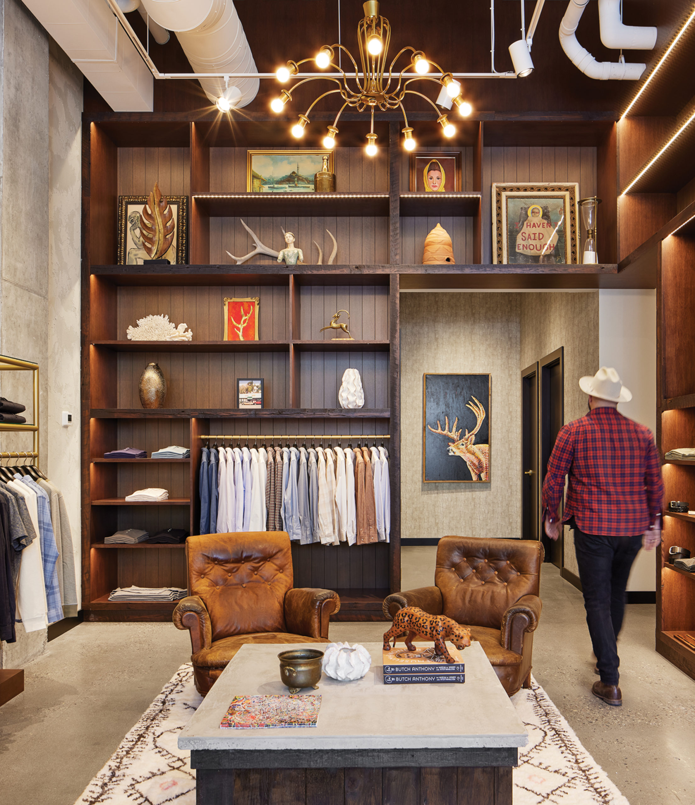
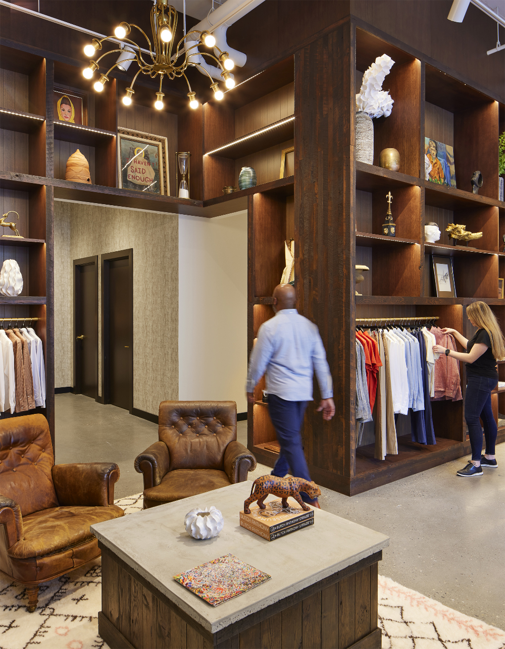
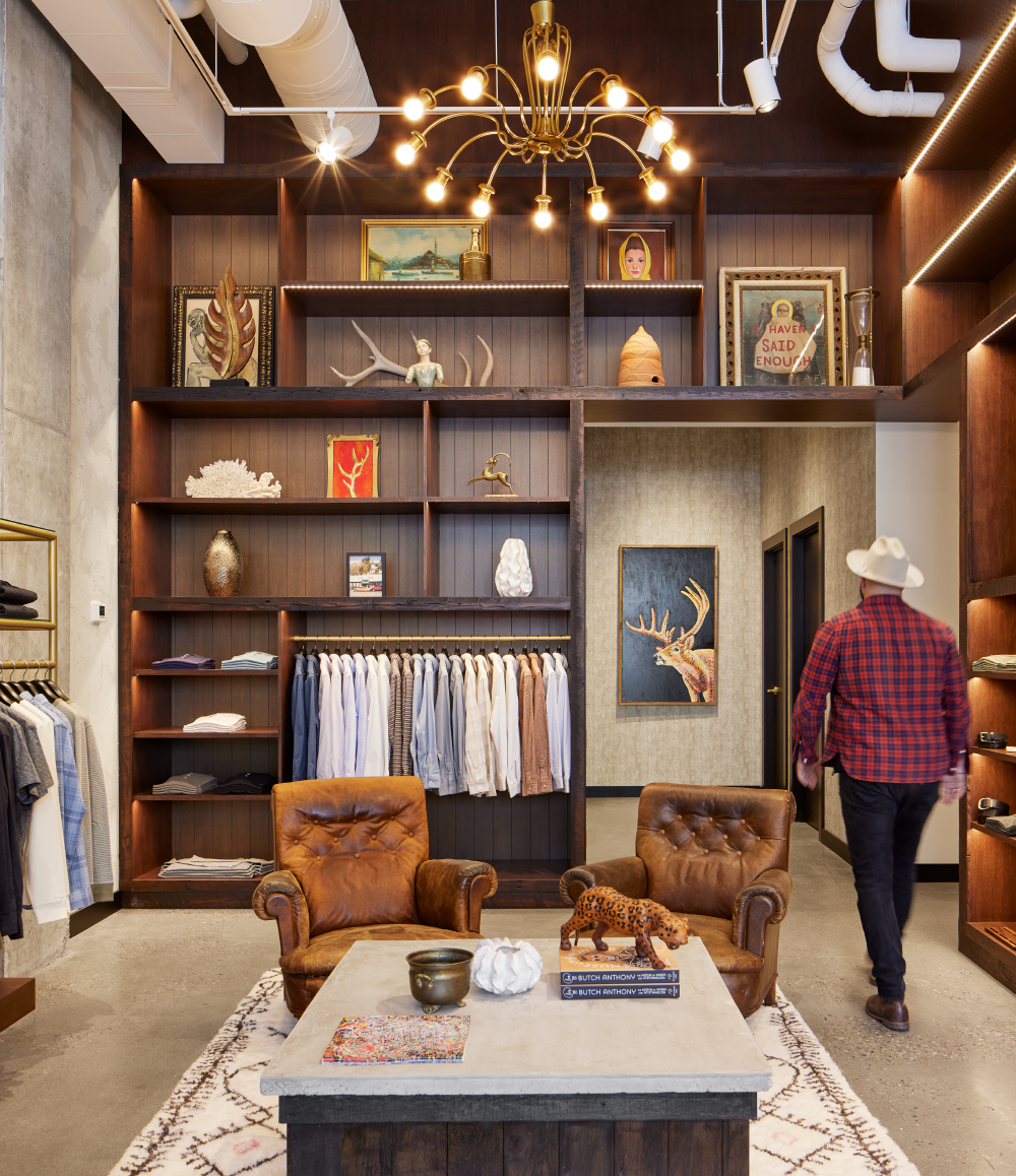
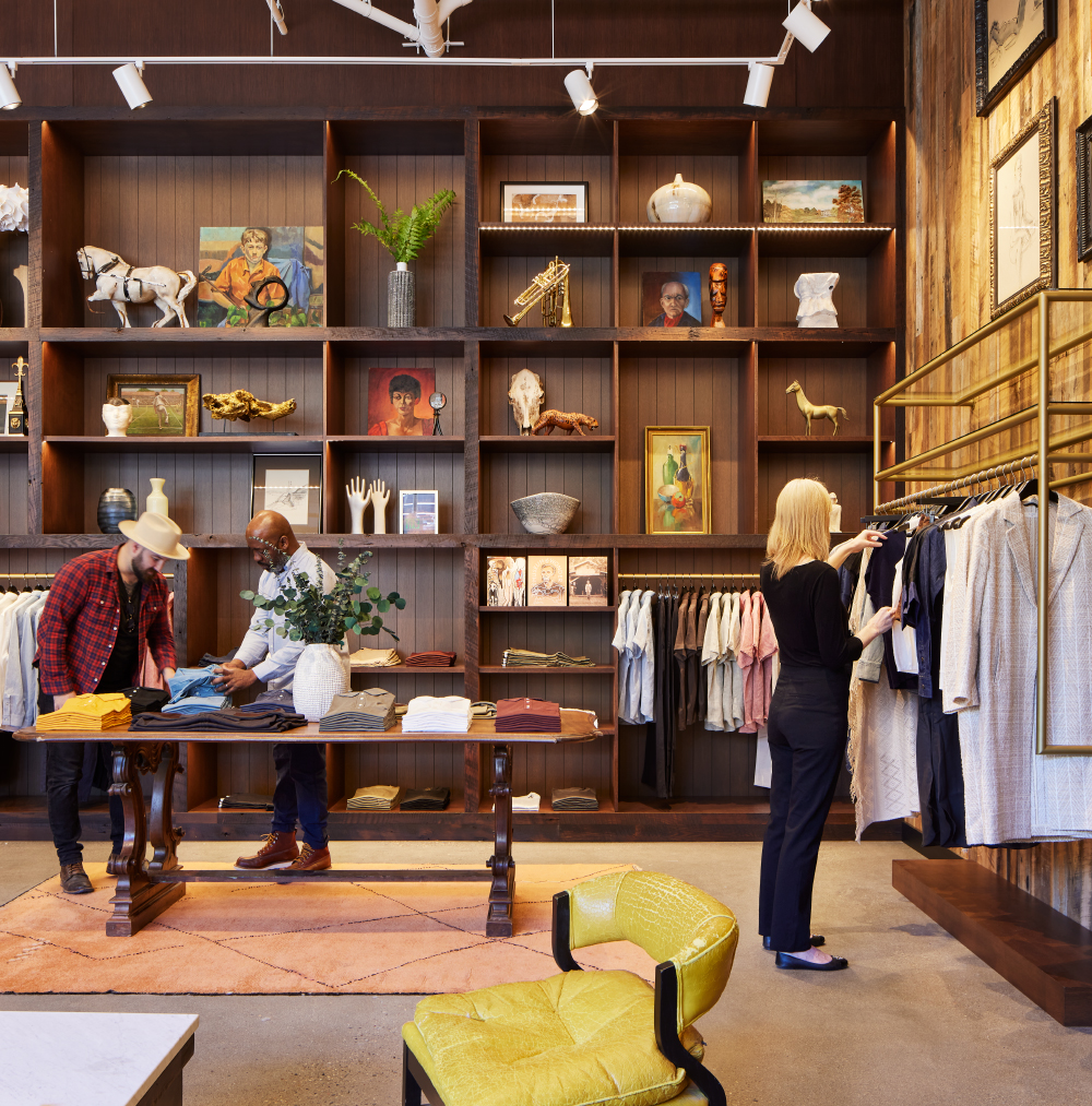
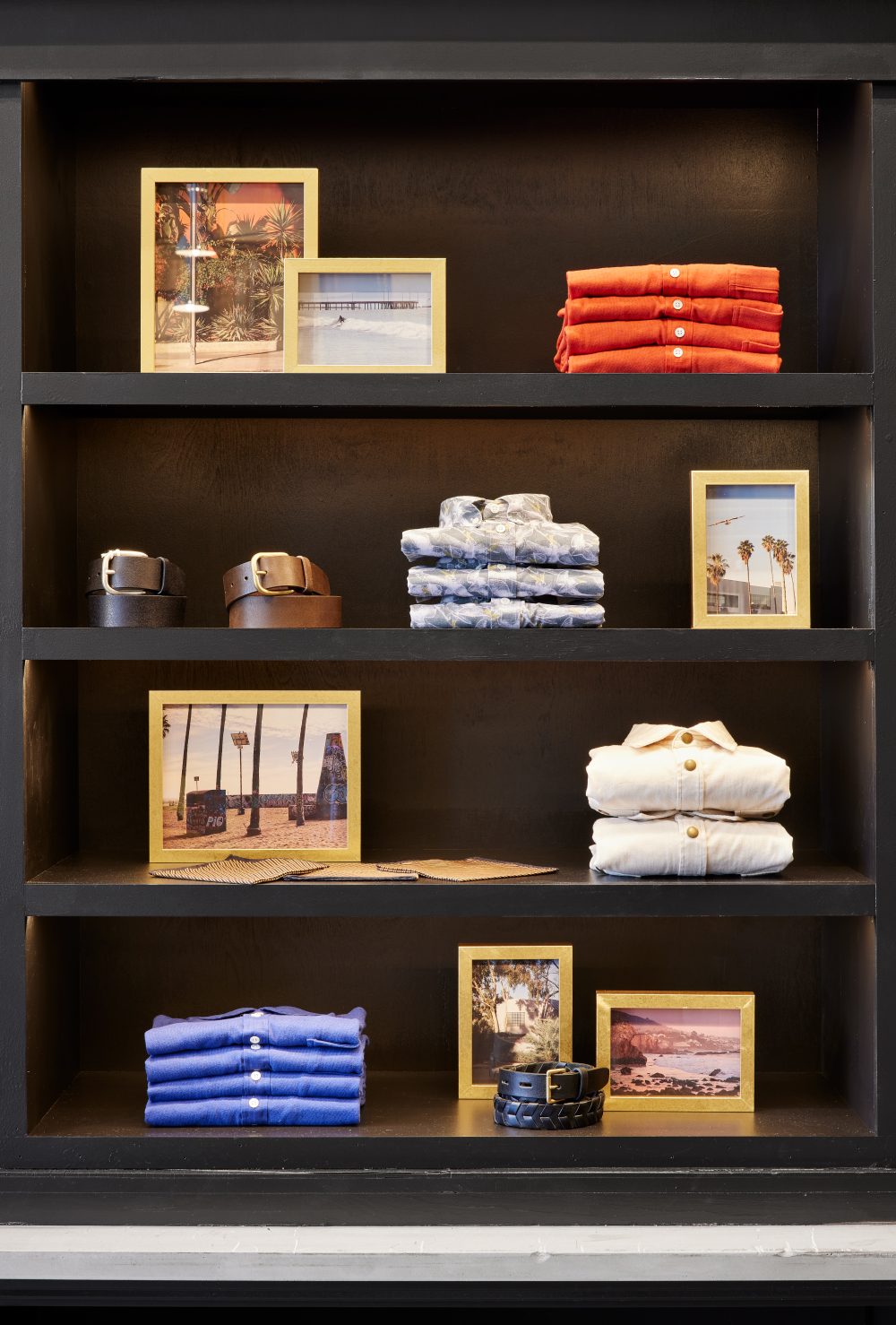
To bring the scale down and help draw customers’ eyes to the clothes without dropping in a ceiling, the team limited fixture heights to eight feet. A custom, locally made chestnut-stained gallery bookcase, peppered with funky found objects (think vintage glove molds, horse sculptures, a hunk of coral) sourced from all over – including from Mr. Reid’s personal collection – adds warmth and a bit of whimsy.
Advertisement“We compartmentalized the vertical plane to get you to look at clothes and not feel like you’re in a giant room with a bunch of stuff,” Vohs says. “The artifacts and clothing become the stars.”
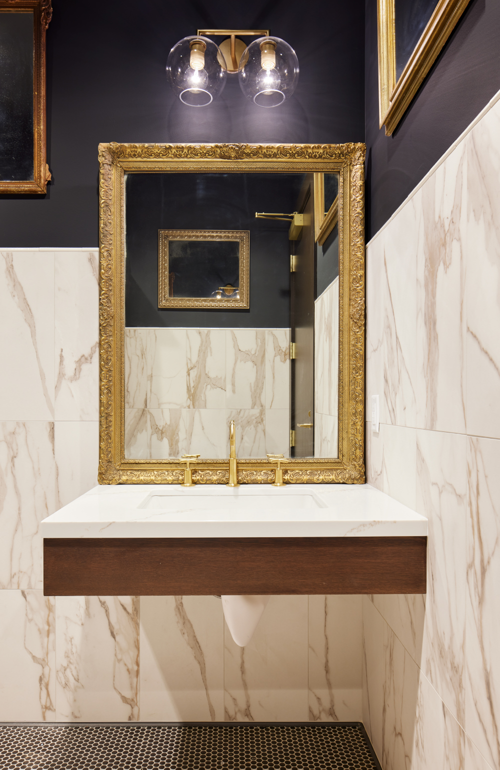
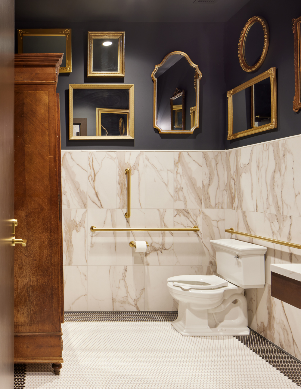
Elements such as natural, worn-in leather furnishings, textured plaster walls, brass, and a linear warm wood accent wall, offset the new-build feel, while creating a neutral, flexible palette. Bright yellow chairs provide a contrast to the simple color scheme, not to mention a spot to sit, relax and enjoy a complimentary coffee.
“We wanted to create contrast, provide places for art, use plaster on the walls for richness … Incorporate things that feel like you’re with Billy,” she says. “It should feel like you’re not in a store, [but rather] like a social space where you shop.”
PHOTO GALLERY (15 IMAGES)
?: Corey Gaffer, North St. Paul, Minn.


MasterClass: ‘Re-Sparkling’ Retail: Using Store Design to Build Trust, Faith and Brand Loyalty
HOW CAN WE EMPOWER and inspire senior leaders to see design as an investment for future retail growth? This session, led by retail design expert Ian Johnston from Quinine Design, explores how physical stores remain unmatched in the ability to build trust, faith, and loyalty with your customers, ultimately driving shareholder value.
Presented by:
Ian Johnston
Founder and Creative Director, Quinine Design


The Häagen-Dazs Rose Project Announces Incredible Global Female Judging Panel for Its Second Year
NRF Honors Champions and Heroes of Main Street at 2024 Retail Advocates Summit

Kroger/Albertsons Merger Hits Temp Halt


Bulletins
Get the most important news and business ideas from VMSD magazine's news bulletins.
-

 Headlines1 week ago
Cilantro Taco Grill to Open 110 Units
-

 Headlines2 weeks ago
Regional Pizza Chain Expands in Walmart
-

 Headlines2 weeks ago
Macy’s Ends Takeover Talks
-

 Headlines3 days ago
Best Buy Details Brand Refresh
-

 Headlines4 days ago
Regional Brands Show Strength in Best Retailers Rankings
-
 Design Detail3 days ago
Cong Banquet, Hangzhou, China
-

 Headlines1 week ago
Darden to Buy Chuy’s
-

 Headlines2 weeks ago
Holiday Shopping ’24: Consumers Pulled in Opposite Directions