Department Stores
PHOTOS: Brilliant Remodel of El Palacio de Hierro Is a Gift to the Community
In this web exclusive, the designer behind the department store’s latest renovation details the project.
THERE ARE MANY faces to the sprawling metropolis of Mexico City, and wherever Palacio de Hierro (Mexico City) plants its flag, it always captures the nuances of each distinct locale. When the high-end retailer charged TPG Architecture (New York) with a collaborative effort with their in-house design team to redesign its existing store in the Perisur Mall, located in the southern suburbs of Mexico City, the mandate presented was clear and consistent.
“The challenge by the client is always the same,” says Alec Zaballero, Managing Executive at TPG. “Every Palacio store is a luxury store, so they all must have a high degree of design. Every Palacio, however, must be unique, you’ll never see one that looks like another.”
The community surrounding the mall is defined by several factors. UNAM, The National Autonomous University of Mexico, founded in 1551, is the largest university in the country and the oldest in Latin America. Located directly next to the Perisur Mall, the university provides the area with a strong culture of art and design.
Also influencing the character of the neighborhood are the lasting effects of the 1968 Olympics. To this day, residents of the borough of Coyoacán are proud that the Olympics were held in their corner of the city, and they’re respectful of the Olympic sculptures and stadiums that remain intact. Additionally, the work of celebrated modernist architect Luis Barragán stands as an enduring component of the cityscape. These community and neighborhood influences had a direct impact on the store’s design.
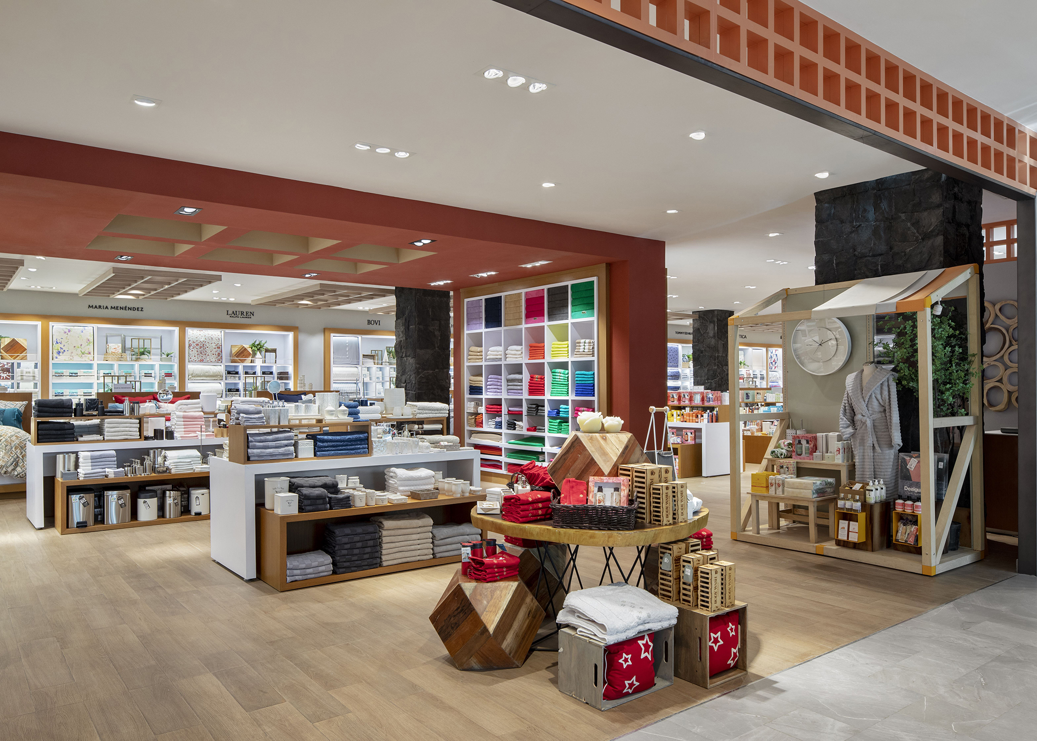
The remodel of the suburban store was a total renovation completed in several phases. In a strategic decision, the store remained open during the entire course of the project. The ground floor, housing jewelry, cosmetics and luxury, and the second floor, showcasing women’s fashion, opened during the Covid crises. Though the pandemic clearly posed many challenges, construction continued.
The remodel also presented several structural challenges. Built in the 1980s, the framework of the building was dated. “We were working within the constraints of existing restricted slab heights,” says Zaballero. “We were also dealing with pink and beige marble and giant torches at the top of the atrium – it was very early ’90s.”
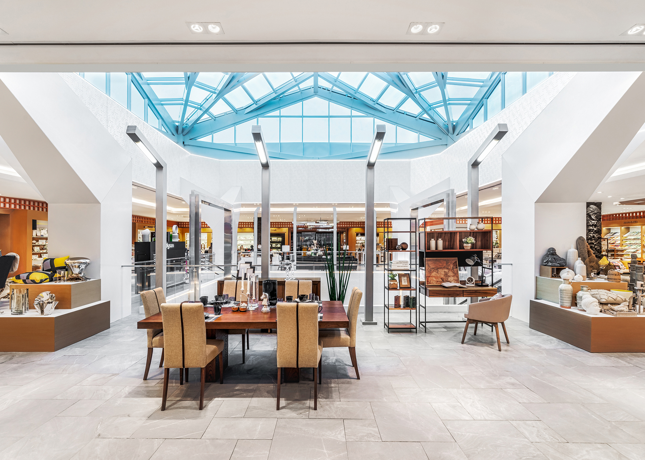
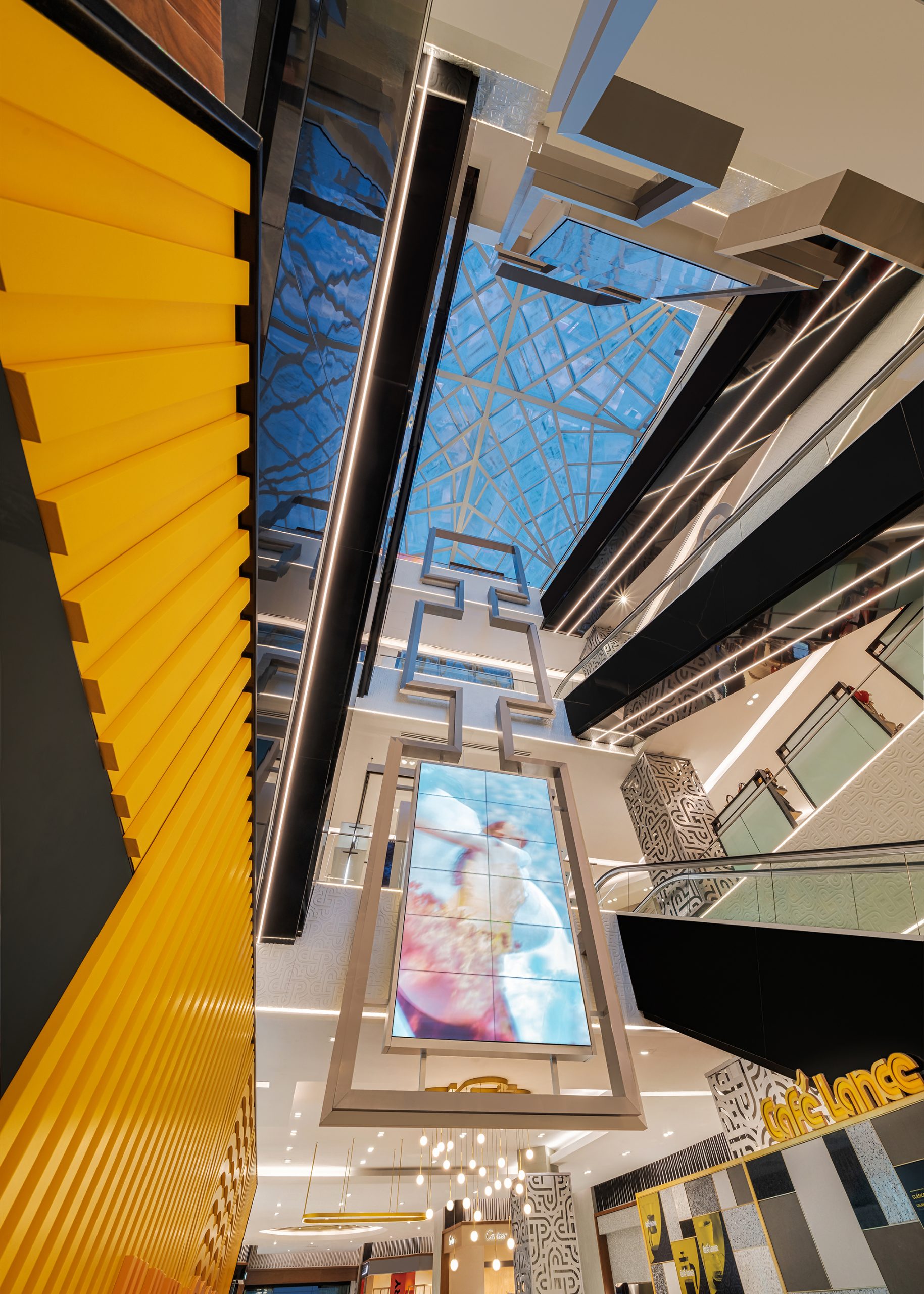
Zaballero noted that the fourth floor was added several years prior with a more updated structural approach. “Once we stripped the structure down to the bare bones, we were able to let loose on the top floor. The new floor has higher ceilings and the structural columns wishbone out into a dome that is four times the size of the original,” he says.
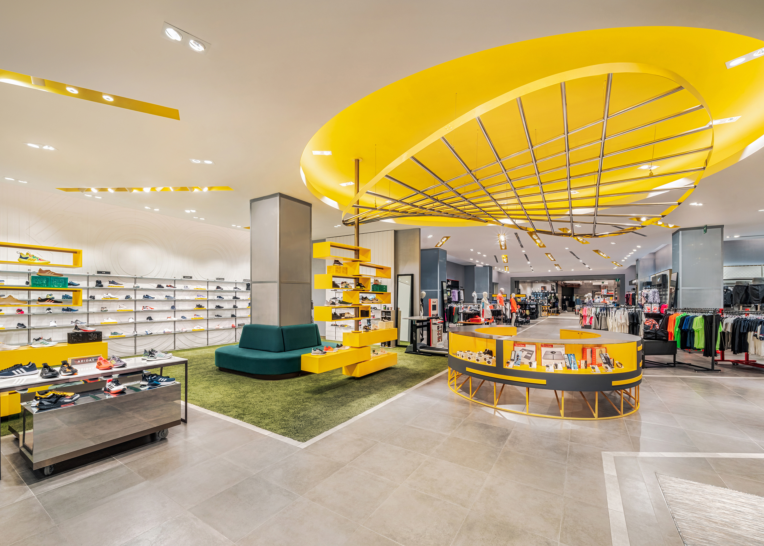
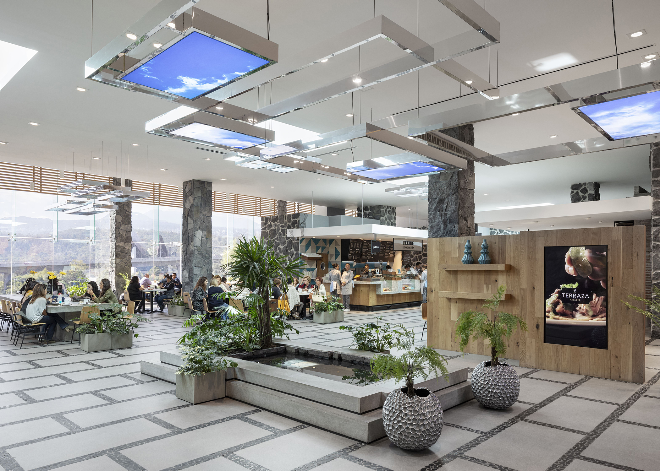
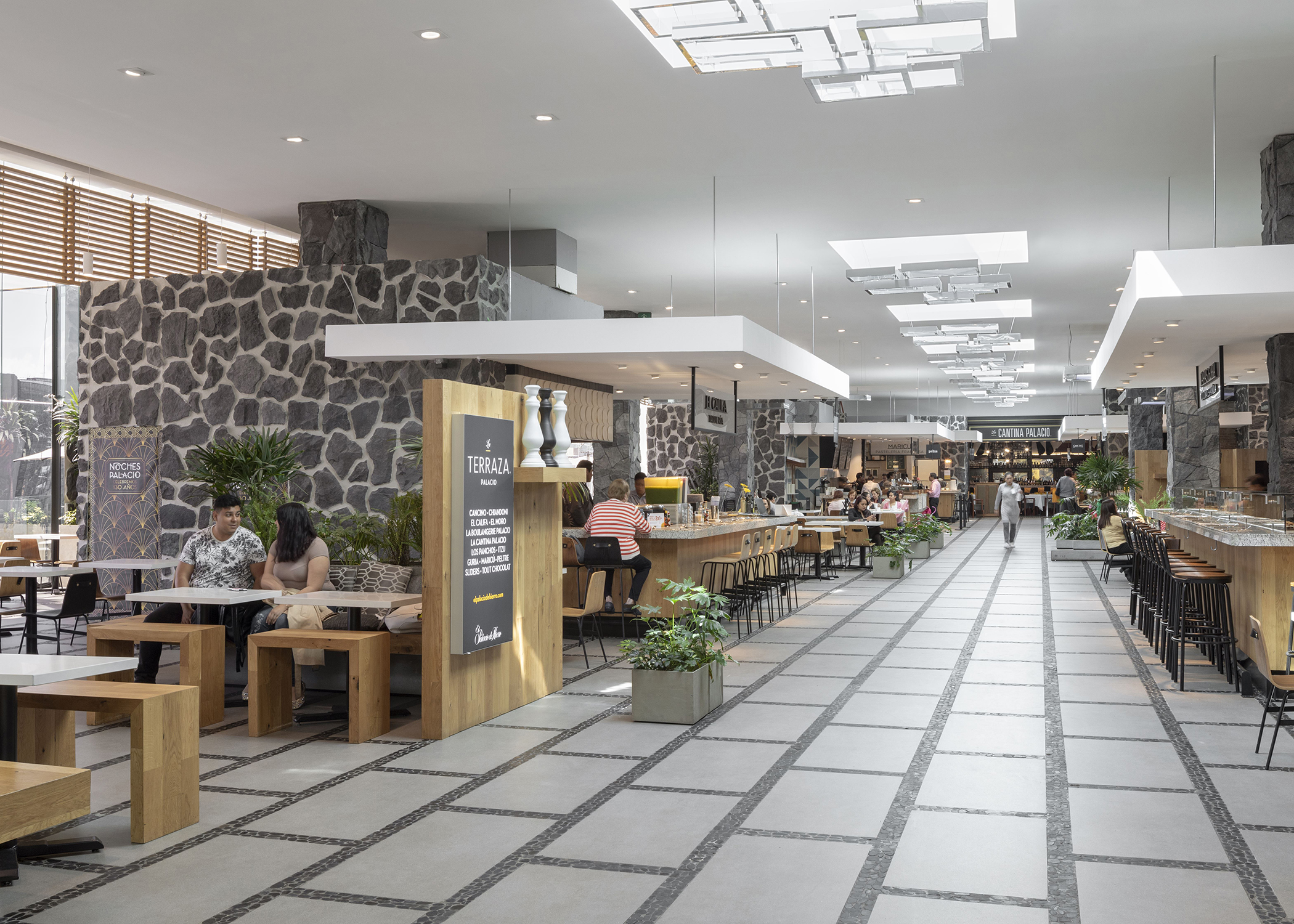
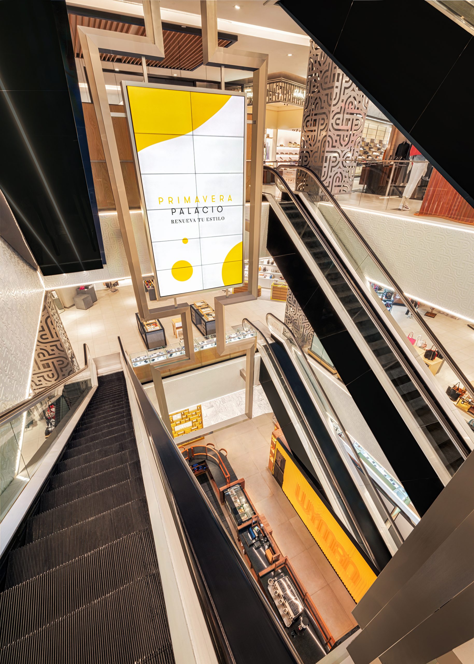
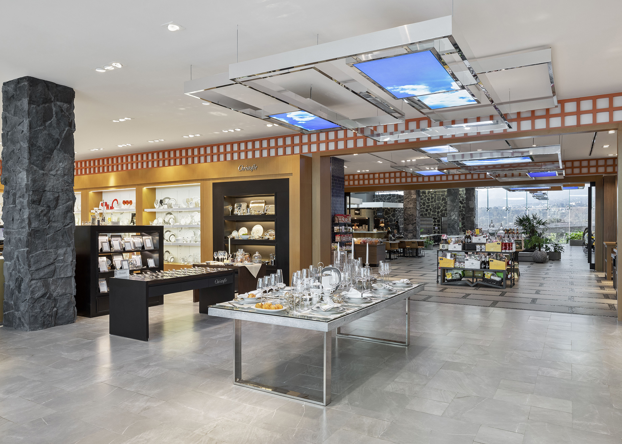
Drawing foot traffic to the top level was another challenge the designers surmounted. With the structural columns fanning out, the oversized dome naturally compels people to move upward toward the top level where an open winter garden effect features home and kitchen goods, as well as decorative items and the food hall. Decorative metal frames running vertically through a relatively narrow atrium communicate through a series of LED screens that reference the visual merchandising moments on each balcony along the way.
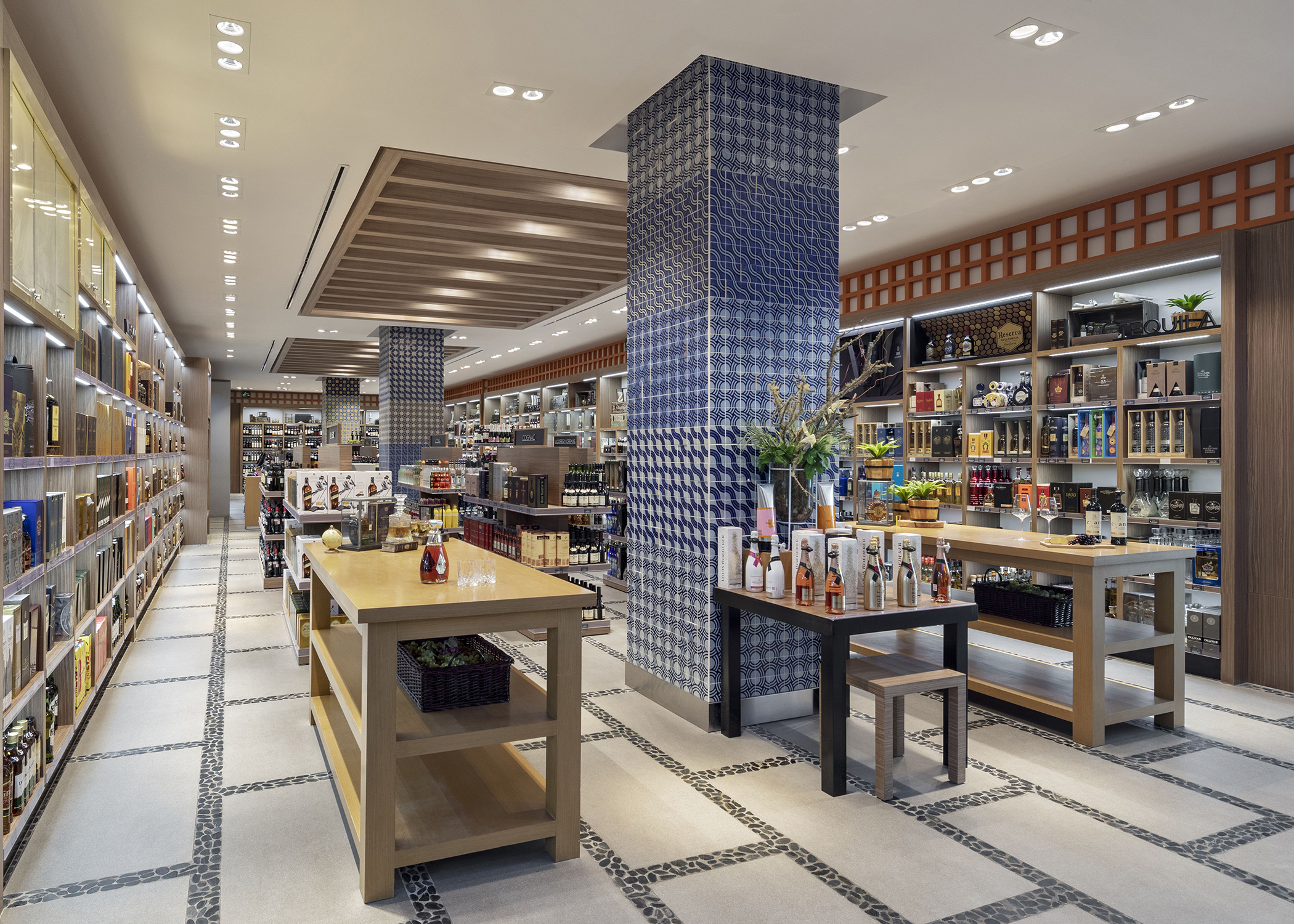
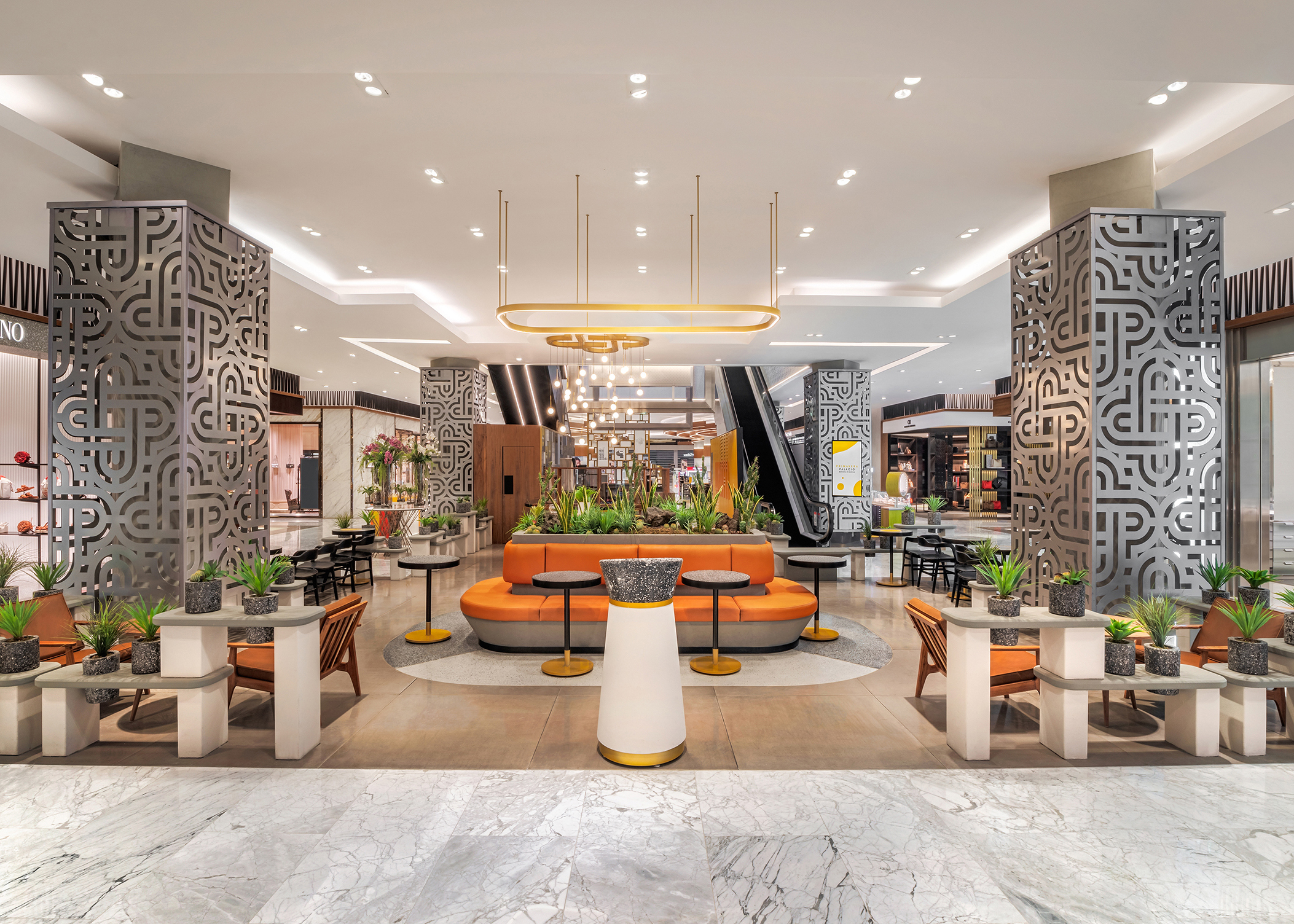
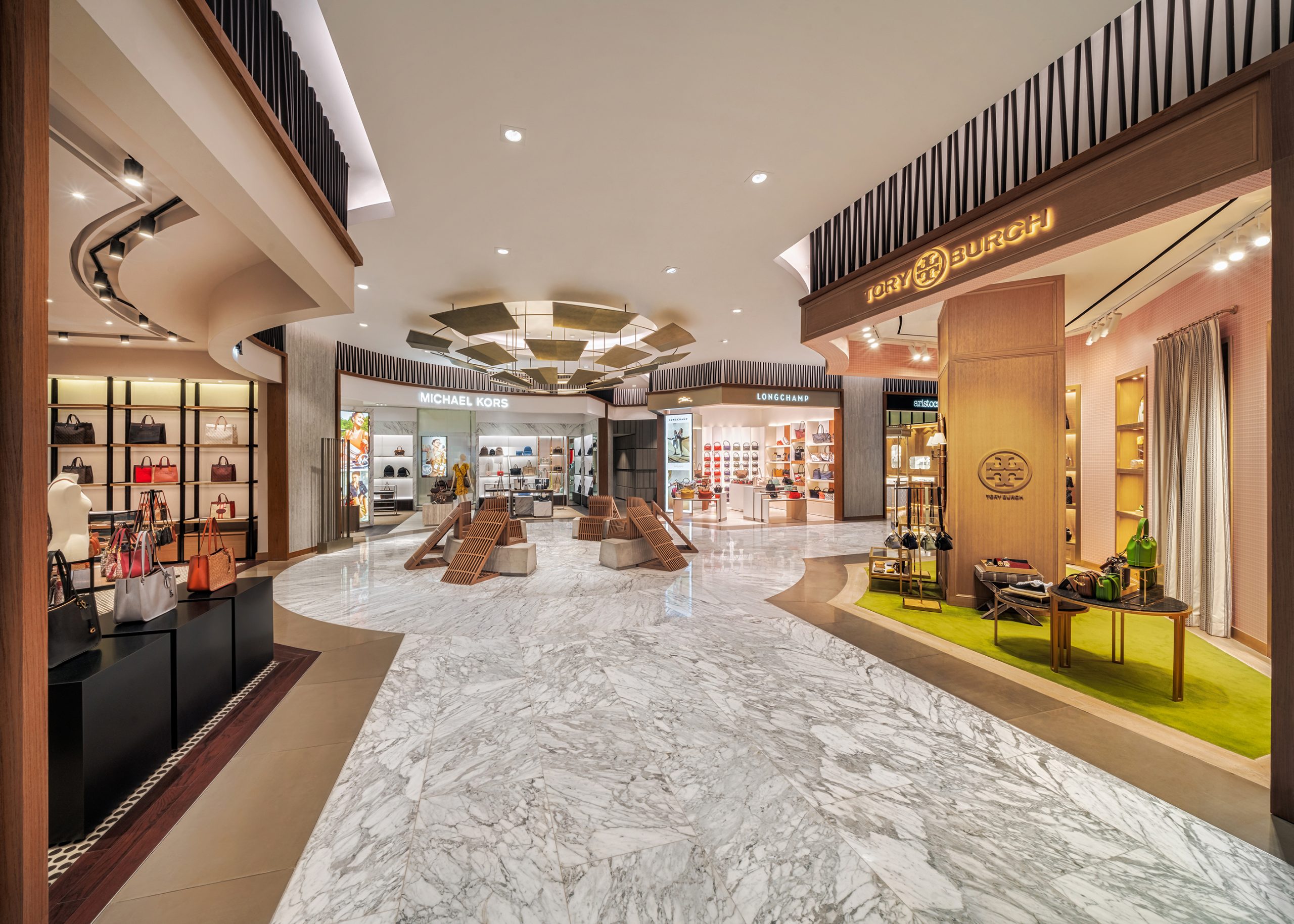
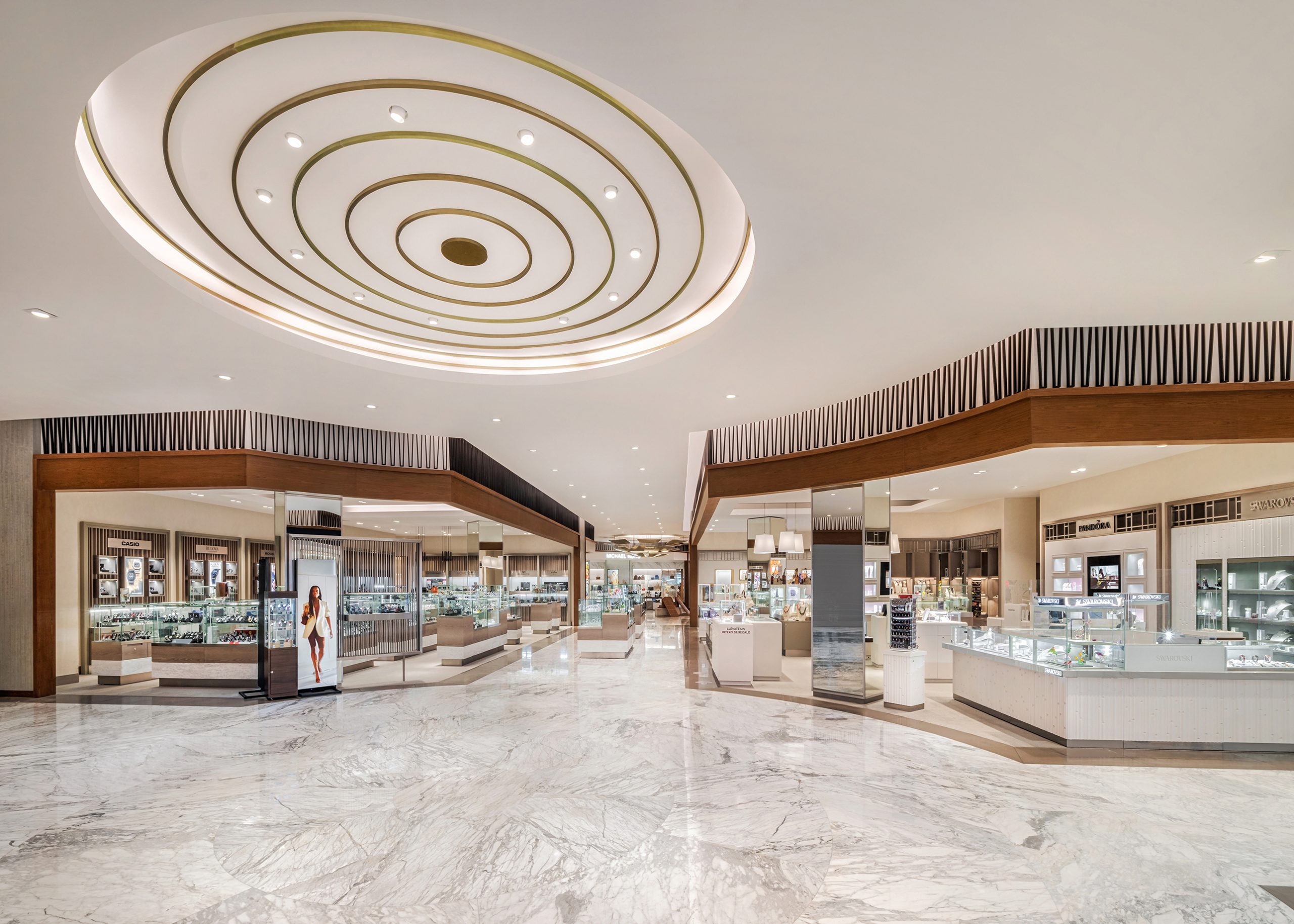
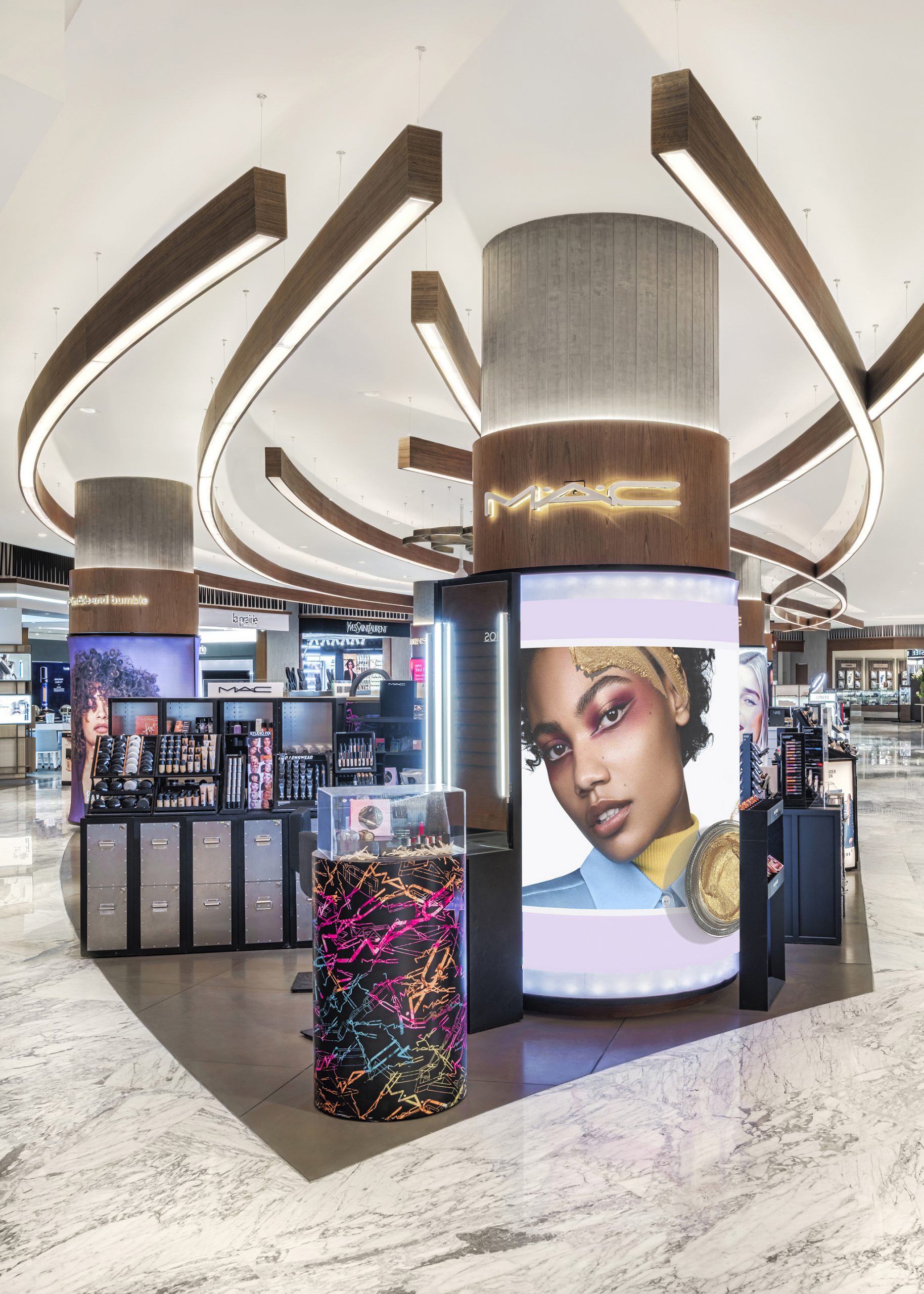
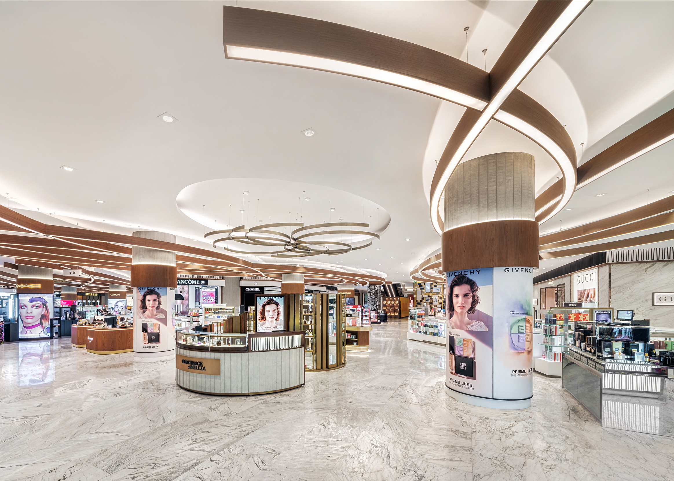
A mid-century appeal was carefully woven into the atrium in a nod to the adjacent housing development designed by Barragán and his fellow mid-century Mexican architects. Luxury retailers established hard shops around the atrium, making the ground floor a combination of luxury mall and department store aesthetics. Large monolithic Carrara marble slabs run throughout the floor as the common thread that takes customers through the luxury offerings. The luxury level features walnut wood, decorative grill work and sculptural ceiling elements. The columns are adorned with laser-cut steel graphics designed by Lance Wyman, the same designer who created the graphics for Mexico 68. In homage to Wyman, the store café is called Café Lance.
Positioned at the entry, cosmetics is an expansion running in two directions, forward toward the atrium and laterally into adjacent areas. A unifying language had to be established to ensure full merchandise exposure. A practical solution involved a combination of lighting and sculpture. A series of flowing pendent tresses with intersecting light beams framed in a wood veneer illuminate the space. The sculptural light fixtures provide both uplighting and downlighting and a wow factor for people entering the store.
The strategic nature of the floorpan is to continually draw people through cosmetics toward the atrium and the rest of the store. Strategically positioned rotundas bring the customer from corner to corner as they travel from one rotunda to another. “The strategy is inspired by the city plan of Paris, strategically driving the customer down the ‘boulevard’ to the next feature,” says Zaballero. “It’s the neighborhood strategy or city planning strategy.”
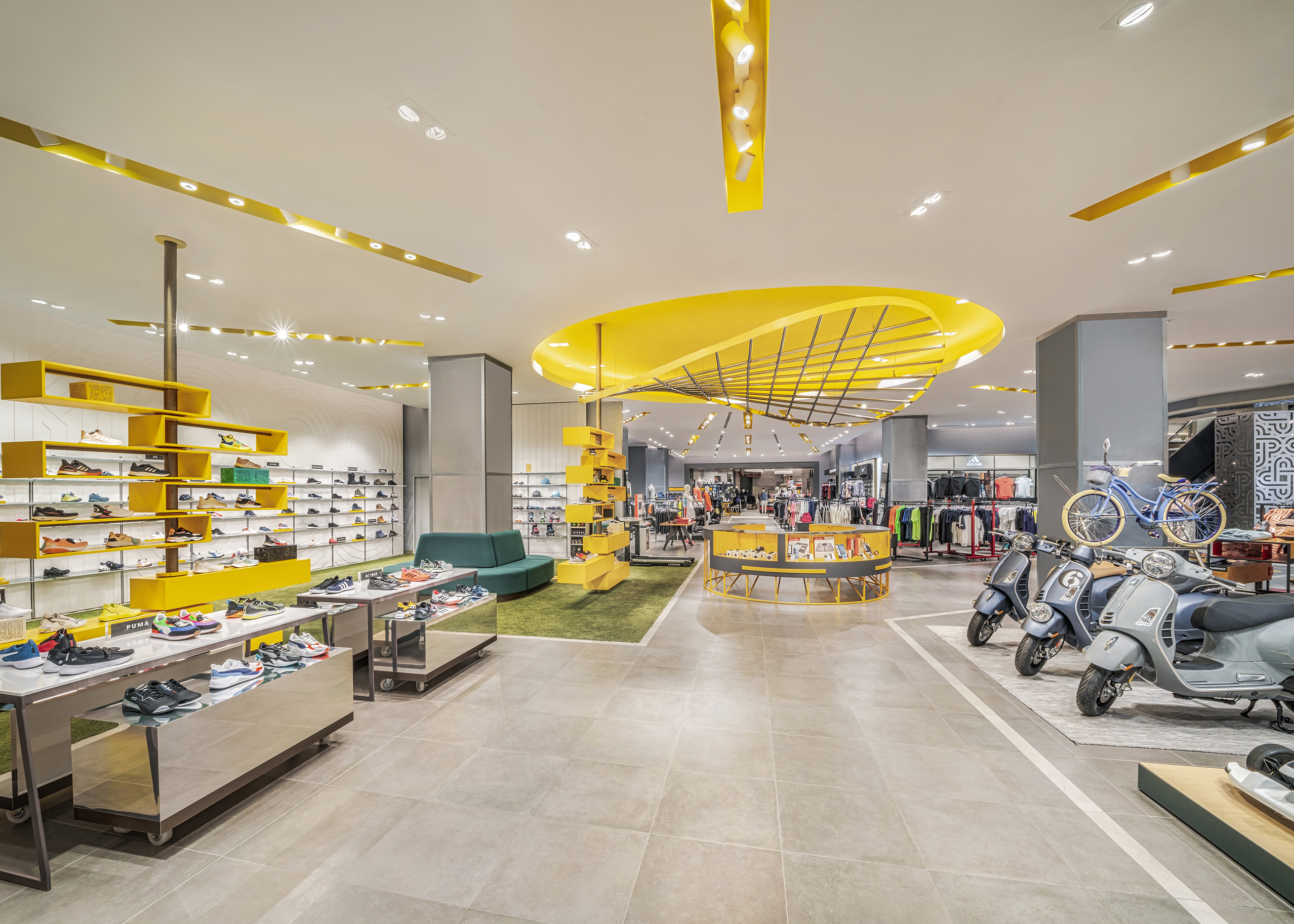
AdvertisementEach department has its own design concept with a common element pulling it all together.
“Palacio is one of the few retailers where the task of the designers is to inspire and delight,” Zaballero explains. “The Palacio image is a total lifestyle immersion. Every Palacio store is unique, every store is a flagship, and every store is a gift to the community.”
Photography: Hector Armando Herrera, Mexico City
MasterClass: ‘Re-Sparkling’ Retail: Using Store Design to Build Trust, Faith and Brand Loyalty
HOW CAN WE EMPOWER and inspire senior leaders to see design as an investment for future retail growth? This session, led by retail design expert Ian Johnston from Quinine Design, explores how physical stores remain unmatched in the ability to build trust, faith, and loyalty with your customers, ultimately driving shareholder value.
Presented by:
Ian Johnston
Founder and Creative Director, Quinine Design


The Häagen-Dazs Rose Project Announces Incredible Global Female Judging Panel for Its Second Year
NRF Honors Champions and Heroes of Main Street at 2024 Retail Advocates Summit

Kroger/Albertsons Merger Hits Temp Halt


Bulletins
Get the most important news and business ideas from VMSD magazine's news bulletins.
-

 Headlines1 week ago
Cilantro Taco Grill to Open 110 Units
-

 Headlines2 weeks ago
Regional Pizza Chain Expands in Walmart
-

 Headlines2 weeks ago
Macy’s Ends Takeover Talks
-

 Headlines3 days ago
Best Buy Details Brand Refresh
-

 Headlines4 days ago
Regional Brands Show Strength in Best Retailers Rankings
-
 Design Detail3 days ago
Cong Banquet, Hangzhou, China
-

 Headlines1 week ago
Darden to Buy Chuy’s
-

 Headlines2 weeks ago
Holiday Shopping ’24: Consumers Pulled in Opposite Directions