Headlines
7-Eleven Launches Brand Repositioning
Cleaner store design emphasizes healthy living and the logo has been changed after 43 years
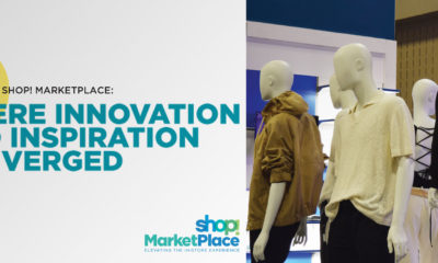
MasterClass: ‘Re-Sparkling’ Retail: Using Store Design to Build Trust, Faith and Brand Loyalty
HOW CAN WE EMPOWER and inspire senior leaders to see design as an investment for future retail growth? This session, led by retail design expert Ian Johnston from Quinine Design, explores how physical stores remain unmatched in the ability to build trust, faith, and loyalty with your customers, ultimately driving shareholder value.
Presented by:
Ian Johnston
Founder and Creative Director, Quinine Design


Jack in the Box Sets Return to Chicago

B&B Theatres to Debut at American Dream

Dream Pairs Opens Second Location


Bulletins
Get the most important news and business ideas from VMSD magazine's news bulletins.
-
 Headlines6 days ago
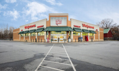
Walgreens Eyes Closing 2000-Plus Stores
-

 Headlines2 weeks ago
Food Hall Set for NY’s Ex-Lord & Taylor Building
-
 Headlines1 week ago
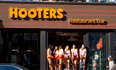
Hooters Shutters 40 Restaurants
-

 Headlines1 week ago
Perkins Updating Its Restaurants’ Look
-

 Headlines2 weeks ago
Target Equipping Workers With AI Chatbot
-
 Specialty Non-Apparel1 week ago
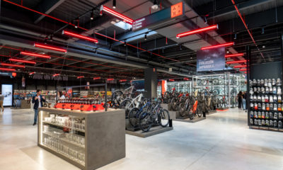
Power Cycle
-

 Headlines1 week ago
Dollar General Fills More Leadership Roles
-
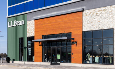
 Headlines7 days ago
L.L.Bean Opening Quartet of Stores in ’24