Greyhound Lines Inc. (Dallas), one of America's most iconic brands, wants to prove you can teach an old dog new tricks. Its rebranding campaign replaces the 91-year-old company's image, which included outdated bus stations and a red, white and blue palette and neon signs, with something hipper.
“We're trying to appeal to a younger, more energetic and ethnic customer,” says Rosemary Adkins, Greyhound's general manager food service/retail.
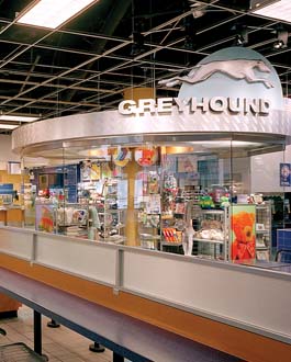
Last year, Greyhound introduced a sleeker logo, renovated bus interiors and updated uniforms for employees. But how do you tell riders inside the terminals that “this isn't your mother's Greyhound?” The answer was found in a new signage and graphics program for its retail and food concession area that takes cues from airport retail.
“We took the perspective that this needs to look and feel and serve the traveler much like airport stores do,” says Tony Camilletti, vp, strategic development, at D|Fab (D|Fab, Madison Heights, Mich.).
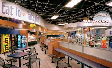
Similar to airline travelers, bus riders feel time-pressed and worry whether or not going into a store or restaurant will make them late. So clear and visible signage became a key element in updating Greyhound's Chicago bus terminal – the sixth-busiest of Greyhound's 80 company-owned locations. It says, come on in and find what you want, easily and quickly.
“This customer doesn't have a lot of time between bus connections,” says Nadine McLearon, D|Fab's marketing and creative director, “so it was really important for people to be able to quickly orient themselves to what they needed.”
Designers created a “Metro Hip” concept to infuse warmth and energy into the confusing and cluttered retail and food areas. To add clarity, designers opened up the retail space using a curved glass partition that defines the area while keeping it connected to the rest of the terminal.
Since the transportation company serves riders who speak many different languages, Greyhound used pictorial images atop new fixtures and on the walls to serve as product signage.
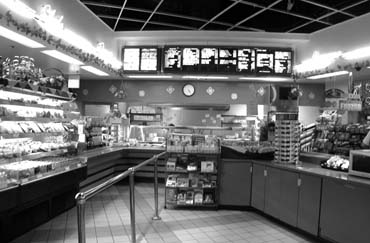
In the food area, illuminated oval accents hold graphics of products, directing customers to the four main food categories – hot food, cold food, fountain drinks and vending.
The redesigned retail area now opens up into the renovated food court. While the retail space was nearly gutted and re-created, the food area's new look was mainly a product of new signage and architectural elements designed and created by D|Fab.
Using CoreLite material, designers fashioned hanging circular headers, baffles and oval accents. A wood-veneer valance defines the perimeter wall, directing travelers through the concession area.
The new silver powdercoated fixturing system for the retail area, by OPTO Intl. Inc. (Wheeling, Ill.), allows Greyhound to better display its assortment of sundries, Chicago-themed items and Greyhound-branded merchandise, while also adding new items. “It complements their new industrial, urban look,” says Debbie Phelan, OPTO's vp, marketing.
Greyhound plans to roll out the new image and signage program to more of its terminals in the near future. Since the upgrades were introduced at the Chicago hub, Adkins says sales have increased slightly. But she adds that the greatest reward is the perceived improvement in the customer experience.
“It brings continuity through the system,” says Adkins, “so that regular riders will know it as Greyhound.”
The Greyhound project also won a First Place in the 2005 ISP/VM+SD International Store Design Competition.
Client: Greyhound Lines Inc., Dallas
Rosemary Adkins, general manager food service/retail
John Isaacson, director design & construction
Design: Design Fabrications Inc., Madison Heights, Mich.
Gregory Geralds, president
Tony Camilletti, vp, strategic development
Nadine McLearon, marketing & creative director
Gretchen Heinle, studio manager
Debora Chin, senior designer
General Contractor: Jerry Kachel Builder Inc., Spring, Texas
Decor, Architectural Elements, Graphics, Wallcoverings: Design Fabrications Inc., Madison Heights, Mich.
Fixtures: OPTO Intl. Inc., Wheeling, Ill.
Great Lakes Woodworking, Detroit
Refrigeration: Regal Pinnacle, Medford, N.J.
Flooring, Wall Tile: Dal-Tile, Dallas
Paint: Sherwin Williams, Cleveland
Lighting: Resource Lighting, Peachtree City, Ga.
Photography: Laszlo Regos, Laszlo Regos Photography, Berkley, Mich.


 Eric Feigenbaum1 week ago
 Headlines6 days ago
 Headlines1 week ago
 Headlines2 weeks ago
 Headlines1 week ago
 Designer Dozen2 weeks ago
 Blogs & Perspectives1 week ago