Uncategorized
5 Points on How a Well-Designed Signage can drive customers into the Store
MasterClass: ‘Re-Sparkling’ Retail: Using Store Design to Build Trust, Faith and Brand Loyalty
HOW CAN WE EMPOWER and inspire senior leaders to see design as an investment for future retail growth? This session, led by retail design expert Ian Johnston from Quinine Design, explores how physical stores remain unmatched in the ability to build trust, faith, and loyalty with your customers, ultimately driving shareholder value.
Presented by:
Ian Johnston
Founder and Creative Director, Quinine Design


Lighting Design International Celebrates Renowned Designs for Harrods 175th Anniversary

MG2 Launches MG2 Advisory Offering Strategy and Insight Services for Retail Markets

Planting the Seeds to Generational Retail Success


Bulletins
Get the most important news and business ideas from VMSD magazine's news bulletins.
-
 Headlines2 weeks ago
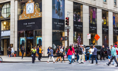
Ted Baker Stores Closing in U.S. and Canada
-

 Headlines2 weeks ago
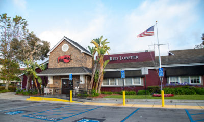
Red Lobster Closes 90 Locales
-
 Headlines5 days ago
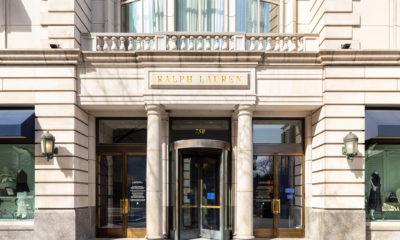
Ralph Lauren Completes Renovation of Chicago Flagship
-

 Headlines1 week ago
Cracker Barrel Testing Reno Prototypes
-

 Headlines2 weeks ago
Two Japanese Retailers Set U.S. Entry
-
 Headlines6 days ago
Red Lobster Files Chapter 11 Bankruptcy
-
 Headlines4 days ago
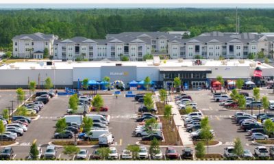
Walmart Opens Two New Neighborhood Market Prototypes
-

 NXTLVL Experience Design4 days ago
Episode 68: James Damian