Uncategorized
5 Points on How a Well-Designed Signage can drive customers into the Store
MasterClass: ‘Re-Sparkling’ Retail: Using Store Design to Build Trust, Faith and Brand Loyalty
HOW CAN WE EMPOWER and inspire senior leaders to see design as an investment for future retail growth? This session, led by retail design expert Ian Johnston from Quinine Design, explores how physical stores remain unmatched in the ability to build trust, faith, and loyalty with your customers, ultimately driving shareholder value.
Presented by:
Ian Johnston
Founder and Creative Director, Quinine Design


Rue 21 Closing All Stores: Report

2 Rising Canadian Retailers Set Growth Plans

REI Co-op to Open 11th Store in Texas


Bulletins
Get the most important news and business ideas from VMSD magazine's news bulletins.
-
Special Reports7 days ago
VMSD’s Retail Design Firm Resource Guide
-
 Headlines2 weeks ago
Target Sued for Biometric Surveillance
-
 Headlines2 weeks ago
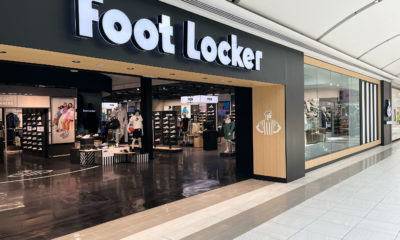
Foot Locker Unveils Updated Store Concept
-
 Headlines2 weeks ago
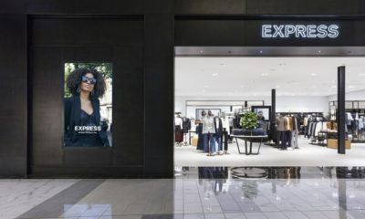
Express Files Chapter 11, Plans to Close 95 Stores
-
 Headlines7 days ago
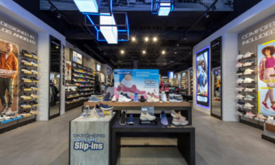
Skechers Debuts Concept Store in Brussels
-
 Eric Feigenbaum5 days ago
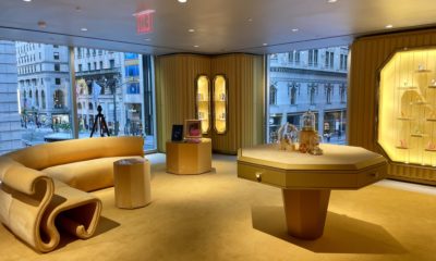
Crystal Clear
-

 Headlines1 week ago
Blackstone to Buy Tropical Smoothie Café
-

 Designer Dozen1 week ago
2024 Designer Dozen: Olga Sapunkova