For retailers in China and around the world, shopping is an art of persuasion. With 85% of shoppers placing color as a primary reason for why they buy a particular product, it is certainly a factor that should be given high consideration during any retail design. Not only are colors important because they evoke certain emotions, but color temperature is also very important in creating atmosphere and driving customer sales. Cycles of light, darkness and color have an effect on our behavioral changes. Get this wrong when designing your retail store and you may put off customers. Get it right and products can look more attractive and lead to increased sales.
Colors in Cultures
Colors can psychologically affect purchases by increasing brand recognition, which is directly linked to consumer confidence, by 80%. It is important to note however that color is not universal. Colors that might entice Western cultures may deter people in China and vice versa. For example, green is the color of infidelity according to Chinese sayings, whereas in the West it represents good luck. In the US red can be associated with love and also anger, while in China it is associated with prosperity. In retail stores in the United States, black is a common design color used throughout spaces, but in China, customers are rarely attracted to dark and dull colors such as black. This color wheel shows the full scale of color representations in many different cultures around the world.
Advertisement
Cater to Your Customer
It is therefore important to consider cultural associations during retail design in a new market. Although the black color is reprehensive death and mourning in western countries, it is not to say that just because your brand or retail design is predominantly black for instance, that you won’t be successful in Europe. Many luxury fashion brands, such as Chanel, Louis Vuitton and Burberry have taken the color black and identified it instead with sophistication and prestige.
A color can mean different things to different people. The import thing is how you communicate your color choice to your target market. Research has shown that different types of shoppers respond to different colors. Impulse shoppers respond best to red-orange, black and royal blue. Budget shoppers respond better to pink, teal, light blue and navy. Traditional shoppers respond better to pink, rose and sky blue. It is clear that knowing your customer, like in any aspect of retail, is fundamental to making the right decision.
Find the Right Balance
Advertisement
By having the correct blend of color and darkness in your store design it is possible to avoid cultural pitfalls. T2, a tea store in Shoreditch, London used a black palette to create space full of dark corners whilst using their orange packaging with flashes of other bright colours to make their products stand out; resulting in them being crowned ‘Store of the Year’ in the 2015 Retail Design Institute awards. Color temperature, a metric measured in Kelvins, also plays an important role in making the packaging appear vibrant and encouraging dwell time in store. Here a warm white of 3,000K is used to achieve this.
Change Your Tune
Customers and employees alike share psychological preferences related to the color appearance of white light. Different spaces have different color needs and these can change over the course of a working day – indicating the need for color-tuning techniques such as dim-to-warm tuning, white color tuning and full color tuning. Color tuning is proving to be an exciting trend in retail store design and is an emerging industry in its own right. Retailers can now tune the color temperature to an optimum level for their merchandise without compromising the location of the display with products that are now widely available.
Adopting the Latest Color Trends to Your Retail Store Design
Advertisement
Color trends may usually begin in the household, but there is no doubt that they can be equally as effective within retail store design. The trend of high striking contrasts, where bright colors mingle with dark tones, much like in T2, allows spaces to activate the senses with an interaction between dark colors that create the illusion of depth and bright colors that envelop the room. An example of which is Prologue, a bookstore in Singapore.
Alternatively, if you wish to achieve a relaxed or optimistic setting, the trend of blurred boundaries with subtle color combinations, such as green and blue or a blend of orange and turquoise, can prove to be effective.
There are many aspects to consider as far as color within retail design is concerned. Overall, individuals should do their homework in order to know what would best suit their customers, their product and their brand. But don’t shy away from trying something new if you believe it would suit all three and result in a positive impact on sales.

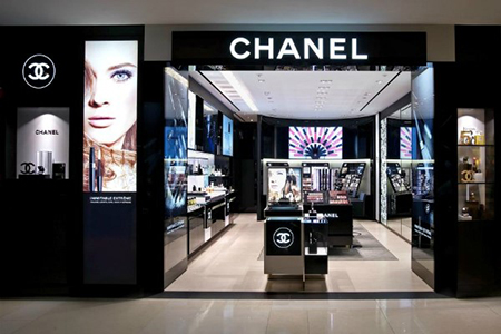

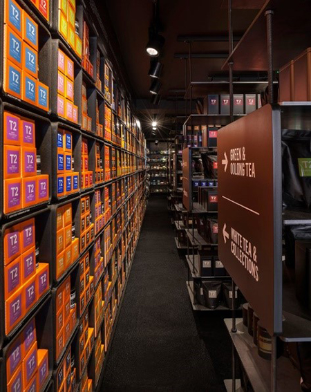
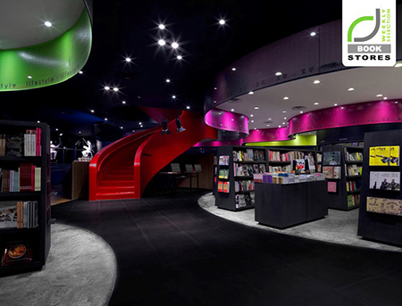
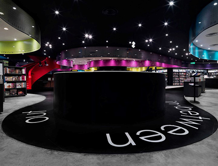
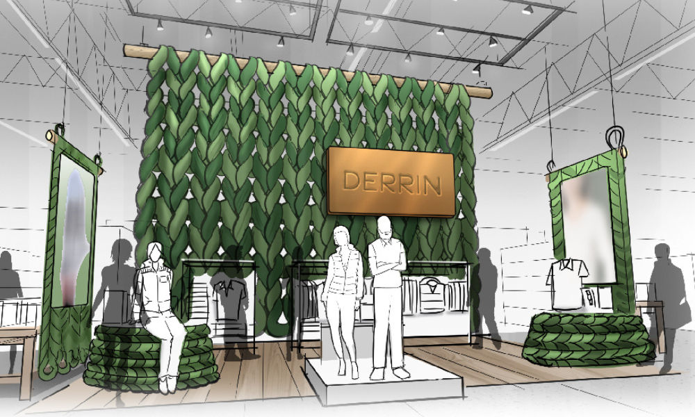


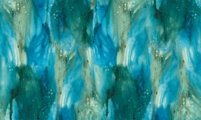


 Photo Gallery1 week ago
 Headlines4 days ago
 Headlines1 week ago
 Headlines2 weeks ago
 Headlines1 week ago
 Designer Dozen1 week ago
 Headlines1 week ago
 Headlines1 week ago