Award of merit, Windows: Special themes
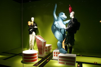
Holt Renfrew, Tokyo Technocolor
Holt highlighted August’s key fashion trend of “technocolor” using plays on space and crowded spaces. Mannequins towered over the landscape of Tokyo, as in a classic Godzilla movie. Each window featured a background with a “technocolor” palette.
Design: Holt Renfrew & Co. Ltd., Toronto – Tracy Fellows, vp, marketing; John Gerhardt, creative director; Tracey Peters, manager, national visual and merchandising; Susanne Shaw, visual presentation manager
Mannequins/forms: Schlappi, Switzerland; Bonaveri, Italy; Pucci, Toronto
Props/decoratives: Tom McAneney, Toronto
Advertisement
Signage/Graphics: Dot and Dash, Toronto
Photography: Jay Robinson, Saw Photography, Toronto
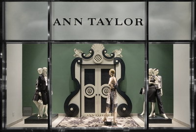
Award of merit, Windows: Fashion Collection, Apparel
Ann Taylor, Spring 2007
The fashion retailer took inspiration from black-and-white photography of Dorothy Draper’s mid-century interiors for its Spring 2007 windows. The season’s graphic achromatic prints and accessories were presented in vignettes using mannequins as “statues.” Shades of green created a counterpoint to the black-and-white details.
Design: Ann Taylor, New York – Victor Johnson, director, visual presentation
Advertisement
Mannequins: Adel Rootstein, New York
Design, Fabrication and Installation: Supercreator, Brooklyn, N.Y.
Photography: Kitty Cheung, New York and Bryan Ellingson, Brooklyn, N.Y.
Award of merit, Windows: Fashion Collection, Apparel
The Bay, Spring 2007 windows
Blue and green vine-like patterns on these window backdrops and glassfronts helped announce the arrival of spring fashions at The Bay’s Toronto flagship.
Advertisement
Design: Hudson’s Bay Co., Toronto – Ana Fernandes, creative design manager; Denis Frenette, director, ISM-HBC
Mannequins: DK Display, New York
Props/decoratives: V&L Associates, Mississauga, Ont.; Danson Decor, St. Laurent, Que.
Signage/graphics: Zebra Studios, Toronto
Photography: James Doiron, Toronto
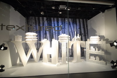
Award of merit, Windows: Fashion Collection, Home
The Bay, Spring Home “Believe In” windows
Using two key trends in home – textured whites and bamboo – Hudson’s Bay Co. created two styles of windows with strong backwall images.
In one series, oversized letters were painted and textured to match the trend each was spelling out. In the other, two-tiered tables matched the fascia of the large letters, telling a story while also relating to the merchandise.
Design: Hudson’s Bay Co., Toronto – Ana Fernandes, creative design manager; Denis Frenette, director, ISM-HBC
Props and decoratives: Colorline Display & Screening, Cambridge, Ont.; Wm. Prager, Toronto
Signage/graphics: Zebra Studios, Toronto
Photography: James Doiron, Toronto
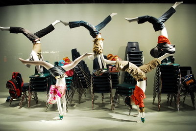
Award of merit, Windows: Seasonal Event
The Bay, Get it Together, Back to School windows
Judges enjoyed the repetition of product, colors and mannequins in this back-to-school promotion for Hudson’s Bay Co. In one window, kid-sized mannequins were in perfect form doing handstands in the school lunchroom.
Client: Hudson’s Bay Co., Toronto – Ana Fernandes, creative design manager; Denis Frenette, director, ISM-HBC
Mannequins/Forms: Pucci, New York; DK Display, New York
Props and decoratives: Umbra, Toronto; Bel-Par Ind., Surrey, B.C.
Signage/graphics: Zebra Studios, Toronto
Photography: James Doiron, Toronto
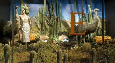
Award of merit, Windows: Seasonal Event
David Jones, The Fabulous Festival of Fantastic Flora Spring Flower Show
Letters of the alphabet gave passersby a hint of the flowers and animals displayed in the retailer’s annual flower show windows, such as “O” for ostrich and orchids.
Design: David Jones Ltd., Sydney – Alisha Wilson, window specialist; Lisa Lubar, stores visual merchandising manager; Elizabeth Street Store visual merchandising team
Flowers: George Low, Sydney
Outside Design Consultant: Flash Photobition, Sydney (printing vinyl, backdrops and ticketing)
Photography: Brett Cornish Photography, Sydney, Australia
More Awards of Merit here.


 Headlines2 weeks ago
 Headlines2 weeks ago
 Headlines2 weeks ago
 Headlines6 days ago
 Eric Feigenbaum5 days ago
 Headlines1 week ago
 Designer Dozen1 week ago