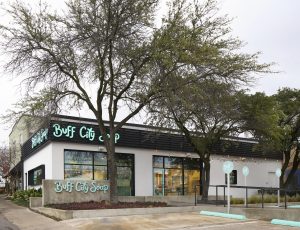
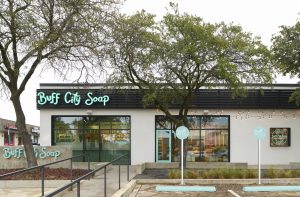
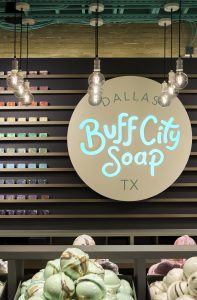
WITH A REBRAND in the works, artisanal soap company Buff City (Dallas) knew the best way to slide into success was to pivot – in style, not substance. Teaming up with CallisonRTKL (Baltimore) at the height of the Covid pandemic, the team came up with a brand new prototype design for retail that was scalable and customizable for different locations, with a kit of parts that allows for seasonal story changes.
The new store in Dallas, Texas, is “fun, playful and interactive,” says Randi Lawrence of CallisonRTKL, the project’s Senior Associate Designer. “The target customer is everyone, from the 10-year-old who wants a bath bomb to the 50-year-old who’s looking for great-smelling laundry detergent. We took the design in a whimsical direction, finished with the theater of in-store creation. It was a labor of love.”
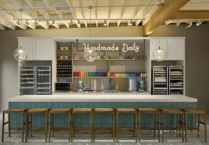
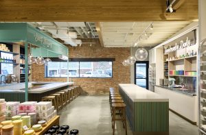
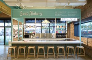
There are two distinct zones within the store: retail and experiential. It’s the latter that Lawrence calls the standout features of the store. “At the front, there’s a soap makery, surrounded by bar stools. Customers can linger here for consultations on skin allergies or scent preferences, then watch as their customized soap is made before their eyes,” explains Lawrence. “We wanted to create a sense of transparency and trust between brand and customer, so we created an open kitchen – messy and imperfect – inspired by a bakery. Soaps are made here and cured on baking racks. The frame that surrounds the kitchen is in the Tokyo green brand color, which pops up at other experiential moments. It’s a trademark of the brand and a traveling piece of architecture.”
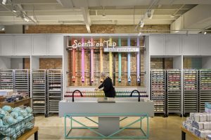
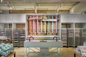
Elsewhere in the store is a sample sink where customers can try out laundry detergents, as well as the “Scents on Tap” display, designed to appeal to the “scent-obsessed” customer. “It’s a series of vertical tubes, like beer taps, highlighting the scent profiles of best-selling products for customers to test,” says Lawrence. “We included these moments to empower the customer journey.”

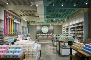
The brand’s “Tokyo green” color is seen at experiential/interactive touchpoints throughout the space.
Other fixtures are neutral and residential, like a bookcase and dining tables, allowing bright products to stand out. Overall, color is a powerful tool in this space. “We represented the duality of respecting the nostalgia of farmers’ markets while looking to the shopping experience of the future with the open-to-structure ceiling, which is half green, half white,” Lawrence says.
The full spectrum of the rainbow can be seen from the outside. Lawrence explains the importance of scent to the brand’s identity, so leaving the store’s doors open to entice customers into the space is part of the retailer’s strategy. It’s this curb appeal, along with a “Willy Wonka-esque” in-store experience, that’s putting Buff City at the top of shoppers’ to-do lists.
PHOTO GALLERY (9 IMAGES)
Photography: DROR BALDINGER FAIA, SAN ANTONIO, TEAXS
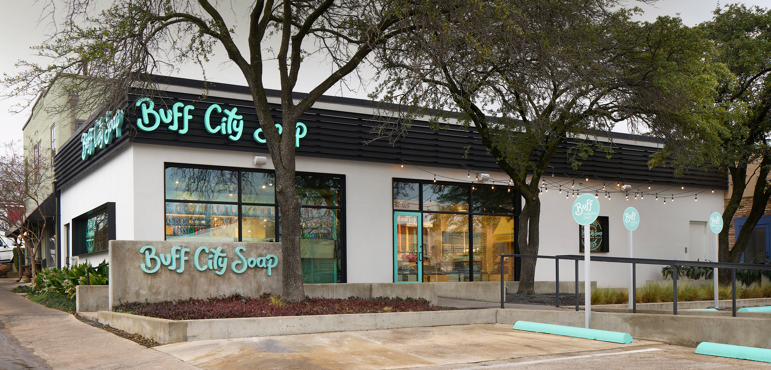
 Photo Gallery1 week ago
 Headlines4 days ago
 Headlines1 week ago
 Headlines2 weeks ago
 Headlines1 week ago
 Designer Dozen1 week ago
 Headlines1 week ago
 Headlines1 week ago

