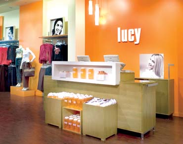
Since its inception as an online clothing store, lucy has chosen its signature orange color to deliver the message that this women's activewear brand is vibrant, energetic and distinctive.
When the brand moved into bricks-and-mortar in 2001, that brand color announced its philosophy with a fun and playful store concept. Its “where style meets sport” theme was delivered by images of an “army of women,” displayed in oversized graphics throughout the store. The message was clear: lucy was a brand for women of all ages from a variety of activities and fitness levels.
However, after four years in the retail arena, lucy discovered that it was a little off on its target audience.
“We see moms and daughters shopping in our stores so we need to be relevant to women in their 20s all the way to their 60s,” says Bonnie Choruby, lucy's senior vp, merchandising and marketing. “But we now know that 40 is really our sweet spot.”
Deciding that this mature demographic desires a more sophisticated store environment, lucy turned to Big Red Rooster (Columbus, Ohio), the design firm that had worked on an earlier lucy store prototype. Now it was being asked to refine the store experience.
Diane Rambo, Big Red Rooster's senior vp and creative director of retail, says the new lucy needed to feel active, yet in a feminine and fresh way. “It's about a lifestyle, not an age,” she says. “The clothing is as suited for the gym as it is for the supermarket.”
Advertisement
The first stop in that maturation makeover, which debuted in San Jose, Calif., was the storefront, which originally had made that loud orange statement.
“In some of the first boutique stores, the storefront came off as a little too young,” says Big Red Rooster's president Aaron Spiess. “Also, since the brand is expanding and moving farther out from its base in Portland, Oregon, we needed to convey lucy's image more quickly.”
So designers moved the signature orange statement to the backwall, creating a focal point inside the store, while the storefront was toned down with large windows and awnings. Big Red Rooster also created a kit of parts that would work in lifestyle centers, malls or street settings as lucy expands into the Midwest and Northeast.
Inside, the brand sought to better tell its product stories and reconfigure its navigation and layout. “We never wanted overt signage,” says Choruby. “We think that's very sporting goods.”
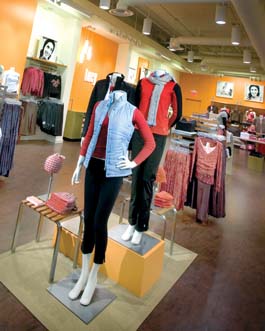
lucy's product selection includes its own private lucy label and well-known athletic brands, such as Nike, adidas and Puma. Apparel comes in sizes 0-18 and is arranged by lifestyle category, such as “balance,” “energy” and “essentials,” not by some sports activity. So mannequins were introduced to relate those product stories to shoppers at the entrance and at focal presentations within the three product areas.
On the surrounding walls, framed black and white photographs of everyday women, not professional athletes, reinforce the brand's active lifestyle. “The new graphics help tell the story of who we are right when the shopper walks in the door,” says Choruby. “Before, people had to approach the product to understand that we were all about 'active.' Now, those photos emphasize that these are regular, mature gals having fun and being active. And the apparel will make them feel good.”
Advertisement
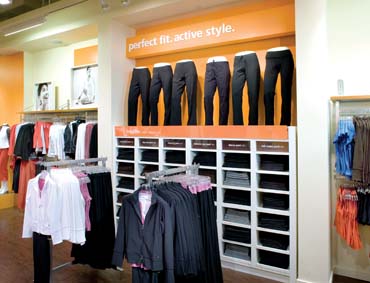
To further distinguish itself from other sportswear retailers, lucy has a “Fit Story” to communicate at the Pants Wall, where many sizes and styles are displayed. In the new concept, designers used mannequins and a new slogan, “Perfect Fit. Active Style,” to further turn that wall into an anchor within the store. “The Fit Story is important to our brand,” says Choruby, “so we built a monument to it.”
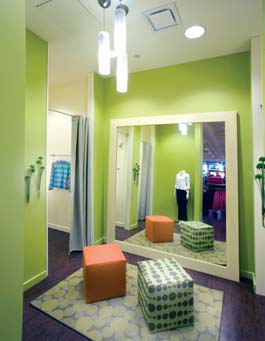
Once a shopper has found what she thinks is that perfect fit, she is directed to a new salon-inspired fitting room. Out is the more sporty decor and in are more relaxing tones of green (to complement the brand's signature orange) and ottomans and flowing curtains, creating a place for lounging.
Further refinements to the lucy environment were made by replacing the original cement and light wood flooring with a warmer, dark wood. A new fixturing and rail wall system designed by Big Red Rooster better accommodates lucy's frequent product changeouts. And artisan pendant lights hang from the white ceiling above focal areas.
“We're giving lucy shoppers a little more grown-up feel,” says Rambo, “because we now know who they are.”
Client: lucy Activewear, Portland, Ore.
Bonnie Choruby, senior vp, visual merchandising
Dawnn Eikenberry, store rollout manager
Brittni vonAhlefeld, visual merchandise manager
Design: Big Red Rooster, Columbus, Ohio
Aaron Spiess, president
Diane Rambo, senior vp, creative director, retail
Dana Fleming, vp, merchandising
Jenine Monks, retail design specialist
Karen Rumora, senior retail design specialist
Dustin Adams, senior communications specialist
Advertisement
Architect: Epoch Design Group Inc., St. Louis
General Contractor: Hycel Inc., St. Louis
Fixtures: Grand + Benedict, Portland, Ore.
Furniture: Silverthreads, Columbus, Ohio
Lighting: Prizim Lighting Ltd., Columbus, Ohio
Mannequins/Forms: Lifestyle Forms and Display Co., New York
Signage/Graphics: International Concept Group, Mission Viejo, Calif.
Photography: Mark Steele Photography, Columbus, Ohio


 Headlines1 week ago
 Headlines1 week ago
 Headlines1 week ago
 Designer Dozen2 weeks ago
 Headlines5 days ago
 Headlines2 weeks ago
 Designer Dozen6 days ago