Last month, 50,000 designers descended on Chicago’s TheMart for NeoCon 2017, the annual commercial interior design exhibition and conference. From the moment I touched down Sunday night till the time my flight took off Thursday morning, it was a nonstop race around the exhibit hall, from showroom to showroom, jumping from seminars to cocktail parties. In other words, it’s three days of super-charged inspiration and innovation.
This year, I wore three hats at NeoCon. First, as the IIDA Ohio/Kentucky vp of student relations, which gave me the awesome responsibility and pleasure of introducing six interior design students from three different colleges to the immersive, and sometimes intimidating, experience that is NeoCon. These students had been nominated by their schools to participate in the annual IIDA Student Design competition and partake in the career boot camp, for which I was a panelist. Along with The Ohio State University graduate student Emily Bell, I was honored to participate as a speaker in the parallel conference, presenting the findings from our human-centered LED research project, which I introduced in my VMSD.com blog last November. Somewhere in there, I also found time to tour as many of the showrooms as possible so that I could bring all of you on my journey of inspiration though the emerging 2017 design trends.
Pantone Paves the Path
As to be expected, many of 2016’s most popular trends reemerged. We saw the pale Pantone colors of “Serenity” (sky blue) and “Rose Quartz” (blush) in many showrooms, however, this year, they appeared in a wider variety of rich textures, from velvety mohair to glossy leather. To anchor the lightness of these soft shades, manufacturers paired them with complementary darker colors. Combined with more vibrant colors and tones, these pastel colors created balance to produce a more energetic space. Combined with whitewashed wood, the palette remains soft and airy, creating a tranquil atmosphere.
Photography: Rebekah L. Matheny, Columbus, Ohio
This year’s Pantone Color of the Year, Greenery, builds off of one of last year’s trends, “need for nature.” Whether it was the pale mint green we saw last year or this year’s more saturated, “grassy” shade, the color was paired with other warm-neutral tones to create a complete nature-inspired palette. The revival of monochromatic color palettes has been developing over the last couple years, and NeoCon brought that out in full force. From a gradient of shades of blue in a dining area to mixed shades on a single piece of furniture or within a single print, monochromatic and gradient color palettes and patterns in grounded in Greenery, Serenity, and Rose Quartz stood out. These three colors surfaced as players within other emerging trends and even went on to define a trend completely as with “Millennial Pink” (a non-Pantone color craze).
Advertisement
Photography: Rebekah L. Matheny, Columbus, Ohio
Pink Power
From fashion and pop culture to credible journalists, everyone has been talking about Millennial Pink. (Its origins are debated: Some online speculate that it was Wes Anderson’s “The Grand Budapest Hotel” in 2014, or the rose gold iPhone in 2015 or Pantone’s Rose Quartz in 2016.) Over the last year, we’ve seen this slightly peachy, dusty rose pink take on a whole new meaning. With global cultural movements such as the January 21, 2017, Women’s March embracing hot pink as its identifying color, giving the once-considered feminine color strength, it’s become embraced by both women and men as a color of empowerment.
Although some articles recently have projected that the Millennial Pink trend is fading (and to start preparing for the return of red), that certainly wasn’t the case at NeoCon this year. Pairing the pale shade with strong colors like black and shades of dark gray, the tone takes on a desired strength, providing a whole new meaning to a space. Accessorizing an environment or merchandising display with cheerful tones, like sunshine yellows, can make high-contrast combos a bit more approachable and friendly. Including natural tones of green also allows for this color combination to work with a biophilic material concept.
Photography: Rebekah L. Matheny, Columbus, Ohio
Without a doubt, pink has become a powerful color, especially as a more vibrant version of the hue adorned the heads of millions of protesters in the cold U.S. streets earlier this year. Brighter and deeper shades of fuchsia — still in the pink family but not a true red — made its way from floors to furniture. These shades can stand strong on their own, become an accent element, or can be mixed with black and gray to give it even more might. A gradation from pink to gray or a monochromatic palette certainly makes a statement. One carpet company even tackled this vibrant shade by designing a bold, largescale graphic floral print with a companion in black and white.
Advertisement
Photography: Rebekah L. Matheny, Columbus, Ohio
Mineral Marvels
The “need for nature” has developed into the integration of many different outdoor elements. As we’ve seen in the past, including live greenery and natural woods, brings nature to life within a space. However, this year, we reach into the earth to uncover the beauty of the rock layers below. Natural stone is timeless, but it’s through unique nature patterns, such as petrified rocks, that natural stone and simulated acrylics are slicing through Earth’s layers to bring a new depth to any natural palette. Embracing the reflective quality of precious metals, shimmering textures have been integrated into textile weaves for carpet and upholstery, which bring depth to LVTs. The Japanese have a term, wabi-sabi, which loosely means “the natural aging and weathering of things.” From table surfaces to floor panels, metals get down and dirty by embraced this notion and emphasizing the natural weathering process from nature. Elevating patina-finished metals, one showroom even reinvented their iconic furniture pieces to make a fashion-forward statement through high-polished mixed materials. Sandwiched between layers of glass or acrylic, metals can be layered into transparent architectural elements within a space.
Photography: Rebekah L. Matheny, Columbus, Ohio
Zooming out to look above the surface at rock formations and the Earth’s surface, new patterns and colors are informing carpet and LVT patterns. For one manufacturer, biophilia is its company’s foundation, so it was only natural to take inspiration from the dried, cracking patterns of the desert. Could this collection be speaking to a larger societal issue of climate change?
Photography: Rebekah L. Matheny, Columbus, Ohio
Advertisement
You’re So Classic
Some things are classic and never go out of style. Black and white, in isolation or in combination, is one of those. No matter how they appear, whether in Nero Marquina or Arabesto marble, mosaic tile patterns, or textiles, these two colors always bring an accessible sophistication to any space. With the grand opening of the new IIDA headquarters, this combination was made modern throughout the entire space. Upon entry, the graphic gradient mosaic burst pattern sets the stage. The reception desk goes a step further in modernizing this classic by utilizing charred wood, a Japanese technique, shou-sugi-ban, as the main surface. Each bathroom also had its own black-and-white tile pattern. Back in the manufacturer showrooms, black-and-white combos appear in bold carpet patterns, lush, textured loop carpets and many different geometric patterns on glass.
Photography: Rebekah L. Matheny, Columbus, Ohio
Making a strong, modern statement, and channeling Jay-Z, black on black (and all-black everything) was running this town. Tying back to the mixed-metals trend, black-on-black appeared as mixture of reflectivity, combining matte black (paint, laminate, wool or other textiles) with semi-gloss and high-polish finishes (leather, metals, stones). Adding textural pattern textiles or carpets or a luscious velvet to the mix takes it to the next level.
Photography: Rebekah L. Matheny, Columbus, Ohio
Activation Station
Last year, we saw a kaleidoscope of color. This year, the underdog trend is all about taking action. Drawing inspiration from the runway (Emilio Pucci, Versace, Prada, etc.) and everyday trendsetters on the street, athletic wear/athleisure provided a point of inspiration for patterns textures and colors. Harnessing the athletic dynamism, carpet patterns created a sense of fast-paced movement in vibrant corals and yellows. Neon versions of these two colors appeared in performance upholstery and mesh textiles.
Photography: Rebekah L. Matheny, Columbus, Ohio
Taking a single color, using a monochromatic palette, and washing it over a space, can transform it into a bright, sunny day. Complementing a bright yellow with a blush Millennial Pink (or softer creams or even a pattern) helps to tone down the solid statement of these vibrant hues. One might be surprised by a carpet manufacture that created a pattern inspired by nature using yellow and orange colors, but when looking at the various lichen colors that occur naturally, you realize that nature does in fact develop a range of vibrant, inspiring colors. While this may be the underdog trend, I think we’ll be seeing a lot more of it this next year.
Photography: Rebekah L. Matheny, Columbus, Ohio
|
|
Rebekah will be presenting at VMSD’s International Retail Design Conference (IRDC), Sept. 5-8, 2017, at The Ritz-Carlton New Orleans, alongside two of her 2016-2017 Ohio State University interior design students, Madeline Cipro and Rachel Herman. They will speak about the importance of retailers using their platform as a channel for promoting environmental and social good. Don’t miss their breakout session, “Redefining the Retail Experience: Designing for a Sustainable Future,” which will take place from 10-10:45 a.m. Thursday, Sept. 7. For more information about IRDC 2017, visit irdconline.com or follow the hashtag #irdc2017 on social media. |
Rebekah L. Matheny is the assistant professor of interior design at The Ohio State University (Columbus, Ohio), where she teaches courses in interior finish materials, lighting design and design studios that integrate a retail brand strategy process. Matheny’s research investigates the sensory perception of interior finish materials and their application in retail design to create an emotional connection between the customer and the brand. Follow Rebekah and her journey with materials on Instagram @rebekahmathenydesign.

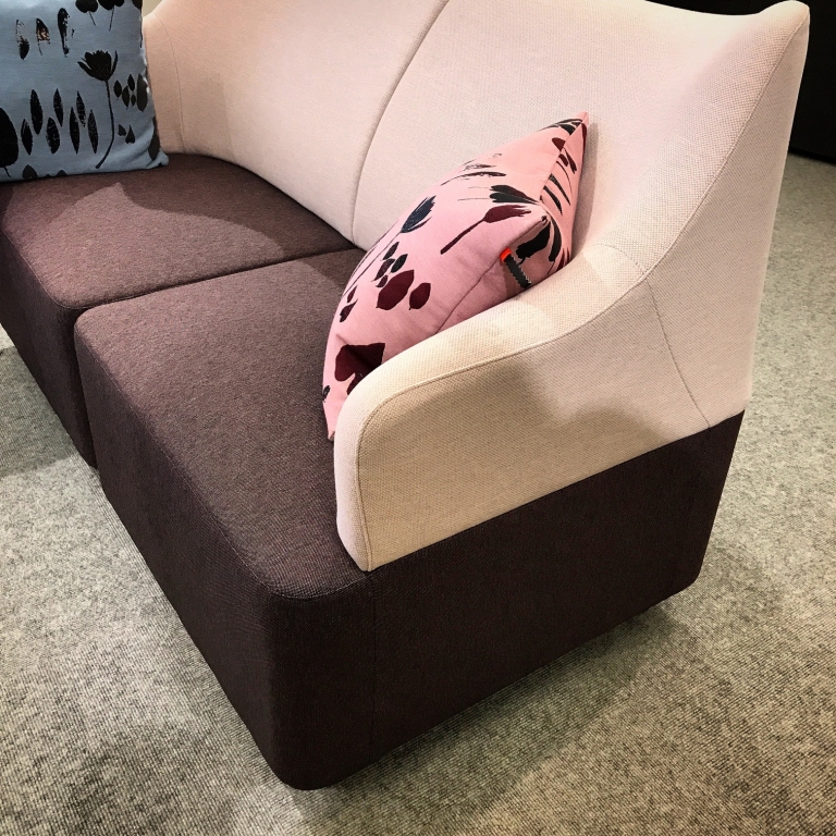
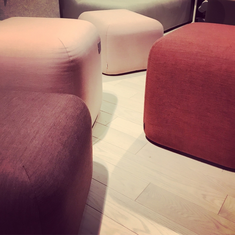
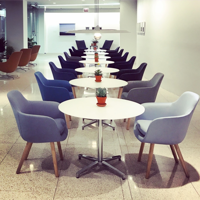

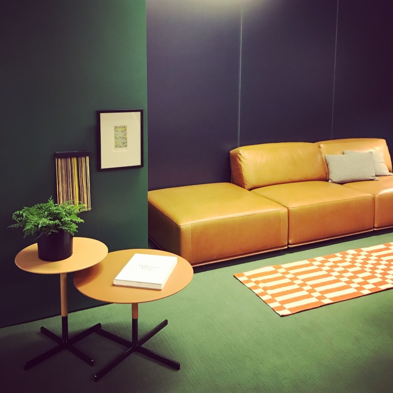
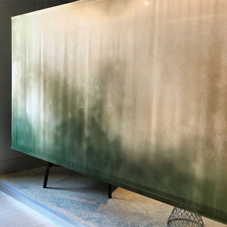
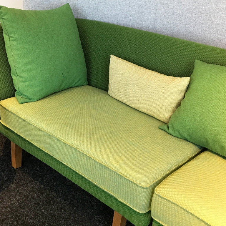
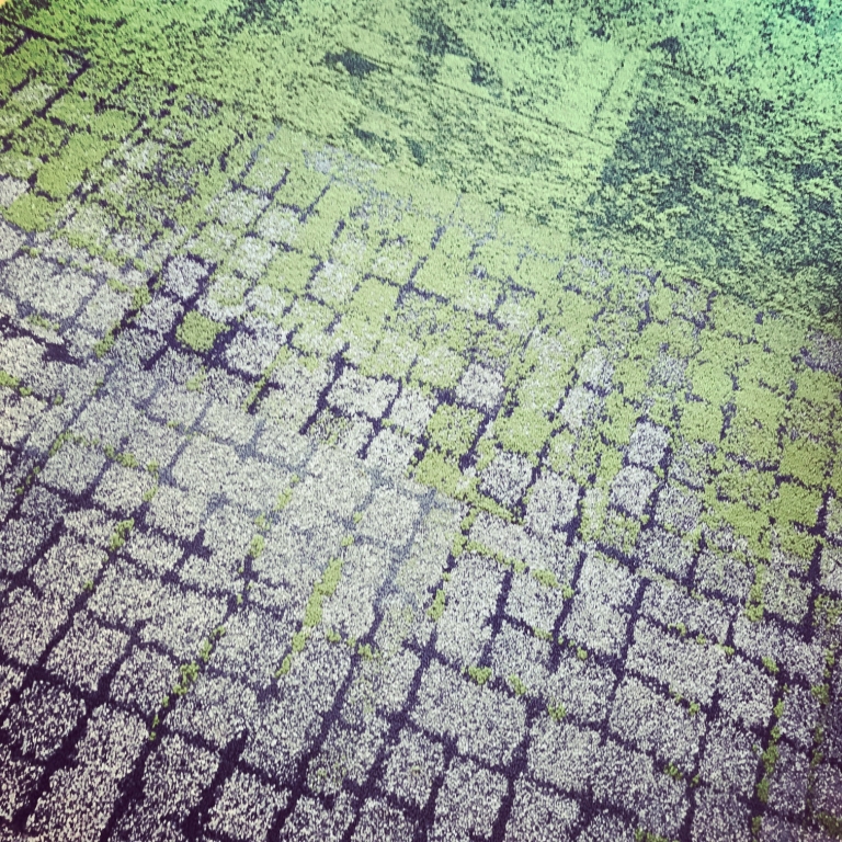
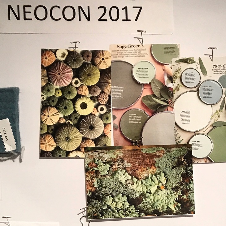
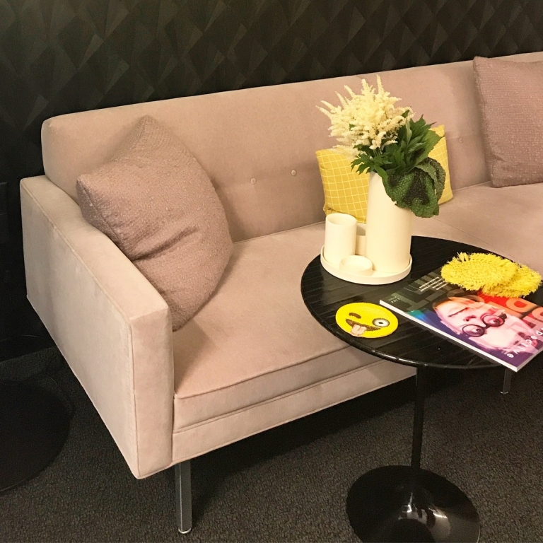
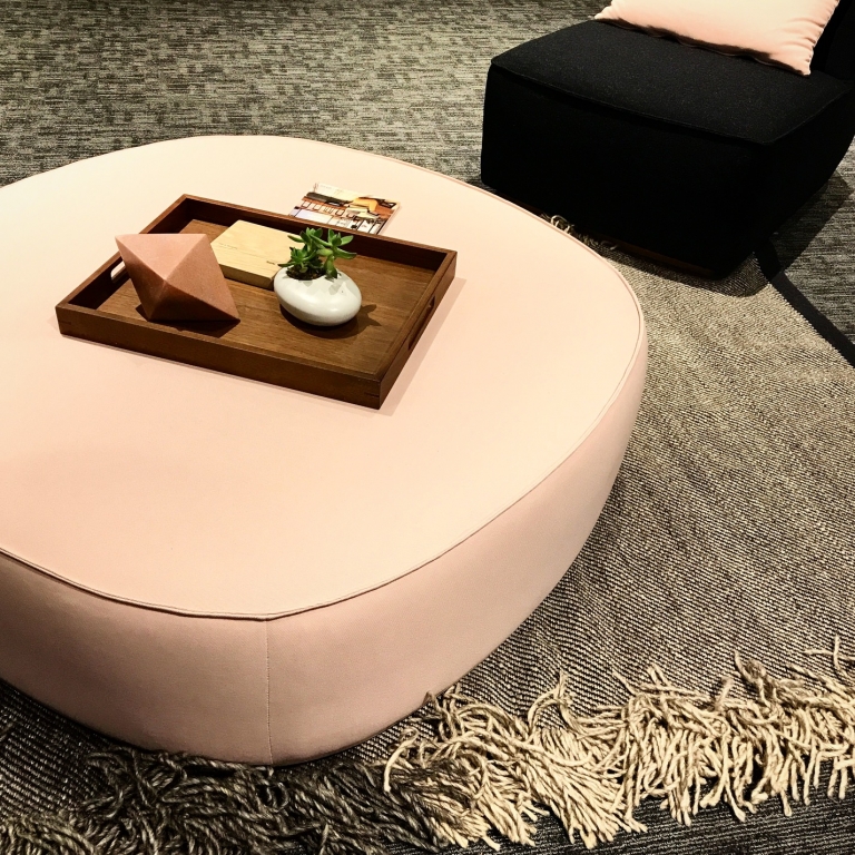
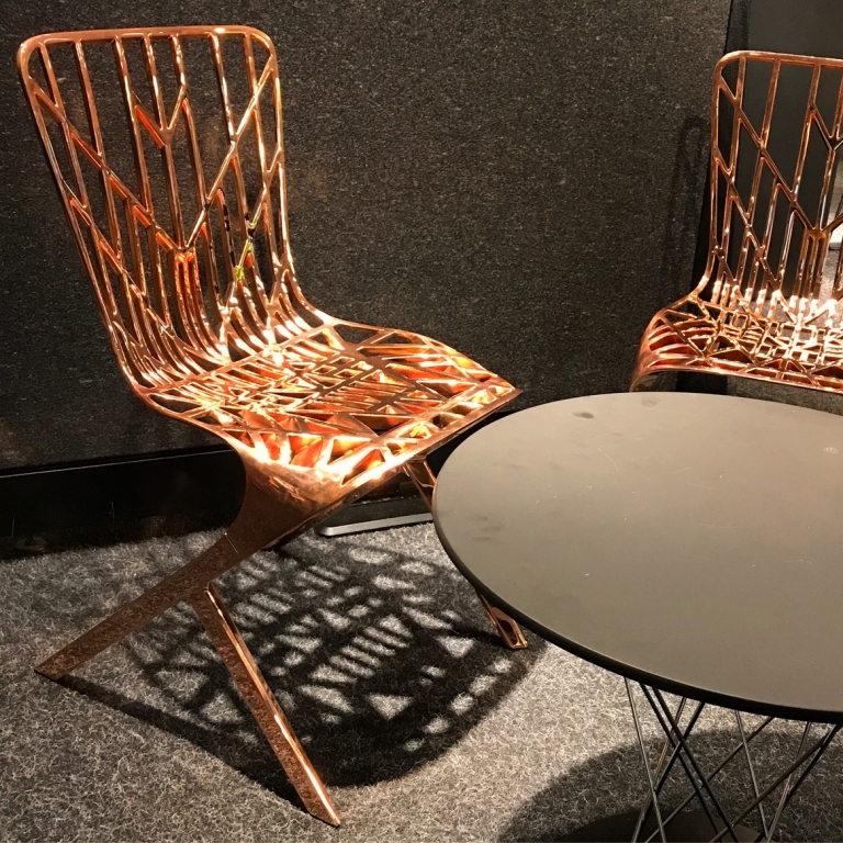
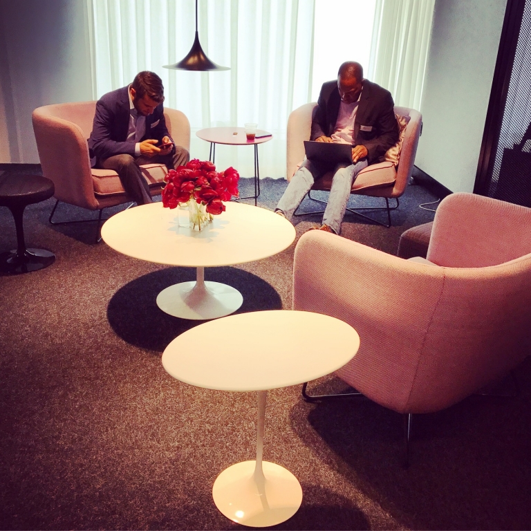
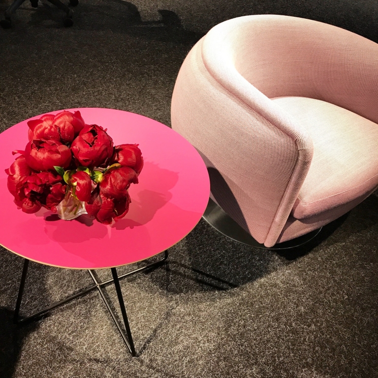
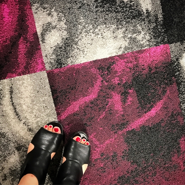
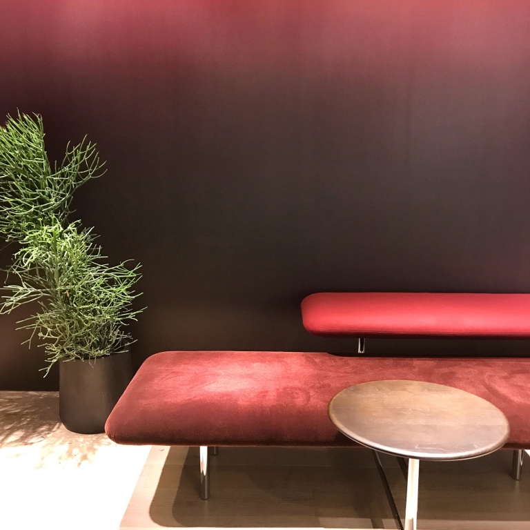
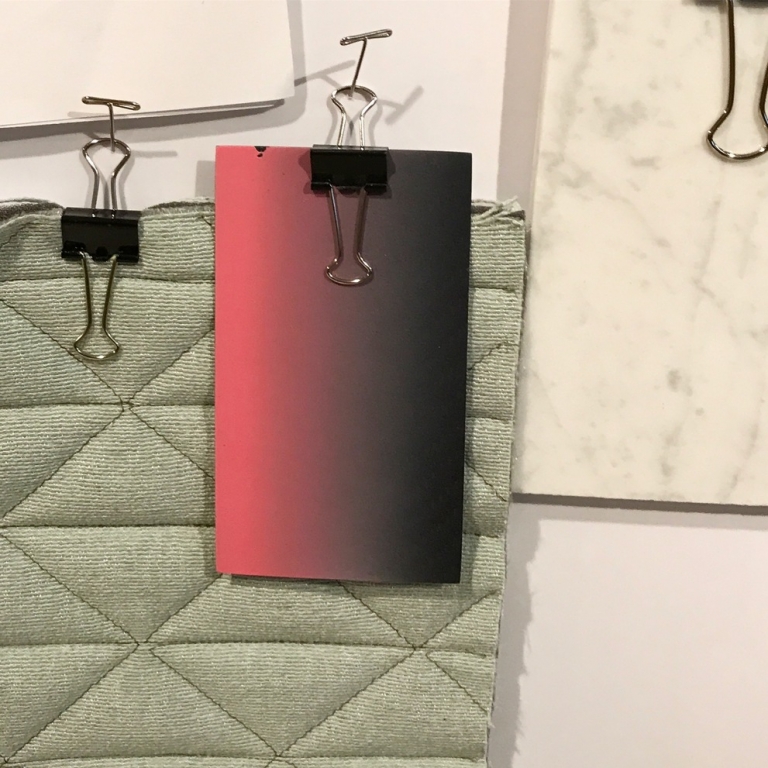
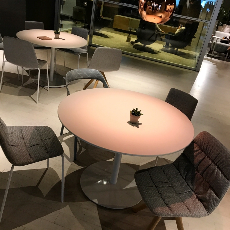
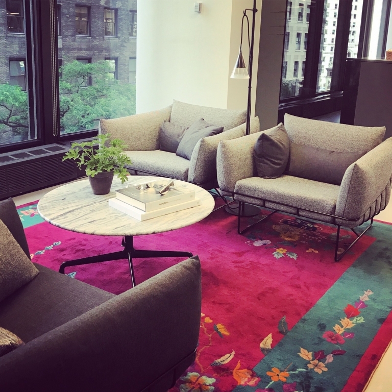
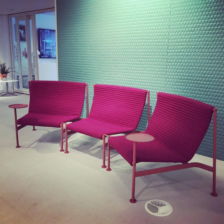
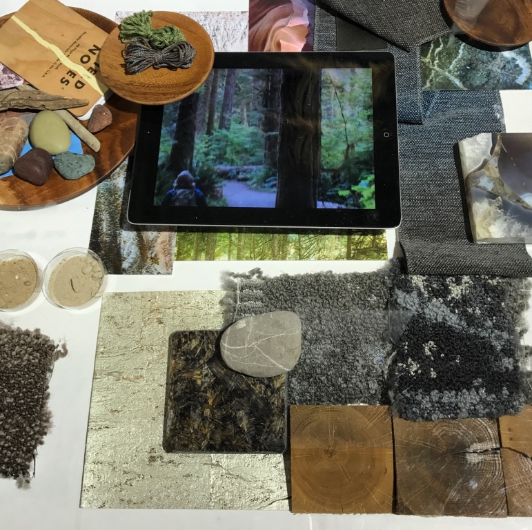

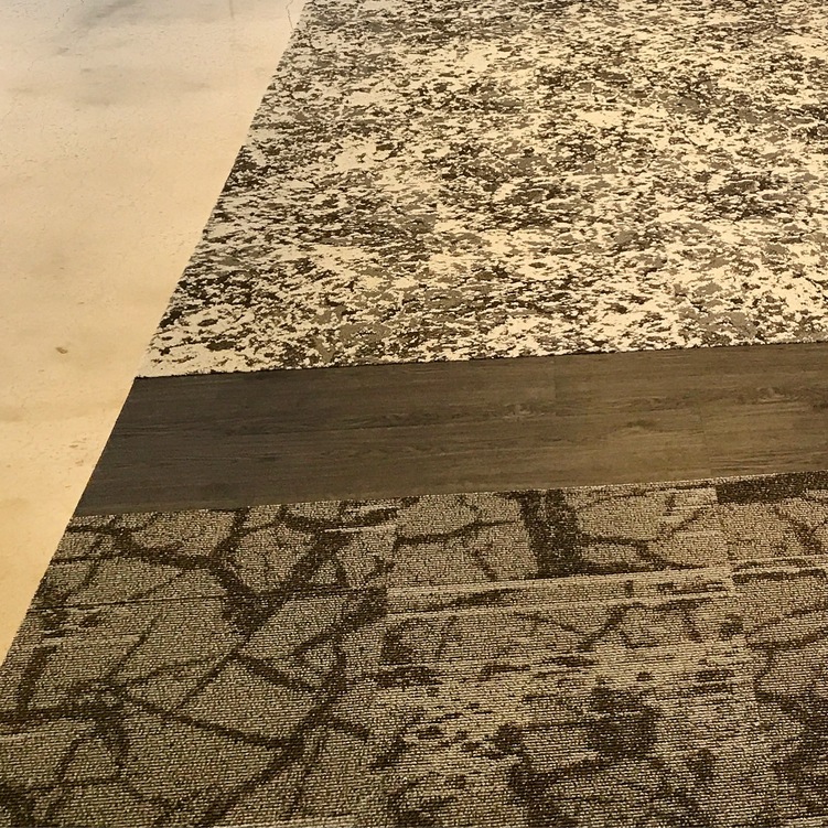

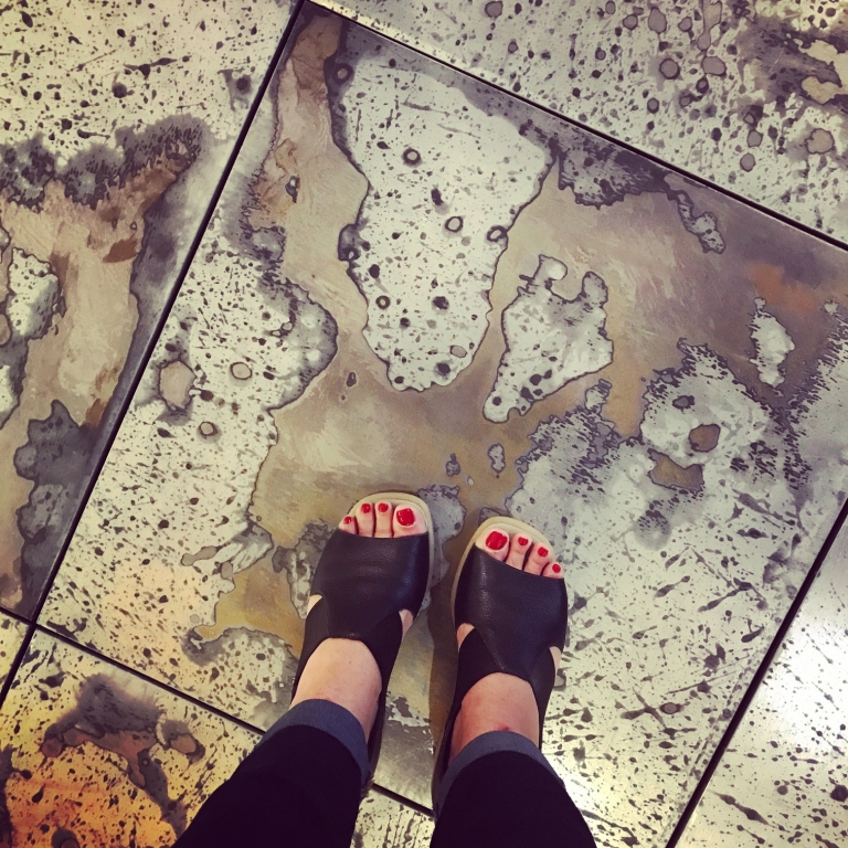
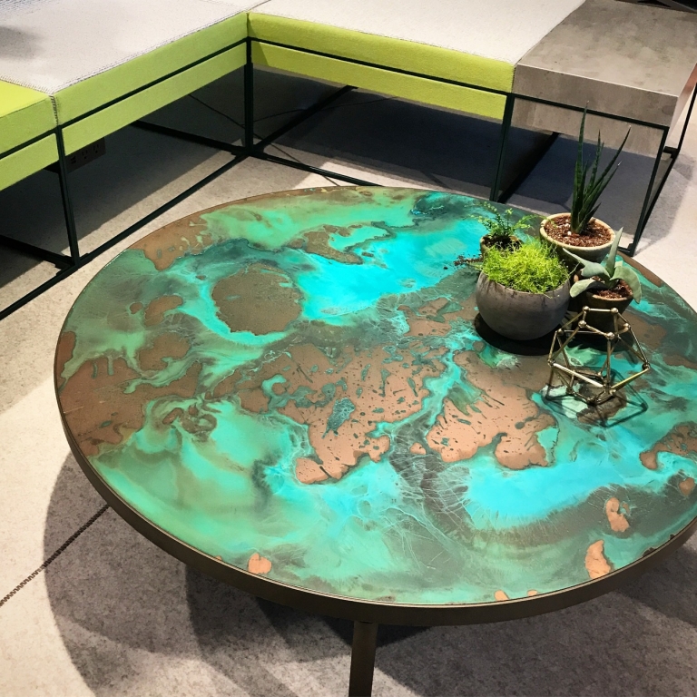
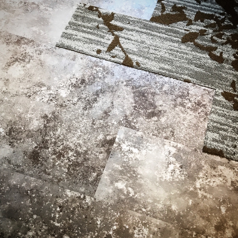
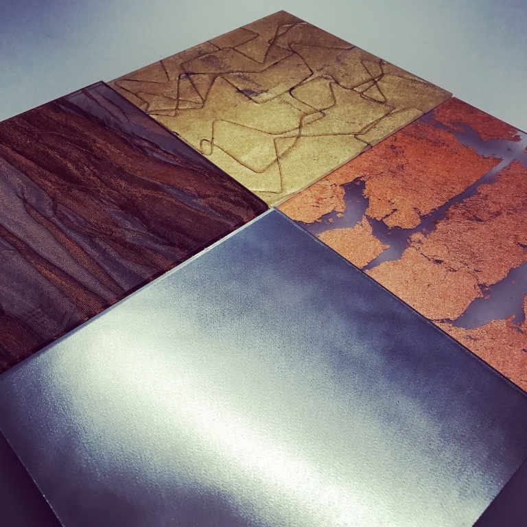
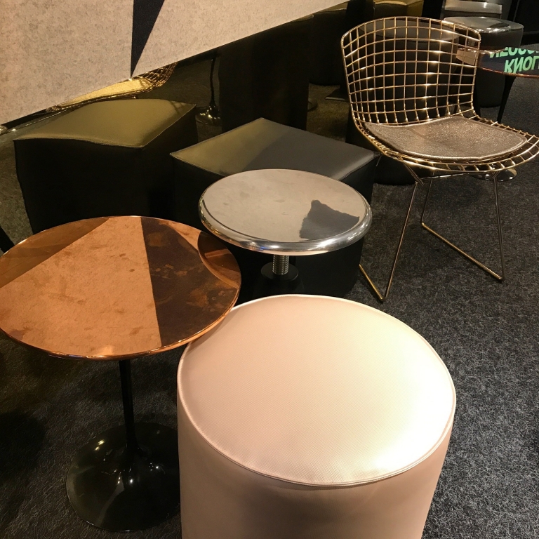
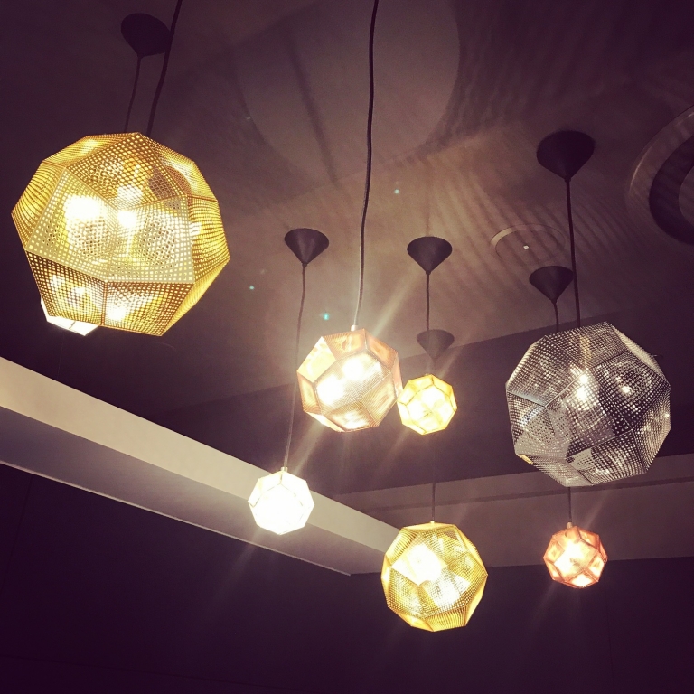
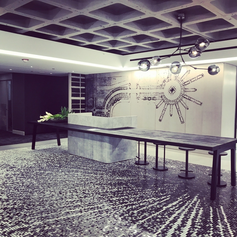
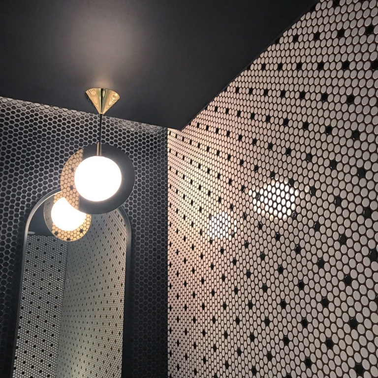
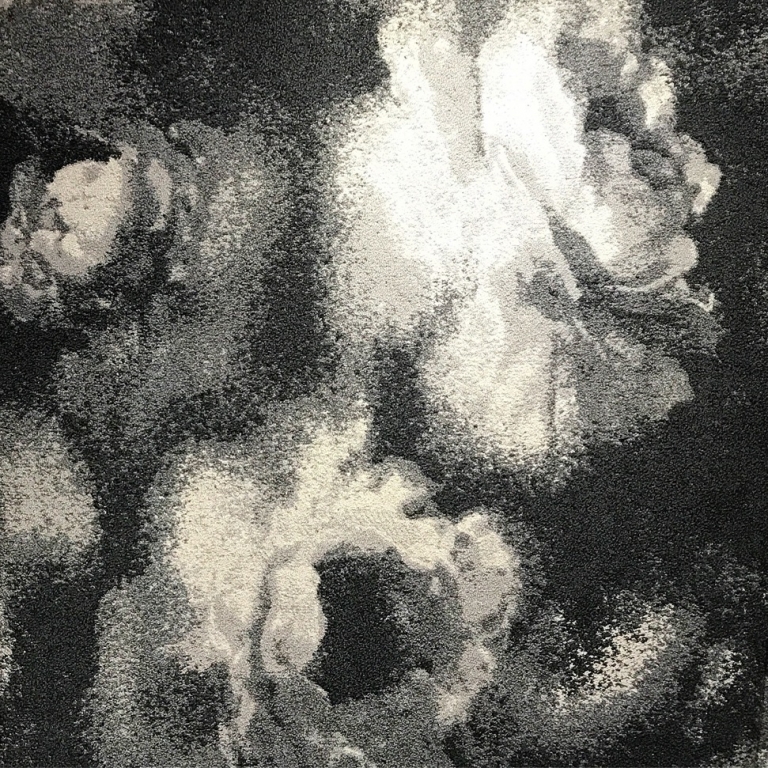
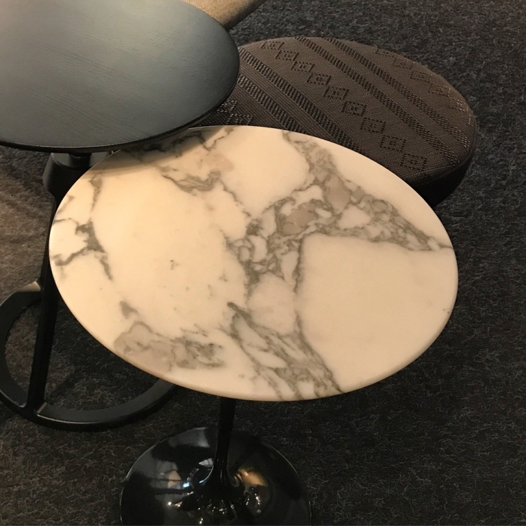
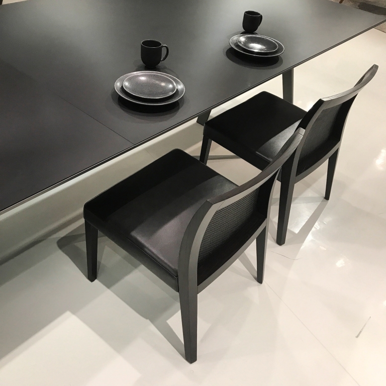


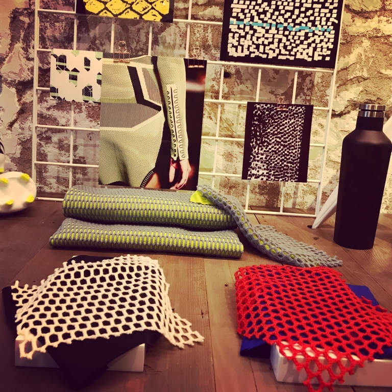

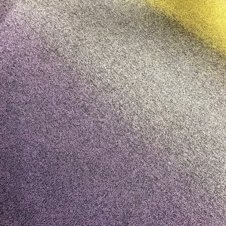
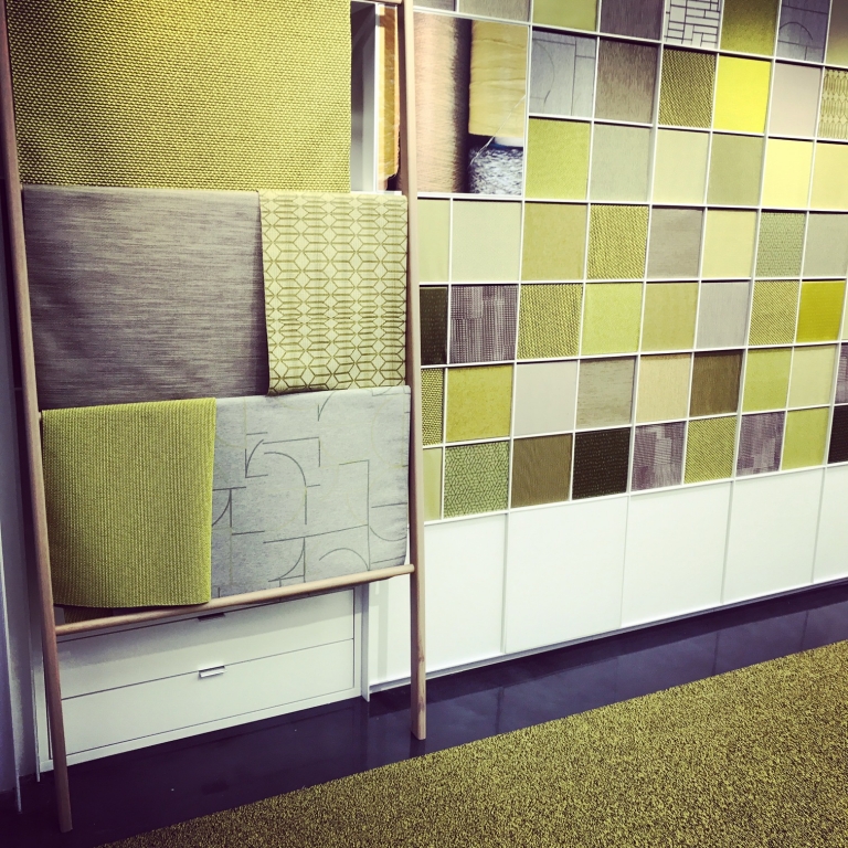
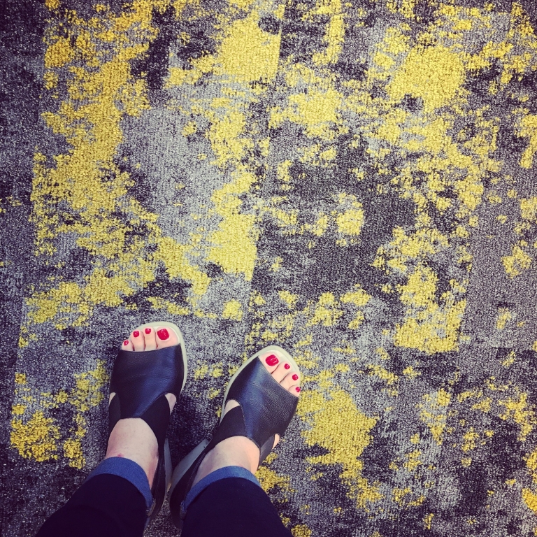

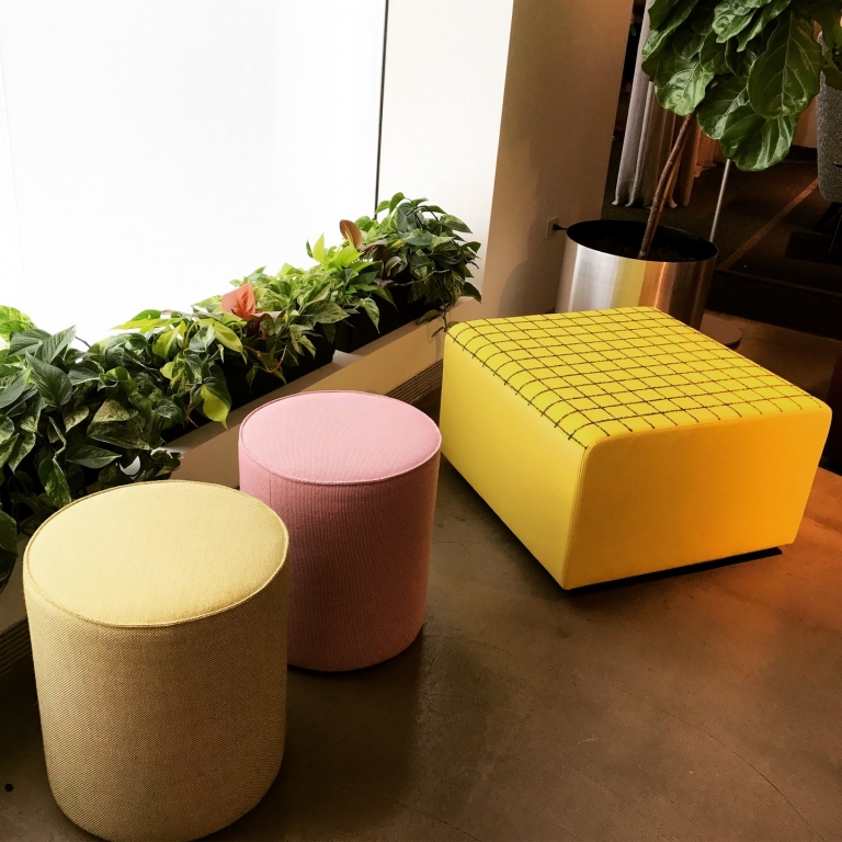


 Photo Gallery1 week ago
 Headlines4 days ago
 Headlines1 week ago
 Headlines2 weeks ago
 Headlines1 week ago
 Designer Dozen1 week ago
 Headlines1 week ago
 Headlines1 week ago