ABOUT VALERIE CRCIAS:
Websites
BIO:
Husband and wife team Valerie Corcias (Argentina) and Dominique Kelly (Brasil) possess a unique southern hemisphere perspective on trends and knowledge related to international visions of culture, ideology, and technology.
Dominique has worked on architectural identity for Luxury Brands such as Louis Vuitton, Hermes, Baccarat… Valerie has worked on product design and development for many brands.
In 2000, they created the PANTONE UNIVERSE consumer brand and signed a worldwide license agreement with PANTONE for conception, distribution, and communication of the Brand.
In 2007, they established Contramundo, an incubator for sustainable projects involving women and children’s education in a Brazilian fishermen’s village, generating content based on sustainable values and integrating processes which provide solutions through art and notions of equity, sharing, and exchange.
From their experience with color and commitment to creating social, technological, and human connections, they have created mycoocoon, a worldwide project to improve well-being by balancing energy through color experiences and natural elements that awaken the senses.
The emotive elements of color have been our field of expertise for more than 30 years and have become part of our DNA.
SHOW INTRO:
Advertisement
Welcome to the NXTLVL Experience Design podcast.
These dynamic dialogues based on our acronym DATA – design, architecture, technology, and the arts crosses over disciplines but maintains a common thread of people who are passionate about the world we live in and human’s influence on it, the ways we craft the built environment to maximize human experience, increasing our understanding of human behavior and searching for the New Possible.
The NXTLVL Experience Design podcast is presented by VMSD magazine.
VMSD is the publisher of VMSD magazine and brings us, in the brand experience world, the International Retail Design Conference. The IRDC is one of the best retail design conferences that there is bringing together the world of retailers, brands and experience place makers every year for two days of engaging conversations and pushing the discourse forward on what makes retailing relevant.
You will find the archive of the NXTLVL Experience Design podcast on VMSD.com.
Thanks also goes to Shop Association the only global retail trade association dedicated to elevating the in-store experience.
Advertisement
SHOP Association represents companies and affiliates from 25 countries and brings value to their members through research, networking, education, events and awards. Check then out on SHOPAssociation.org
In this episode I talk with Valerie Corcias Co-founder, with her husband Doninique Kelly, of mycoocoon and the BrainBo App.
Based on chromotherapy, the Mycoocoon Color-Institute combines the ancestral beliefs about color with the aid of technology and immerses its users in a color bath that supports health and wellbeing.
First though, a few thoughts on color…
* * *
When I was young, my mom put me in a painting school.
Advertisement
She recognized that I loved to draw and every Thursday I would run down to a small painting studio about a mile from my home and immerse myself in the world of art.
For a lot of years, I did most of my early art experiences in black and white.
It seemed like the pencil felt comfortable in my hand and I loved exploring through drawings tonal value relationships, shades and shadows and creating textures.
But most of it was in black and white.
Drawing in black and white simply seemed to be easier and I always believed that color was a greater challenge.
I found color to be complex and to be honest, somewhat scary. I was often concerned that in mixing colors I would make mud rather than magic.
It wasn’t until I got to architecture school and taking watercolor courses with a deeply influential person in my art life path – Jerry Tondino – that I began to understand color.
It seemed like a natural progression to understand light first and then move to color and color theory and how color could be leveraged to increase the impact and expressiveness of artwork.
Even now, with the paintings that I do all of my reference photos are in black and white. The color that I choose is of my own making.
I guess you could say I’ve become more comfortable with understanding how to use color.
That said, I think that my experiments are in still trying to understand colors – primaries and complementary colors – first or second or third order complementarities to the basic color hues that I’m trying to use in paintings.
I’ve also come to understand that I tend to gravitate towards a certain range of colors. Mostly in the fuchsias and purples and dark blues.
You don’t often see many of my paintings in green for example. For some reason green just doesn’t seem to go in my body well, even though I know that the color green has a relationship to emotions and well-being that are fundamental because we came from swinging through forests and living for much longer in a verdant green jungle than a concrete one.
When I’m using deep blues, purples and fuchsias I have a sense of calm. I’m not really sure why that exactly why that is but I appreciate that it is part of my color personality profile.
This doesn’t necessarily mean that my entire clothing wardrobe for example is fuchsias and purples although I must admit those colors do pop up in patterns. There was a period of time where I was focused on buying shirts from designers like Robert Graham whose color and pattern were I believed extraordinary. I’m also aware that many of the people in my industry, designers, architects and other creatives tend to wear black a lot.
I’m not sure where it is that black actually emerged as the uniform for creatives because it seems to be a color that is dead.
Or maybe it’s the sum of a pigments combined together creating black. So, you could consider black as the sum of all color pigments as being ‘color inclusive.’
I know that color in light and color in pigments are different things but they still both are wavelengths.
Color pigments that we perceive in the world around us are wavelengths that are not absorbed by the molecules of whatever it is we are looking at and they are reflected back to us and then perceived as color.
Then there is color as light.
When you combine colored light you dont perceive them as black like those that are used in pigments but combined together to create white light.
Understanding the physics of light and color have been influential in terms of how I understand painting and reflected colors and how the colors of one object influence the surrounding objects.
A pink object in a white room necessarily makes part of that room pink, or some version of pink, as the wavelengths are reflected from the object and also influences its surroundings.
This brings me to the idea that color in our surroundings has a direct effect on how we feel.
If I happen to love fuchsia, purples and dark blues surrounding myself with these colors may also effect my emotional state.
It’s often said that red for example stimulates love, hunger or aggression or it is a color that induces a sense of fear…
whereas oranges induces a sense of energy or happiness and vitality…
yellow also is a happy color with a sense of hope…
it also happens to be the color in the visual spectrum that is most easily perceived by the human eye. Think about it next time you’re at a sporting event and look through the audience you’ll likely be able to see the guy wearing a yellow shirt much more quickly than someone who might be wearing something like a deep purple or blue…
green has a sense of new beginnings or a sense of abundance and obviously nature…
and blue induces a sense of calm and perhaps often related to the idea of sadness…
hence the Blues as a music genre are connected to the lament of painful life circumstances as expressed through music…
purple has been related to creativity and royalty and creating the pigment purple was originally made from crushing seashells. It was so expensive to produce that it was often only available to aristocracies and royalty.
black connotes a sense of mystery to me and maybe even evil ..I was often not particularly fond and felt afraid of the dark…
but strangely, at the other end of the spectrum, it has a sense of elegance…
black tie events…
and not surprisingly, we often say that it’s a gray and moody day when overcast and raining.
All of this leads to the idea that we have over time attributed certain values and emotions to different colors.
Therefore, it’s not surprising that during the early goings of the COVID pandemic people were rushing out to renovate their homes, since they were spending more time in them, and changing the colors of their interiors some to be more uplifting by using brighter colors or variations on white…
there are hundreds of variations on white.
So this is where discussion of my guest on this episode comes in.
Valerie Corcias and her husband Dominic Kelly worked in the color industry for years with companies like Pantone and they developed a deep understanding about color and light and how these things affected our mood.
In recent years they’ve created a company called mycoocoon – spelled all in one word as my.. double C…double o …n and something called the Brainbo app.
Mycoocoon, has developed a color immersion relaxation pod, and has launched the Color-Institute App that features a simple test to determine a user’s personal color profile, which will then help them select a light immersion session to balance their energy needs.
The app can be used as a standalone application for color therapy combined with music, or as a remote control for the relaxation pod or Mycoocoon’s color walls.
Valerie Cocias explains in our talk that “…based on chromotherapy, the Mycoocoon Color-Institute combines the ancestral beliefs about color with the aid of technology.”
Ancestral beliefs about color combined with modern tech.
Mycoocoon taps into something that is deeply embedded in our ancestry.
You might even say that color is an emotion are just in our DNA.
For hundreds of thousands of years our visual system has been attuned to the world around us and all of its color. And those colors, as I mentioned, have come to represent certain emotional feelings.
It may be obvious that red for example would induce a sense of fear or anger because of say ancestral wars or the fact that a member of your ancient hominid tribe would have been carried away, bleeding, by a Saber toothed tiger.
And so these things are deeply embedded in us.
Mycoocoon’s product line includes the pods, which give clients a ‘light bath’ under biocompatible lamps.
And it turns out that the lamps are critically important in creating a visual environment where the mind the body is bathed in color.
One of the challenges with using modern technologies like LED lighting systems is that there is a flicker to the lamp we don’t see. It’s happening so quickly that it blends into what we perceive as a as a persistent glow of a particular color from a lamp.
But if you use your cell phone and try to take a video of LED lights you will quickly see lights flickering. It also turns out that that flicker is disruptive in our brain and you can imagine why certain colored lamps in the LED technology world have a direct effect on compounding things like fatigue in workplaces and other potential emotional effects.
The lamps in the mycoocoon pod immerse the whole body in key colours, along with sounds to enhance the experience and can be used for meditation sessions.
The company also supplies Color Immersion Walls, which can be implemented in various room configurations and used with yoga, reflexology, or treatments for jet-lag, or can be installed in a relaxation room.
This idea of using color in rooms becomes an aha moment in my discussion with Valerie as I consider the implications of setting up office spaces and or meeting rooms with clients bathed in certain colors.
It could very well be that the color experience of a room prior to a meeting could set the meeting off on a good or bad foot. So next time you’re thinking about having a meeting or maybe having to discuss a difficult issue with a client, friend or other significant relationship imagine what it would be like to be in a room where the color experience of that place is directly affecting our mind body state creating us more calm or enthusiastic and energetic and more willing to take risks and take on challenges.
The implications here are super important because we can begin to understand color as a mediator or activator of certain emotional states. And that has a direct effect on how we consider using color in the built environment.
One other consideration here would also be the proliferation of digital screens in our environments and the use of immersive digital experiences at an urban scale. Think about the color influence of standing in the middle of Times Square in New York and how that might elevate your sense of agitation or perhaps the fact that all of that visual stimulation and you were being blasted by color wavelengths from all angles also increases your sense of exhaustion.
Mycoocoon recently launched its products in Asia in partnership with VDL Cosmetics so consumers can select their makeup based on their colour moods after taking the Mycoocoon test and immerse themselves in the colour pods.
Another way to consider color would be to understand what people’s color personality profile would be.
Meaning, I happen to like fuchsia purples and dark blues that says something about my personality. Now imagine you’re also in a corporate meeting of some sort and or you have a company that has multiple brands. Often these different segments of businesses become siloed and also develop in a sense their own personalities.
It would be interesting to get members of different brands owned by the same parent company in workshops and begin to understand that even though they’re working within different segments of the business their color personality profile actually makes them more connected to each other than they may think.
These are the sort of things that Valerie Corcias and mycoocoon actually do.
They speak at international conferences, run workshops for hotels and work with international brands to begin to teach people about the importance and influence of color has on our emotions and our sense of well being.
ABOUT DAVID KEPRON:
LinkedIn Profile: linkedin.com/in/david-kepron-9a1582b
Websites:
https://www.davidkepron.com (personal website)
vmsd.com/taxonomy/term/8645 (Blog)
Email: david.kepron@NXTLVLexperiencedesign.com
Twitter: DavidKepron
Personal Instagram: https://www.instagram.com/davidkepron/
NXTLVL Instagram: https://www.instagram.com/nxtlvl_experience_design/
Bio:
David Kepron is a multifaceted creative professional with a deep curiosity to understand ‘why’, ‘what’s now’ and ‘what’s next’. He brings together his background as an architect, artist, educator, author, podcast host and builder to the making of meaningful and empathically-focused, community-centric customer connections at brand experience places around the globe.
David is a former VP – Global Design Strategies at Marriott International. While at Marriott, his focus was on the creation of compelling customer experiences within Marriott’s “Premium Distinctive” segment which included: Westin, Renaissance, Le Meridien, Autograph Collection, Tribute Portfolio, Design Hotels and Gaylord hotels.
In 2020 Kepron founded NXTLVL Experience Design, a strategy and design consultancy, where he combines his multidisciplinary approach to the creation of relevant brand engagements with his passion for social and cultural anthropology, neuroscience and emerging digital technologies.
As a frequently requested international speaker at corporate events and international conferences focusing on CX, digital transformation, retail, hospitality, emerging technology, David shares his expertise on subjects ranging from consumer behaviors and trends, brain science and buying behavior, store design and visual merchandising, hotel design and strategy as well as creativity and innovation. In his talks, David shares visionary ideas on how brand strategy, brain science and emerging technologies are changing guest expectations about relationships they want to have with brands and how companies can remain relevant in a digitally enabled marketplace.
David currently shares his experience and insight on various industry boards including: VMSD magazine’s Editorial Advisory Board, the Interactive Customer Experience Association, Sign Research Foundation’s Program Committee as well as the Center For Retail Transformation at George Mason University.
He has held teaching positions at New York’s Fashion Institute of Technology (F.I.T.), the Department of Architecture & Interior Design of Drexel University in Philadelphia, the Laboratory Institute of Merchandising (L.I.M.) in New York, the International Academy of Merchandising and Design in Montreal and he served as the Director of the Visual Merchandising Department at LaSalle International Fashion School (L.I.F.S.) in Singapore.
In 2014 Kepron published his first book titled: “Retail (r)Evolution: Why Creating Right-Brain Stores Will Shape the Future of Shopping in a Digitally Driven World” and he is currently working on his second book to be published soon. David also writes a popular blog called “Brain Food” which is published monthly on vmsd.com.
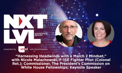

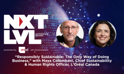


 Headlines1 week ago
 Headlines1 week ago
 Headlines1 week ago
 Designer Dozen2 weeks ago
 Headlines5 days ago
 Headlines2 weeks ago
 Designer Dozen6 days ago