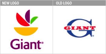
Giant Food Inc. (Landover, Md.) has introduced a new logo. The previous logo, a big blue G with red “Giant” in block letters, has been around since 1963. It is being replaced with an upper-and-lower case “Giant” in an eggplant shade topped with abstract half-moons that, says The Washington Post, “bring to mind a tropical bird, or perhaps a fruit salad, depending on how you squint.”
The logo was unveiled last week at the Georgetown Square store in Bethesda, Md. Employees will also be donning new “logo wear” uniforms – purple and gold knit shirts, aprons and hats – to replace the old green.
“The equity is the Giant name,” said Jim Dwyer, executive vp for strategy and business development at Giant and its sister chain, The Stop & Shop Supermarket Co. (Quincy, Mass.), both subsidiaries of Royal Ahold NV (Amsterdam). “We are giving it a new, refreshed face to get consumers to notice that things inside the store have changed.”
Along with the new logo, says The Post, Giant is planning to expand its selection of prepared foods and private-label offerings. It also is instituting a family checkout lane that bans tabloids and candy in favor of yogurt, animal crackers and bottled water. Hand-held scanners soon will be available for shoppers to ring up groceries while they browse the store.
The company is also making structural changes. About 100 stores will be remodeled over the next two and a half years. The effort has been dubbed “Project Refresh” and will focus on upgrading the perishable-food departments, such as produce, and improving the look of stores with touches such as new floors and lighting.
Advertisement
Stephen Vowles, senior vp for marketing and corporate brands at Stop & Shop and Giant, said the design is intentionally vague but that consumers generally associate the look with “positive” and “fresh.” The company pulled the purple and gold from the logo and onto employees' uniforms to help them stand out from other retailers' colors, typically reds, blues and greens.
Hanging new signs on all of Giant's stores will likely take two to three years, said The Post, though shoppers will begin to see the new logo more frequently over the next few weeks. The company has spent the past two years researching consumer shopping habits and last summer hired the global marketing firm Interbrand Corp. (New York) – which helped pharmaceutical company Eli Lilly & Co. (Indianapolis) create the name Prozac for its popular antidepressant – to develop the logo.
 Headlines2 weeks ago
 Headlines2 weeks ago
 Headlines2 weeks ago
 Headlines6 days ago
 Eric Feigenbaum4 days ago
 Headlines1 week ago
 Designer Dozen1 week ago


