Food Retailing / Supermarkets
Starbucks Introduces New Logo
Updates iconic design on the 40th anniversary of the company
MasterClass: ‘Re-Sparkling’ Retail: Using Store Design to Build Trust, Faith and Brand Loyalty
HOW CAN WE EMPOWER and inspire senior leaders to see design as an investment for future retail growth? This session, led by retail design expert Ian Johnston from Quinine Design, explores how physical stores remain unmatched in the ability to build trust, faith, and loyalty with your customers, ultimately driving shareholder value.
Presented by:
Ian Johnston
Founder and Creative Director, Quinine Design


Blackstone to Buy Tropical Smoothie Café

More Toys “R” Us Shops Headed to UK

MasterClass: ‘Re-Sparkling’ Retail: Using Store Design to Build Trust, Faith and Brand Loyalty


Bulletins
Get the most important news and business ideas from VMSD magazine's news bulletins.
-
 Photo Gallery1 week ago
The 2024 Shop! Design Awards Winners
-
 Headlines4 days ago
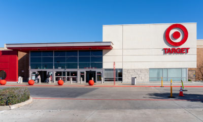
Target Sued for Biometric Surveillance
-
 Headlines1 week ago
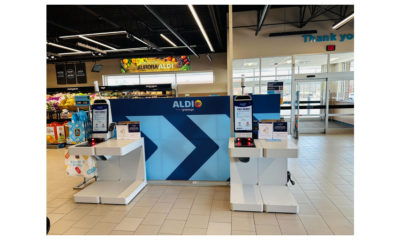
ALDI Launches Checkout-Free Grocery
-

 Headlines2 weeks ago
Long Island Shopping Center Sold for $8M
-
 Headlines2 weeks ago
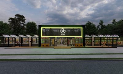
Micro Grocery Store Being Built in Tulsa
-

 Designer Dozen1 week ago
2024 Designer Dozen: Lisa Rachielles
-
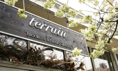
 Headlines1 week ago
Anthropologie’s Terrain Unit Opens Store at Brooklyn Botanic Garden
-

 Headlines3 days ago
Express Files Chapter 11, Plans to Close 95 Stores