Gap seems determined to join the European Union. It has announced that, beginning in the fall, its men’s and women’s European clothing lines will be designed over here. They will capture the spirit of the brand, the retailer says, which will be different from what is available in the U.S.
Gap has also remodeled a store in the Brent Cross shopping center in north London, a prototype it hopes will further establish a separate European identity. Designed by London-based consultancy Dalziel + Pow, this 7000-square-foot space is intended to have a more “urban Brit” feel – gritty and a bit stripped-down.
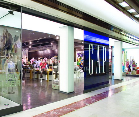
In its other U.K. stores, Gap has always opted for a fairly traditional storefront treatment, with display windows surrounding a routine entryway, even in a mall. In Brent Cross, there’s an entirely different look. There are small windows on either side of the entrance, but they’re very much bit players compared to the 50-foot store entrance that yawns between them.
This broad introduction to the store is not only dramatic but it also provides a perfect vista to its three merchandise departments. At a glance, shoppers can see that womenswear is on the far left, menswear is in the middle and, in an almost separate shop, kids and babywear have their own area to the right.
Matthew Brown, head of research at retail consultancy Echochamber (London), says: “I really like the whole open frontage thing – the fact that when you stand in front of the store, it’s possible to make sense of the space without signage. People seem to read this very quickly and react instinctively.”
In the middle of the entrance, a square, blue acrylic Gap logo rises almost from floor to ceiling. The smooth, white pillars flanking the icon create a sense of drama around the storefront, which, coupled with mannequins standing on a series of tiered platforms just inside the door, ensure that shoppers’ attention is drawn there.
Advertisement
The kids’ department follows the U.S. model, but the men’s and women’s zones signify that the retailer’s up to something different. “They’re trying to move away from the white box they’ve been using for so long,” says Brown. “There are shirts hanging from metal poles that you don’t see elsewhere.”
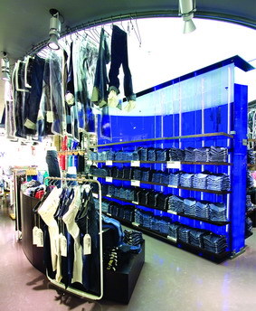
In the center of the floor is a feature that Gap has christened “the stadium.” Acting as a divide between the men’s and women’s collections, it consists of a freestanding cavity wall made of glass. In the middle of the wall is a translucent royal-blue sheet. Blue neon tubes have been vertically inserted on either side of the wall’s internal sheet.
The legend “architects of denim” is written on either side of the wall. Overhead, a circular lighting rig is used as a clothesline for jeans and for the spotlights that highlight the merchandise. Putting both men’s and women’s denim areas on either side of the wall in the mid-shop emphasizes Gap’s workwear heritage while also rejuvenating the presentation, says a Gap spokeswoman.
In both the men’s and women’s departments, stock densities are higher than in other European Gap stores – this is a large shop, but not huge, and the plan was to have the bulk of the merchandise on display.
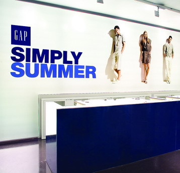
At the back of the store, the cashwrap is the final showstopper. It consists of a highly polished white table into which the till points have been recessed, maintaining a smooth surface line. An image taken from the current European Gap marketing promotion has been turned into an enormous back-lit graphic that runs the length of the counter. This highly visible area helps draw shoppers’ eyes through the entire store, from front to back.
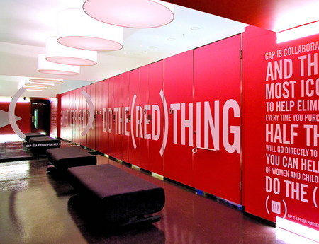
Little has been left to chance. Even the fitting rooms have been decorated with graphics that pick up on Gap’s association with the Bono-endorsed (Product) RED campaign.
Advertisement
Consultant Brown is impressed. “I really like the fact that, in spite of the trouble Gap has been in lately, it has done something bold,” he says. If this is a hint of what will happen when the new Euro lines of merchandise hit the stores later this year, Gap U.S. could do a lot worse than see what its trans-Atlantic cousin has been up to.
Client: Gap Europe, London
Design: Dalziel + Pow, London
General Contractor: Withey Contracts, Kempston, U.K.
Lighting: Iguzzini U.K., Mitcham, U.K.
Merchandise System: Visplay U.K., Thame, U.K.
Advertisement
Music: Dogstar AV Ltd., Sutton in Ashfield, U.K.
Resin Floor: Resintek Services Ltd., Hove, U.K.
Store Equipment: Mice Group, Coventry, U.K.
Courtesy of Gap Europe, London


 Headlines1 week ago
 Headlines1 week ago
 Headlines1 week ago
 Designer Dozen2 weeks ago
 Headlines5 days ago
 Headlines2 weeks ago
 Designer Dozen6 days ago